
In this article, you will learn how to build a full-stack feedback application in SvelteKit using Form Actions and Prisma ORM. Using Form Actions will enable us to directly mutate data in the database from the frontend application, which means we do not have to go through an API layer.
We will progressively enhance the forms to ensure that they function even when JavaScript is disabled in the browser or unavailable. We have already created this same application in SvelteKit in the article titled ‘Build a Frontend App in SvelteKit using a RESTful API‘, but this one requires an API layer to modify data on the server.
Moreover, if you’re interested, there are Next.js and Rust versions of this feedback application available for exploration. The Rust implementation is found in the article titled ‘Build a Full Stack App with Rust, Yew.rs, and Actix Web‘, while the Next.js version can be found in the article titled ‘Build a Simple Frontend App in Next.js 13 App Directory‘.
Before we delve into the tutorial, let’s give credit to Brad Traversy, who originally created this application in Svelte with local storage for feedback item storage. However, in our implementation, we’ll elevate it to a higher level by incorporating a PostgreSQL database and Prisma ORM. Without further delay, let’s dive into the tutorial and start building this exciting application!
More Practice (Optional):
- How to Build a Simple API in SvelteKit
- Build a Frontend App in SvelteKit using a RESTful API
- Learn Next.js Server Actions and Mutations with Examples
- Integrate FastAPI Framework with Next.js and Deploy
- Integrate Python Flask Framework with Next.js and Deploy
- JWT Authentication in Next.js 13 API Route Handlers
- User Registration and Login in Next.js 13 App Directory
- Build a Simple API in Next.js 13 App Directory
- Build a Simple Frontend App in Next.js 13 App Directory
- Next.js – Add Google and GitHub OAuth2 using NextAuth.js
- Next.js – Use Custom Login and SignUp Pages for NextAuth.js
- How to Setup Prisma ORM in Next.js 13 App Directory
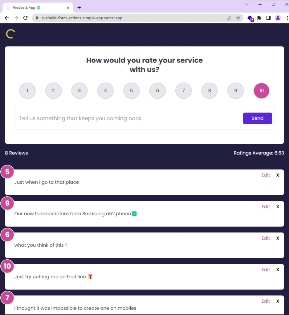
Running the FullStack Feedback App
Here’s a preview of the feedback application we’ll create in this tutorial. At the top, there’s a form with a label, radio buttons to rate feedback, and a text box for adding comments.
Below the form, you’ll see statistics showing the total number of reviews and the average ratings.
After that, there’s a list of cards displaying the feedback items. Each card has Edit and Delete buttons. If you click Edit, an input field appears to edit the feedback text. When you click Delete, you’ll be asked to confirm before removing the feedback from both the database and the user interface.
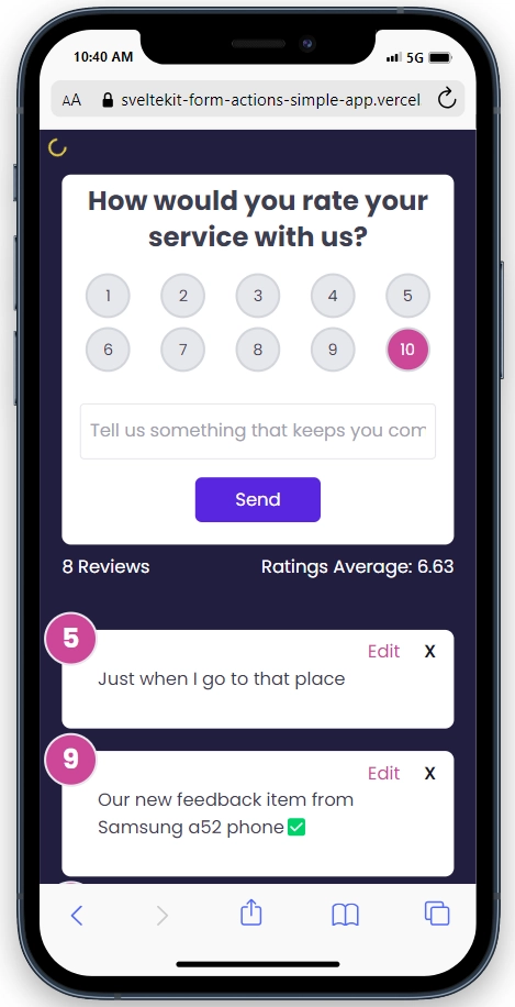
Below is a preview of the application on a mobile device, demonstrating its full responsiveness and seamless adaptability to all screen sizes.
To run the SvelteKit feedback app on your local machine, follow these steps:
- Download and Set Up:
- Download or clone the project from its GitHub repository at https://github.com/wpcodevo/sveltekit-form-actions-simple-app.
- Open the source code in your preferred IDE or code editor.
- Install Dependencies:
- In your terminal, run
pnpm installto install all the required dependencies. If you don’t have the PNPM package manager installed, you can install it by runningnpm i -g pnpm.
- In your terminal, run
- Database Configuration:
- Duplicate the
.env.examplefile and rename the copy to.env. - Inside the
.envfile, add your cloud Postgres database URL to theDATABASE_URLvariable. You can obtain a cloud PostgreSQL URL from Supabase.
- Duplicate the
- Optional: Use Docker for PostgreSQL:
- If you don’t have a cloud PostgreSQL database, you can use Docker to set up a local PostgreSQL server in a Docker container. Ensure you have Docker installed on your machine.
- Run
docker-compose up -din the terminal to start the PostgreSQL server.
- Start the Development Server:
- Run the command
pnpm dev --port 3000in the terminal. This will generate the Prisma Client, apply migrations to the database, and start the SvelteKit development server.
- Run the command
- Access the Application:
- Visit the provided URL in your web browser to access the application.
- Feel free to explore and interact with the application’s features, such as adding, editing, and deleting feedback items.
- If you wish to test the API using an API client, you can import the
Feedback App API.postman_collection.jsonfile, which is provided in the source code, into tools like Postman or the Thunder Client VS Code extension. Once imported, you can utilize the pre-defined requests to interact with the SvelteKit API, allowing you to add, edit, retrieve, and delete feedback items.
Setting up the SvelteKit Project
To begin building our SvelteKit application, let’s create a new project. If you already have one, feel free to skip this step. Navigate to the folder where you want to keep the source code and use one of the commands below, based on your preferred package manager. For example, I’ll use PNPM.
# For PNPM
pnpm create svelte@latest sveltekit-form-actions-simple-app

# For Yarn
yarn create svelte@latest sveltekit-form-actions-simple-app

# For NPM
npm create svelte@latest sveltekit-form-actions-simple-app
After running the command, you’ll be prompted to choose a template. Select the “skeleton project” option, and then choose “Yes” for TypeScript type checking. Optionally, you can include ESLint and Prettier by selecting them with the spacebar. Finally, press the Enter key to generate the project.
After creating the project, navigate to its folder and run pnpm install to install all the necessary dependencies. Once the installation is complete, you can open the project in your preferred IDE.
Setting up the Database
To set up a cloud Postgres database, I’ll walk you through obtaining the connection URL from Supabase. However, you can choose any other provider if you prefer. Follow these simple steps:
- Sign up at https://supabase.com/dashboard/sign-up using your GitHub account.
- Create a new project. Once the project is set up, click on the settings icon located in the left sidebar.
- In the settings page, select “Database” and scroll down to the “Connection string” section. Under this, choose the “URI” tab and copy the provided URI.
- Create a
.envfile at the root level of your project and paste the copied connection string as the value for theDATABASE_URLvariable. Remember to replace the[YOUR-PASSWORD]placeholder with your actual Postgres database password, which you received when creating the new project on Supabase.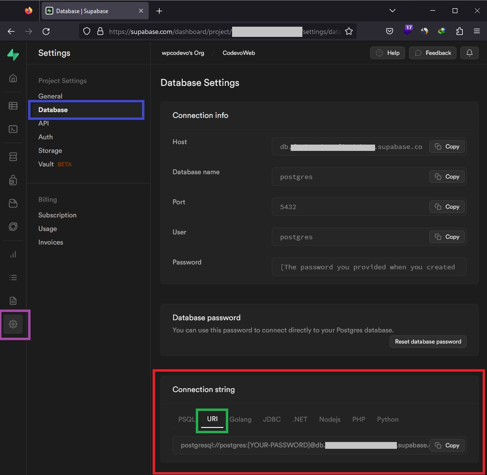
.env
# -----------------------------------------------------------------------------
# Database (PostgreSQL - Supabase)
# -----------------------------------------------------------------------------

DATABASE_URL=paste_cloud_postgres_uri_here
Optional: Using Docker
To set up a Postgres server and pgAdmin in Docker, begin by creating a docker-compose.yml file at the root level of your project. Then, add the following configurations to the file:
docker-compose.yml
services:
  postgres:
    image: postgres
    container_name: postgres
    ports:
      - 6500:5432
    env_file:
      - ./.env
    volumes:
      - postgres:/var/lib/postgresql/data
  pgadmin:
    image: dpage/pgadmin4
    container_name: pgadmin
    ports:
      - "5050:80"
    env_file:
      - ./.env
    volumes:
      - pgadmin-data:/var/lib/pgadmin
    restart: always
volumes:
  postgres:
  pgadmin-data:
Please note that pgAdmin has been included to provide a visual interface for inspecting the data stored in the PostgreSQL server. This will enable us to conveniently view and manage the database contents.
For the configuration, we used a .env file in the env_file field. This file will hold the necessary credentials to build the PostgreSQL and pgAdmin images. To ensure these credentials are accessible, create a .env file at the project’s root directory and include the following environment variables:
.env
# -----------------------------------------------------------------------------
# PostgreSQL Credentials for Docker Compose
# -----------------------------------------------------------------------------
POSTGRES_HOST=127.0.0.1
POSTGRES_USER=admin
POSTGRES_PASSWORD=password123
POSTGRES_DB=sveltekit_feedback_app
POSTGRES_PORT=6500

# -----------------------------------------------------------------------------
# pgAdmin4 Credentials for Docker Compose
# -----------------------------------------------------------------------------
PGADMIN_DEFAULT_EMAIL=admin@admin.com
PGADMIN_DEFAULT_PASSWORD=password123
PGADMIN_LISTEN_PORT=80


# -----------------------------------------------------------------------------
# Database (PostgreSQL - Docker)
# -----------------------------------------------------------------------------
DATABASE_URL=postgresql://admin:password123@localhost:6500/sveltekit_feedback_app?schema=public
With the environment variables set, run the command docker-compose up -d to start both the PostgreSQL and pgAdmin servers in their respective containers.
Initializing Prisma and Running Database Migrations
With the PostgreSQL database now operational, let’s proceed to integrate Prisma ORM into the project. Start by installing the Prisma CLI and Client using the following command:
# For PNPM
pnpm add @prisma/client && pnpm add -D prisma

# For Yarn
yarn add @prisma/client && yarn add -D prisma

# For NPM
npm i @prisma/client && npm i -D prisma
Once the packages are installed, initialize Prisma in the project using the command below:
# For PNPM
pnpm prisma init --datasource-provider postgresql

# For Yarn
yarn prisma init --datasource-provider postgresql

# For NPM
npx prisma init --datasource-provider postgresql
Next, access the prisma/schema.prisma file and replace its existing content with the following code snippet. This snippet defines the Feedback model along with its fields, representing the structure of a feedback item:
prisma/schema.prisma
// This is your Prisma schema file,
// learn more about it in the docs: https://pris.ly/d/prisma-schema

generator client {
  provider = "prisma-client-js"
}

datasource db {
  provider = "postgres"
  url      = env("DATABASE_URL")
}

model Feedback {
  id        String   @id @default(uuid())
  text      String   @unique
  rating    Float
  createdAt DateTime @default(now())
  updatedAt DateTime @updatedAt
}
After making the necessary changes to the schema, execute the following command to establish a connection with the active PostgreSQL database, generate schema migrations based on the Feedback model, synchronize the migrations with the Postgres database schema, and generate the Prisma Client within the node_modules folder:
# For PNPM
pnpm prisma migrate dev --name init

# For Yarn
yarn prisma migrate dev --name init

# For NPM
npx prisma migrate dev --name init
To view the tables added to the PostgreSQL database, access the pgAdmin GUI by opening your web browser and navigating to http://localhost:5050/. Ensure that your Docker container is up and running.
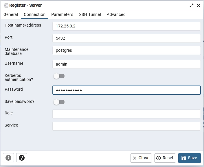
Then, log in to pgAdmin using the credentials specified in the .env file. Once logged in, on the pgAdmin dashboard, create a new server using the PostgreSQL credentials from the .env file. Use the default Postgres port (5432) instead of the one provided in the .env file.
To obtain the IP of the running Postgres server, you can use the following steps:
- Run the command
docker psto list all running Docker containers. - Find the container ID of the PostgreSQL container from the output.
- Run the command
docker inspect <container_id>, replacing<container_id>with the actual container ID from the previous step. - In the output, scroll down to the “NetworkSettings” section and copy the value of the “IPAddress” field.
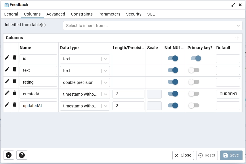
After successfully registering the Postgres server in pgAdmin, go to the sveltekit_feedback_app -> Schemas -> Tables section. Next, right-click on the Feedback table and select “Properties” to view its details. In the displayed popup, click on the “Columns” tab to explore the table’s columns and their properties.
If you are using Supabase, you can get the connection info from the “Database Settings” page provided by Supabase.
Instantiating the Prisma Client
Now that the Prisma migrations are synchronized with the database schema, we can leverage the Prisma Client to interact with the database. However, before proceeding, there’s an essential step to consider. When using SvelteKit’s development server, it performs hot reloads whenever we make changes to the source code. To prevent creating a new Prisma Client instance with each hot reload, which could lead to additional database connections, we should store the Prisma Client as a global variable during development.
To begin, open your src/app.d.ts file and add a new variable named prisma with the type PrismaClient. Here’s how it should look:
src/app.d.ts
// See https://kit.svelte.dev/docs/types#app

import type { PrismaClient } from '@prisma/client';

// for information about these interfaces
declare global {
	namespace App {
		// interface Error {}
		// interface Locals {}
		// interface PageData {}
		// interface Platform {}
	}
	var prisma: PrismaClient;
}

export {};
With that in place, go to the src/lib/ directory and create a new folder called server. Inside the server folder, add a file named prisma.ts and include the following code:
src/lib/server/prisma.ts
import { PrismaClient } from '@prisma/client';

const prisma =
	globalThis.prisma ??
	new PrismaClient({
		log: ['query']
	});

if (process.env.NODE_ENV != 'production') globalThis.prisma = prisma;

export { prisma };
By placing the prisma.ts file within a server directory, we tell SvelteKit that the content of the file should only be used on the server. Alternatively, we could have directly indicated this in the file name as prisma.server.ts, which would achieve the same result as the folder approach.
Adding and Configuring Tailwind CSS
As of the current time, SvelteKit doesn’t include Tailwind CSS by default as Next.js does. Nevertheless, adding Tailwind CSS to your SvelteKit project is a straightforward process. You can do this with just one terminal command:
npx svelte-add tailwindcss
Upon executing this command, Tailwind CSS configurations will be automatically integrated into your project. The process generates two crucial files, postcss.config.cjs and tailwind.config.cjs, which come with default settings optimized for SvelteKit. Additionally, a app.postcss file will be created in the src directory, containing the essential Tailwind CSS directives.
In case the +layout.svelte file is not yet present in the src/routes/ directory, the setup process will generate it for you. It automatically imports the app.postcss file, ensuring that Tailwind CSS classes are applied throughout your markup.
Now, let’s move on to customizing the Tailwind CSS container property and adding a font to the fontFamily property. To accomplish this, navigate to the tailwind.config.cjs file and replace its current content with the following configurations:
tailwind.config.cjs
/** @type {import('tailwindcss').Config}*/
const config = {
	content: ['./src/**/*.{html,js,svelte,ts}'],

	theme: {
    extend: {
      fontFamily: {
        Poppins: ['Poppins, sans-serif'],
      },
      container: {
        center: true,
        padding: '1rem',
        screens: {
          lg: '1125px',
          xl: '1125px',
          '2xl': '1125px',
        },
      },
    },
  },

	plugins: []
};

module.exports = config;
Next up, let’s add the font import and apply some default CSS styling to the app.postcss file. To achieve this, open src/app.postcss and replace the current content with the following code:
src/app.postcss
/* Write your global styles here, in PostCSS syntax */
@import url('https://fonts.googleapis.com/css2?family=Poppins:wght@300;400;500;600;700&display=swap');

@tailwind base;
@tailwind components;
@tailwind utilities;

html {
	font-family: 'Poppins', sans-serif;
}

body {
	background-color: #202142;
	width: 100%;
	height: 100%;
}
Adding a Toast Notification
To improve our project, let’s incorporate toast notifications that will provide user feedback upon completing certain operations. While there are various toast notification libraries to choose from, we’ll opt for @zerodevx/svelte-toast due to its elegant design and customizable features. To install it, use the following command:
# For PNPM
pnpm add @zerodevx/svelte-toast

# For Yarn
yarn add @zerodevx/svelte-toast

# For NPM
npm i @zerodevx/svelte-toast
To integrate @zerodevx/svelte-toast into our SvelteKit application, follow these steps to configure the root layout component. Open the src/routes/+layout.svelte file and replace its content with the provided code:
src/routes/+layout.svelte
<script>
	import '../app.postcss';
	import { SvelteToast } from '@zerodevx/svelte-toast';

	const options = {
		initial: 0,
		next: 1,
		duration: 6000,
		pausable: true
	};
</script>

<slot />
<SvelteToast {options} />

<style>
	:global(.danger) {
		--toastBackground: #4299e1;
		--toastBarBackground: #2b6cb0;
	}

	:global(.success) {
		--toastBackground: rgba(245, 208, 254, 0.95);
		--toastColor: #424242;
		--toastBarBackground: fuchsia;
	}
</style>
In the provided code, we imported the <SvelteToast /> container and placed it next to the <slot /> component. The configuration object options allows us to modify settings such as the duration and appearance of the toast notifications.
Moreover, we defined global classes, “danger” for error messages and “success” for successful messages. We’ll apply these classes when displaying the toast notifications for different scenarios.
Feel free to further customize the toast notifications based on your needs. Detailed interactive documentation and more customization options can be found at https://zerodevx.github.io/svelte-toast/.
Creating a Svelte Writable Store
Phew, that was quite a few configurations! Now, we’re ready to start working on our feedback application. But first, we’ll create a special way to handle loading states using the svelte/store library. This will help us manage situations where things take time to load, like when we send requests to our Form Actions.
Here’s what you need to do. Go to the src/lib/ folder, and create a new file called store.ts. Inside this file, put the following code:
src/lib/store.ts
import { writable } from 'svelte/store';

type Store = {
	pageloading: boolean;
	setPageLoading: (val: boolean) => void;
};

function useFeedbackStore() {
	const { update, subscribe, set } = writable<Store>({
		pageloading: false,
		setPageLoading: (val) => update((state: Store) => ({ ...state, pageloading: val }))
	});
	return { update, subscribe, set };
}

const feedbackStore = useFeedbackStore();
export default feedbackStore;
In this code, we created a custom store named feedbackStore using the svelte/store library. This store holds a boolean value, pageloading, which indicates whether a page or operation is currently loading. Additionally, we have a handy function called setPageLoading, which we can use to update the pageloading value.
Loading Data using SvelteKit Load Function
Now, let’s create a SvelteKit load function to fetch feedback items from the database and make them available on the page. To achieve this, we’ll use the load function in a +page.server.ts file, which means it will only run on the server. This is because we’ll be accessing the database using Prisma, which can only be used on the server. If we weren’t accessing the database, we would have used the +page.ts file instead.
To set this up, create a +page.server.ts file in the src/routes/ folder and add the following code:
src/routes/+page.server.ts
import type { PageServerLoad } from './$types';
import { prisma } from '$lib/server/prisma';

export const load: PageServerLoad = async ({ url, depends }) => {
	depends('fetch:feedbacks');

	const pageQueryParam = url.searchParams.get('page');
	const limitQueryParam = url.searchParams.get('limit');
	const orderBy = url.searchParams.get('orderBy') === 'asc' ? 'asc' : 'desc';

	const page = pageQueryParam ? parseInt(pageQueryParam, 10) : 1;
	const limit = limitQueryParam ? parseInt(limitQueryParam, 10) : 10;
	const skip = (page - 1) * limit;

	const [totalFeedbacks, feedbacks] = await Promise.all([
		prisma.feedback.count(),
		prisma.feedback.findMany({
			skip,
			take: limit,
			orderBy: {
				createdAt: orderBy
			}
		})
	]);

	const totalPages = Math.ceil(totalFeedbacks / limit);
	const hasNextPage = page < totalPages;
	const hasPreviousPage = page > 1;

	return {
		status: 'success',
		pagination: {
			totalPages,
			currentPage: page,
			totalResults: totalFeedbacks,
			hasNextPage,
			hasPreviousPage
		},
		feedbacks
	};
};
Quite a lot is happening in the above code. Let’s break it down:
- First, we defined the
loadfunction and typed it using thePageServerLoadtype provided by SvelteKit. - Then, we used the
dependsfunction to specify that this page’s server load relies on data fetched using the name'fetch:feedbacks'. This approach allows us to utilize theinvalidatefunction later, which triggers theloadfunction to re-run and fetch the most up-to-date feedback data. - Next, we extracted the
page,limit, andorderByquery parameters from the incoming request URL and assigned default values to them in case they were omitted. - Moving on, we used the Prisma client to perform two queries in parallel using
Promise.all(): one to get the total count of feedbacks and another to get the feedback items for the current page, respecting the specifiedlimit,skip, andorderByvalues. - Finally, we calculated the total number of pages based on the total number of feedback items and the limit. The function also determines whether there are next or previous pages available based on the current page number. Then, the function returns an object containing the status of the request, pagination information, and the array of feedback for the current page.
Creating the Form Actions
At this point, we come to the most important section of this article where we will create Form Actions that will enable us to POST data to the server to create, edit, and delete feedback items in the database. Apart from exporting a load function in the +page.server.ts file, we can also export actions that will enable us to mutate data on the server from the frontend.
Adding a New Feedback
Let’s begin by creating the first Form Action responsible for adding feedback items to the server database. First, open the +page.server.ts file and add the following import at the top:
import { type Actions, fail } from '@sveltejs/kit';
Next, below the load function, include the following code:
src/routes/+page.server.ts
export const actions = {
	addFeedback: async ({ request }) => {
		try {
			const { text, rating } = Object.fromEntries(await request.formData()) as {
				text?: string;
				rating: string;
			};

			if (!text) {
				return fail(400, {
					type: 'add',
					message: 'feedback input cannot be empty',
					feedback: { text, rating, id: '' }
				});
			} else if (text.trim().length < 10) {
				return fail(400, {
					type: 'add',
					message: 'feedback text must be at least 10 characters',
					feedback: { text, rating, id: '' }
				});
			}

			const feedback = await prisma.feedback.create({
				data: { text, rating: Number(rating) }
			});

			return { newFeedback: feedback };
		} catch (err: any) {
			if (err.code === 'P2002') {
				return fail(409, {
					type: 'add',
					message: 'Feedback with this title already exists',
					feedback: { text: '', id: '' }
				});
			}

			return fail(500, {
				type: 'add',
				message: err.message,
				feedback: { text: '', id: '' }
			});
		}
	}
} satisfies Actions;
Here’s an overview of what the Form Action does:
- The
addFeedbackfunction is an asynchronous function that takes arequestobject as an argument. It is responsible for handling the addition of new feedback items to the server database. - The function extracts the
textandratingvalues from the form data sent with the request. It expects a form submission with the fieldstext(optional) andrating(required). - It performs validations on the input data to ensure that the
textfield is not empty and that it contains at least 10 characters. - If the input data is valid, it uses the Prisma client to add the new feedback item to the database. The
ratingvalue is converted to a number before being saved. - If the addition is successful, the function returns an object containing the newly added feedback item with the key
newFeedback. - If there is an error during the addition process, the function handles different types of errors. If the feedback item with the same title already exists in the database, it returns a conflict error with an appropriate error message. Otherwise, it returns a generic error with the error message provided by the caught exception.
Editing an Existing Feedback
Still, in the same +page.server.ts file, let’s add another method to the actions object that will handle editing or modifying a feedback item in the database. Copy the editFeedback function and add it to the actions object.
src/routes/+page.server.ts
export const actions = {
	// 👈 addFeedback Action

	editFeedback: async ({ url, request }) => {
		const feedbackId = url.searchParams.get('id');
		try {
			if (!feedbackId) {
				return fail(400, {
					type: 'edit',
					message: 'invalid request',
					feedback: { text: '', id: feedbackId }
				});
			}

			const { text } = Object.fromEntries(await request.formData()) as { text?: string };

			if (!text) {
				return fail(400, {
					type: 'edit',
					message: 'feedback input cannot be empty',
					feedback: { text, id: feedbackId }
				});
			} else if (text.trim().length < 10) {
				return fail(400, {
					type: 'edit',
					message: 'feedback text must be at least 10 characters',
					feedback: { text, id: feedbackId }
				});
			}

			await prisma.feedback.update({
				where: { id: feedbackId },
				data: { text }
			});

			return { status: 200 };
		} catch (err: any) {
			if (err.code === 'P2002') {
				return fail(409, {
					type: 'edit',
					message: 'Feedback with this title already exists',
					feedback: { text: '', id: feedbackId }
				});
			}

			if (err.code === 'P2025') {
				return fail(404, {
					type: 'edit',
					message: 'No Feedback with the Provided ID Found',
					feedback: { text: '', id: feedbackId }
				});
			}

			return fail(500, {
				type: 'edit',
				message: err.message,
				feedback: { text: '', id: feedbackId }
			});
		}
	}
} satisfies Actions;
In the above code, we implemented the editFeedback function in the actions object. This function is responsible for handling the editing of existing feedback items in the database when a form action is submitted to the ?/editFeedback&id={feedback.id} URL.
When the function is invoked, it extracts the feedback ID from the URL and checks if it is provided. If the ID is missing, it returns a 400 (Bad Request) error with an appropriate message.
Next, the function extracts the text value from the form data submitted with the request. It performs some validations to ensure that the text is provided and that it is at least 10 characters long.
If the validation passes, the function uses the Prisma client to update the feedback item in the database with the new text content.
In case of any errors during the editing process, the function catches and handles specific Prisma error codes to return appropriate error responses with status codes and error messages.
Deleting a Feedback
Continuing in the same +page.server.ts file, let’s add the last Form Action that will handle the deletion of feedback items in the database. We will name this Form Action deleteFeedback, and it will be triggered when a form action is submitted to the ?/deleteFeedback&id={feedback.id} URL.
src/routes/+page.server.ts
export const actions = {
	// 👈 addFeedback Action

	// 👈 editFeedback Action

	deleteFeedback: async ({ url }) => {
		const feedbackId = url.searchParams.get('id');
		try {
			if (!feedbackId) {
				return fail(400, {
					type: 'delete',
					message: 'invalid request',
					feedback: { text: '', id: feedbackId }
				});
			}

			await prisma.feedback.delete({
				where: { id: feedbackId }
			});

			return {};
		} catch (err: any) {
			if (err.code === 'P2025') {
				return fail(404, {
					type: 'delete',
					message: 'No Feedback with the Provided ID Found',
					feedback: { text: '', id: feedbackId }
				});
			}

			return fail(500, {
				type: 'delete',
				message: err.message,
				feedback: { text: '', id: feedbackId }
			});
		}
	}
} satisfies Actions;
When the function is invoked, it extracts the feedback ID from the URL and checks if it is provided. If the ID is missing, it returns a 400 (Bad Request) error with an appropriate message.
Next, the function uses the Prisma client to delete the feedback item from the database based on the provided ID.
In case of any errors during the deletion process, the function catches and handles specific Prisma error codes to return appropriate error responses with status codes and error messages.
Note: The return {}; statement after successful deletion is used to indicate that the deletion was successful. Since we do not need to return any additional data, an empty object is returned.
Creating the Svelte Components
In this part, we’ll create several components, including Rating, Statistic, Form, and Feedback Item components. This method allows us to divide the code into smaller, reusable parts, ensuring that the page files remain organized and uncluttered. By doing so, we avoid adding all the code directly to the page file, making it easier to maintain and understand.
Rating Component
The Rating component is our first component, allowing users to select a rating from a list of options. Only one option can be selected at a time, as each feedback item should have a single rating value. Here’s how to create the Rating component:
- Start by creating a
componentsfolder within thesrcdirectory. - Inside the
componentsfolder, create a new file namedrating.svelte. - Now, add the following code to the
rating.sveltefile:
src/components/rating.svelte
<script lang="ts">
	export let selected = 10;
</script>

<ul
	class="list-none grid grid-cols-5 sm:grid-cols-10 gap-y-2 sm:grid-rows-1 place-items-center sm:gap-0 sm:justify-around sm:my-7 my-4"
>
	{#each Array.from({ length: 10 }, (_, i) => i + 1) as i}
		<li
			class="relative sm:w-14 sm:h-14 w-10 h-10 p-3 text-center rounded-full border-gray-300 border-2 transition duration-300 {selected ===
			i
				? 'bg-pink-500 text-white'
				: 'bg-gray-200'}"
		>
			<input
				type="radio"
				class="opacity-0"
				id={`feedback-rating-radio-button-${i}`}
				name="rating"
				value={i}
				bind:group={selected}
			/>
			<label
				for={`feedback-rating-radio-button-${i}`}
				class="absolute text-sm sm:text-base w-full h-full flex items-center justify-center rounded-full top-1/2 left-1/2 transform -translate-x-1/2 -translate-y-1/2 cursor-pointer hover:bg-pink-500 hover:text-white transition duration-300"
			>
				{i}
			</label>
		</li>
	{/each}
</ul>
In the above code, we’ve created an array of 10 elements and used the {#each} block to iterate through them. For each iteration, we display a radio button and a label inside a list item (<li>). The appearance of each rating option changes based on whether it is selected ({selected === i}).
The selected prop is bound to the hidden input element (<input type="radio">). When a user clicks on a rating option, the value is updated, and the appearance of the rating options reflects the selected value.
Statistic Component
Next, let’s proceed with creating the Statistic component, which will display essential statistics about the feedback items, such as the total number of feedback items returned from the database and the average rating. To create this Statistic component, follow these steps:
- Begin by creating a new file named
feedback-stats.sveltein thecomponentsdirectory. - Now, add the following code to the
feedback-stats.sveltefile:
src/components/feedback-stats.svelte
<script lang="ts">
	import type { Feedback } from '@prisma/client';

	export let feedbacks: Feedback[];

	$: count = feedbacks.length;
	$: sum = feedbacks.reduce((acc, feedback) => acc + feedback.rating, 0);
	$: average = count > 0 ? (sum / count).toFixed(2) : '0.00';
</script>

<div class="flex justify-between items-center mb-11 text-white">
	<h4>{count} Reviews</h4>
	<h4>Ratings Average: {average}</h4>
</div>
In the code above, we’ve created a Statistic component that receives a prop feedbacks containing an array of Feedback objects. We use reactive statements ($:) to calculate the count, sum, and average based on the feedbacks array.
The count represents the total number of feedback items. The sum is the sum of all ratings from the feedback items. The average calculates the average rating, displayed with two decimal places (toFixed(2)), or ‘0.00’ if no feedback is available.
Feedback Form Component
Now, let’s proceed with creating the Form component, which will allow users to add new feedback. We’ll use our addFeedback Form Action that we previously defined in the +page.server.ts file. Additionally, the form component will utilize the Rating component we created earlier.
We will progressively enhance the form to ensure it functions even when JavaScript is disabled or unavailable. However, there will be a minor issue with the Rating component when JavaScript is disabled; selecting a rating will not trigger a color change to indicate selection, as that functionality depends on JavaScript.
To create the Form component, follow these steps:
- Create a new file named
feedback-form.sveltein thecomponentsdirectory. - Add the following code to the
feedback-form.sveltefile:
src/components/feedback-form.svelte
<script lang="ts">
	import { enhance } from '$app/forms';
	import { toast } from '@zerodevx/svelte-toast';
	import Rating from './rating.svelte';
	import feedbackStore from '$lib/store';

	import type { SubmitFunction } from '@sveltejs/kit';
	import type { ActionData } from '../routes/$types';

	export let form: ActionData;
	let rating = 10;

	const handleSubmit: SubmitFunction = () => {
		$feedbackStore.setPageLoading(true);
		return async ({ update, result }) => {
			await update();
			if (result.type === 'success') {
				rating = 10;
				toast.push('Added Feedback Successfully', { classes: ['success'] });
			}
			$feedbackStore.setPageLoading(false);
		};
	};
</script>

<div class="bg-white text-gray-700 rounded-lg p-2 my-2 sm:p-8 sm:my-5 relative">
	<form action="?/addFeedback" method="POST" use:enhance={handleSubmit}>
		<div class="max-w-md mx-auto">
			<label for="feedback-input" class="inline-block text-center text-2xl font-bold"
				>How would you rate your service with us?</label
			>
		</div>
		<Rating bind:selected={rating} />
		<div
			class="flex flex-col items-center gap-y-4 sm:gap-y-0 sm:flex-row sm:border rounded-lg sm:my-4 px-2 py-3"
		>
			<input
				type="text"
				id="feedback-input"
				name="text"
				value={form?.feedback?.text ?? ''}
				class="sm:flex-grow border w-full rounded sm:rounded-none px-2 py-3 sm:border-none text-base sm:text-lg focus:outline-none"
				placeholder="Tell us something that keeps you coming back"
			/>
			<button
				type="submit"
				class="border-0 rounded-md w-28 h-10 cursor-pointer bg-indigo-600 text-white hover:bg-indigo-500 disabled:bg-gray-400 disabled:text-gray-800 disabled:cursor-not-allowed"
			>
				Send
			</button>
		</div>
		{#if form?.message && form.type === 'add'}
			<div role="alert" aria-live="polite" class="sm:pt-3 text-center text-purple-600">
				{form.message}
			</div>
		{/if}
	</form>
</div>
In the code above, we’ve created the Form component, which will allow users to add new feedback. The rating variable holds the selected rating, which will be initialized to 10. The form uses the enhance function from SvelteKit to handle form submissions. When the form is submitted, the handleSubmit function is called.
The form contains a label, the Rating component, and text input for user feedback. When the user submits the form, the addFeedback Form Action will be triggered. If the addition is successful, a success toast notification will be displayed.
Feedback Item Component
Let’s proceed with creating the feedback item component, which will allow us to display the content of a feedback item. We’ll utilize the editFeedback and deleteFeedback Form Actions that we defined in the +page.server.ts file to enable editing and deleting feedback from the database.
The component will have an Edit button that, when clicked, displays a hidden input element to edit the feedback’s text. Additionally, there will be a Delete icon that, when clicked, triggers the deleteFeedback action to permanently remove the feedback item from both the database and the UI.
To create this component, follow these steps:
- Create a new file named
feedback-item.sveltein thecomponentsfolder. - Add the following code to the
feedback-item.sveltefile:
src/components/feedback-item.svelte
<script lang="ts">
	import { enhance } from '$app/forms';
	import { toast } from '@zerodevx/svelte-toast';
	import { tick } from 'svelte';
	import { fade } from 'svelte/transition';

	import feedbackStore from '$lib/store';
	import type { Feedback } from '@prisma/client';
	import type { SubmitFunction } from '@sveltejs/kit';
	import type { ActionData } from '../routes/$types';

	export let feedback: Feedback;
	export let form: ActionData;

	let editing = false;
	let editedFeedbackText = feedback.text;

	function windowConfirm(message: string) {
		return window.confirm(message);
	}

	let inputElement: HTMLInputElement | null = null;

	$: if (editing) {
		(async () => {
			await tick();
			inputElement?.focus();
		})();
	}

	const handleSubmit: SubmitFunction = (options) => {
		const deleteAction = options.action.search.includes('deleteFeedback');
		const editAction = options.action.search.includes('editFeedback');

		if (deleteAction) {
			const confirm = windowConfirm('Do you really want to delete this item?');
			if (!confirm) {
				options.cancel();
				return;
			}
		}

		if (feedback.text === editedFeedbackText && editAction) {
			editing = false;
			options.cancel();
			return;
		}

		$feedbackStore.setPageLoading(true);
		return async ({ update, result }) => {
			if (result.type === 'success' && editAction) editing = false;
			await update();

			if (result.type === 'success' && editAction) {
				toast.push('Edited Feedback Successfully', { classes: ['success'] });
			} else if (result.type === 'success' && deleteAction) {
				editing = false;
				toast.push('Deleted Feedback Successfully', { classes: ['success'] });
			}

			$feedbackStore.setPageLoading(false);
		};
	};
</script>

<form
	action="?/editFeedback&id={feedback.id}"
	method="POST"
	use:enhance={handleSubmit}
	in:fade={{ delay: 300, duration: 300 }}
	out:fade={{ delay: 300, duration: 300 }}
	class="bg-white text-gray-700 rounded-lg p-8 my-5 relative"
>
	<div
		class="bg-pink-500 text-white rounded-full border-2 border-gray-200 w-12 h-12 flex items-center justify-center text-2xl font-bold absolute top-0 left-0 -mt-4 -ml-4"
	>
		{feedback.rating}
	</div>
	<button
		class="absolute text-gray-900 font-semibold top-2 right-4"
		formaction="?/deleteFeedback&id={feedback.id}"
	>
		X
	</button>
	<button
		type="button"
		class="absolute top-2 right-12 text-pink-500 hover:text-pink-700"
		class:hidden={editing}
		on:click={() => (editing = true)}>Edit</button
	>
	{#if editing}
		<div class="flex flex-col items-center sm:flex-row justify-between sm:gap-4 gap-y-2">
			<input
				type="text"
				name="text"
				class="border rounded-lg p-2 w-full focus:outline-none"
				bind:value={editedFeedbackText}
				bind:this={inputElement}
			/>
			<div class="flex gap-2">
				<button type="submit" class="text-pink-500 hover:text-pink-700">Save</button>
				<button class="hover:text-pink-700" on:click={() => (editing = false)}>Cancel</button>
			</div>
		</div>
		{#if form?.message && form.type === 'edit' && feedback.id === form.feedback.id}
			<div class="sm:pt-3 text-sm text-center text-purple-600">{form.message}</div>
		{/if}
	{:else}
		<p>{feedback.text}</p>
	{/if}
</form>
It’s essential to be aware that the Edit functionality won’t work when JavaScript is disabled, as it relies on state changes to display the hidden input element. However, the Delete functionality will still work even when JavaScript is disabled. This means that users with JavaScript disabled will be able to delete feedback items without any issues.
Using the Components in a Page File
Oops, there seems to be quite a lot of code now. However, don’t worry; we’re almost done with creating all the necessary components for our project. The next step is to import these components into the root page file and use them so that they can be rendered on the actual page.
To do this, let’s open the +page.svelte file in the routes directory and add the following code:
src/routes/+page.svelte
<script lang="ts">
	import { fade } from 'svelte/transition';
	import { onMount } from 'svelte';
	import FeedbackForm from '../components/feedback-form.svelte';
	import FeedbackStats from '../components/feedback-stats.svelte';
	import FeedbackItem from '../components/feedback-item.svelte';
	import type { ActionData, PageData } from './$types';
	import { invalidate } from '$app/navigation';
	import feedbackStore from '$lib/store';

	export let data: PageData;
	export let form: ActionData;
	$: ({ feedbacks } = data);
	let pageLoading = false;

	async function onFocus() {
		$feedbackStore.setPageLoading(true);
		await invalidate('fetch:feedbacks');
		$feedbackStore.setPageLoading(false);
	}

	onMount(() => {
		window.addEventListener('focus', onFocus);

		return () => {
			window.removeEventListener('focus', onFocus);
		};
	});

	$: pageLoading = $feedbackStore.pageloading;
</script>

<svelte:head>
	<title>Feedback App ✅</title>
</svelte:head>

<main class="md:container mt-10 sm:mt-24 px-5">
	<FeedbackForm {form} />
	<FeedbackStats {feedbacks} />

	{#each feedbacks as feedback}
		<FeedbackItem {form} {feedback} />
	{/each}

	{#if feedbacks.length === 0}
		<p
			in:fade={{ delay: 700, duration: 300 }}
			class="max-w-md mx-auto py-6 text-center text-lg rounded-md bg-white"
		>
			No Feedbacks Found
		</p>
	{/if}
</main>
{#if pageLoading}
	<div
		class="fixed top-2 left-2 sm:top-5 sm:left-5 inline-block h-4 w-4 sm:h-8 sm:w-8 animate-spin rounded-full border-2 sm:border-4 border-solid border-yellow-400 border-r-transparent align-[-0.125em] text-warning motion-reduce:animate-[spin_1.5s_linear_infinite]"
		role="status"
	/>
{/if}
In the code above, we have imported the necessary components and functions at the top of the file. The onFocus function is used to handle page reloading when the page gains focus. We invoke invalidate('fetch:feedbacks') to trigger the load function defined in +page.server.ts to re-run and fetch the latest changes in the feedback items from the database.
The main content of the page is wrapped inside the <main> tag. We render the FeedbackForm, FeedbackStats, and a list of FeedbackItem components for each feedback item in the feedbacks array.
If there are no feedback items, we display a message “No Feedbacks Found” using the fade transition. Additionally, if the page is still loading (indicated by pageLoading being true), a spinning loader animation is displayed.
Testing the SvelteKit Application Locally
Now that we have completed the project, it’s time to test it to ensure everything works as expected. First, make sure the Postgres and pgAdmin Docker containers are running, and the Prisma migrations have been applied to the database. If the Docker containers are not running, you can launch them using the command docker-compose up -d. If you haven’t synced the database schema with the Prisma schema, you can do so by running the command pnpm prisma migrate dev. This will connect to the Postgres database, apply the migrations, and generate the Prisma Client.
Next, start the SvelteKit development server on port 3000 by running the command pnpm dev --port 3000. Once the server is up and running, open the application in your browser at http://localhost:3000/.
Now, you can thoroughly test the application by performing the following actions:
- Add Feedback: Use the feedback form to add new feedback items. Verify that the feedback is successfully added to the database and displayed on the page.
- Edit Feedback: Click the “Edit” button on a feedback item to activate the editing mode. Modify the feedback text and save the changes. Ensure that the feedback is updated in the database and the changes are reflected on the page.
- Delete Feedback: Click the “X” icon on a feedback item to delete it. Confirm the deletion and verify that the feedback is removed from the database and no longer displayed on the page.
- Progressive Enhancement: Disable JavaScript in your browser settings and try adding and deleting feedback items. These functionalities should still work because they are progressively enhanced to function even without JavaScript.
Deploying the Application to Vercel
Now that we have confirmed the application works in the development environment, it’s time to deploy the project to Vercel and test its functionality in a production environment.
To begin, install the Vercel adaptor for SvelteKit and configure the project to use it. Open your terminal and run the following command to install the adaptor:
# For PNPM
pnpm add -D @sveltejs/adapter-vercel

# For Yarn
yarn add -D @sveltejs/adapter-vercel

# For NPM
npm i -D @sveltejs/adapter-vercel
Once the Vercel adaptor is installed, modify the svelte.config.js file to use the Vercel adaptor. Replace '@sveltejs/adapter-auto' with '@sveltejs/adapter-vercel' in the import and adapter section, as shown below:
svelte.config.js
import adapter from '@sveltejs/adapter-vercel';
import { vitePreprocess } from '@sveltejs/kit/vite';

/** @type {import('@sveltejs/kit').Config} */
const config = {
	// Consult https://kit.svelte.dev/docs/integrations#preprocessors
	// for more information about preprocessors
	preprocess: [vitePreprocess({})],

	kit: {
		// adapter-auto only supports some environments, see https://kit.svelte.dev/docs/adapter-auto for a list.
		// If your environment is not supported or you settled on a specific environment, switch out the adapter.
		// See https://kit.svelte.dev/docs/adapters for more information about adapters.
		adapter: adapter()
	}
};

export default config;
Next, build the project in the development environment to simulate how Vercel will build the project. In your terminal, run the command pnpm build. Make sure you have Node v18 installed to avoid any build errors. After the project build is complete, a .vercel folder will be generated at the root level of the project. Add this folder to the .gitignore file to exclude it from commits. To preview the build, run the command pnpm preview --port 3000 and access it in your browser.
Now, modify the build script in the package.json file to generate the Prisma client, apply migrations to the database, and then build the project. Here’s how the modified build script should look:
package.json
{
	"name": "sveltekit-form-actions-simple-app",
	"version": "0.0.1",
	"private": true,
	"scripts": {
		"dev": "prisma db push && prisma generate && vite dev",
		"build": "prisma db push && prisma generate && vite build",
		"preview": "vite preview"
	},
	"devDependencies": {

	},
	"type": "module",
	"dependencies": {

	}
}
Next, deploy the project to Vercel. Create a GitHub repository for your project and push the source code into it. Then, sign in to your Vercel account and click on the “Add New” button. Select the “Project” option from the dropdown menu and choose the repository where you pushed the source code.
Vercel will recognize your project as a SvelteKit project and provide default configurations, which usually work well. Customize settings as needed, and add your cloud database URL as the value of the DATABASE_URL variable in the “Environment Variables” section.
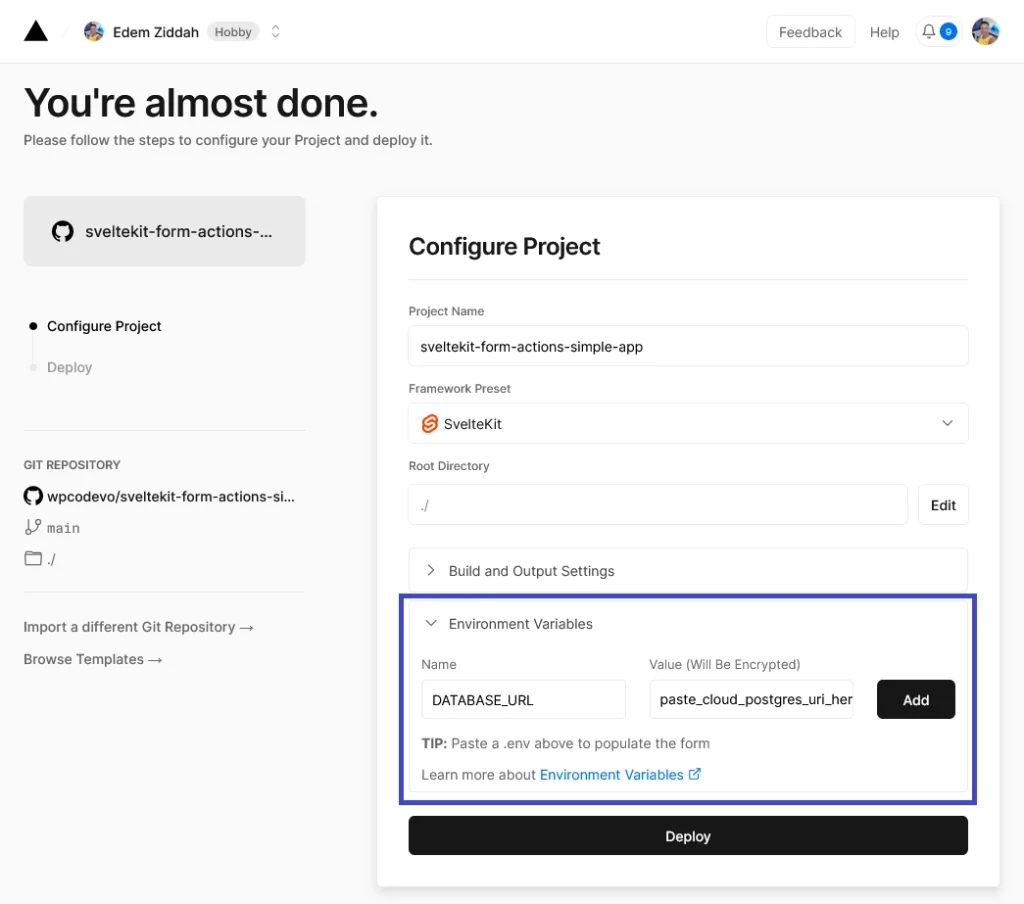
Click the “Deploy” button to start the deployment process. Vercel will handle the building of your SvelteKit project. Once the deployment is finished, you will be provided with a domain specifically for your project. Access this domain to see your SvelteKit app live in action. You can now add, edit, and delete feedback items.
Conclusion
And we’ve reached the end! Congratulations on making it this far. Throughout this tutorial, you learned how to create a full-stack application in SvelteKit using Form Actions and successfully deploy it to Vercel. I hope you found this tutorial helpful and enjoyable.
If you have any questions or feedback, don’t hesitate to leave a comment below. Your input is valuable, and I’ll be glad to assist you. Thank you for reading, and best of luck with your future SvelteKit projects! Happy coding!