
In this article, you will learn how to build a feedback application in SvelteKit using a REST API. Specifically, we will be creating the UI that interacts with the REST API we built for the feedback application in the previous tutorial.
The way we will implement the UI will resemble how it’s done in React.js, with minor changes. This means the application will only function properly when JavaScript is enabled. I’m really excited about guiding you through this process because this is my first project in SvelteKit.
In an upcoming tutorial, we will build the same feedback application using SvelteKit Form Actions, allowing the application to function even when JavaScript is disabled. This means there won’t be any API layer. I have completed the project, but I haven’t had the opportunity to create a tutorial for it yet. Nevertheless, you can explore the source code directly at https://github.com/wpcodevo/sveltekit-form-actions-simple-app.
Before we proceed, I’d like to extend a special shout-out to Brad Traversy, who originally created this feedback application in one of his YouTube tutorials. Be sure to watch his video and subscribe to his channel if you haven’t already.
Additionally, I’ve developed versions of this application using Next.js and Rust. You can find the Next.js version titled ‘Build a Simple Frontend App in Next.js 13 App Directory‘ and the Rust version called ‘Build a Full Stack App with Rust, Yew.rs and Actix Web‘. Without further ado, let’s dive into the article!
More Practice (Optional):
- How to Build a Simple API in SvelteKit
- Learn Next.js Server Actions and Mutations with Examples
- Integrate FastAPI Framework with Next.js and Deploy
- Integrate Python Flask Framework with Next.js and Deploy
- JWT Authentication in Next.js 13 API Route Handlers
- User Registration and Login in Next.js 13 App Directory
- Build a Simple API in Next.js 13 App Directory
- Build a Simple Frontend App in Next.js 13 App Directory
- Next.js – Add Google and GitHub OAuth2 using NextAuth.js
- Next.js – Use Custom Login and SignUp Pages for NextAuth.js
- How to Setup Prisma ORM in Next.js 13 App Directory

Running the Full-Stack SvelteKit App on Your Machine
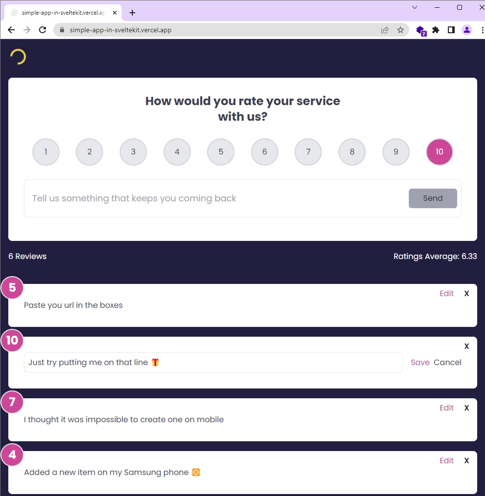
Below is a sneak peek of the UI for the feedback application we will be building in the second part of our two-part tutorial series. The top section comprises a card with radio buttons for feedback ratings and an input field for adding feedback text. Beneath the card, you’ll find statistics displaying the total number of reviews and the average ratings.
Moving forward, there’s a list of cards displaying the feedback items. Each card comes with an Edit button and a Delete icon. Clicking the Edit button reveals an input field for editing the feedback text. In contrast, the Delete button prompts a confirmation before removing the feedback item from both the database and the UI.
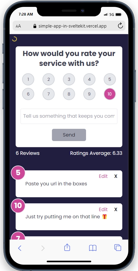
Here is a preview of the application viewed on a mobile device, indicating that it is fully responsive and can easily adapt to all screen sizes.
To run the SvelteKit feedback app on your local machine, follow these steps:
- Download and Set Up:
- Download or clone the project from its GitHub repository at https://github.com/wpcodevo/simple-app-in-sveltekit.
- Open the source code in your preferred IDE or code editor.
- Install Dependencies:
- In your terminal, run
pnpm installto install all the necessary dependencies. If you don’t have the PNPM package manager installed, you can install it by runningnpm i -g pnpm.
- In your terminal, run
- Database Configuration:
- Duplicate the
.env.examplefile and rename the copy to.env. - Inside the
.envfile, add your cloud Postgres database URL to theDATABASE_URLvariable. You can obtain a cloud PostgreSQL URL from Supabase.
- Duplicate the
- Optional: Use Docker for PostgreSQL:
- If you don’t have a cloud PostgreSQL database, you can use Docker to set up a local PostgreSQL server in a Docker container. Ensure you have Docker installed on your machine.
- Run
docker-compose up -din the terminal to start the PostgreSQL server.
- Start the Development Server:
- Run the command
pnpm dev --port 3000in the terminal. This will generate the Prisma Client, apply migrations to the database, and start the SvelteKit development server.
- Run the command
- Access the Application:
- Visit the provided URL in your web browser to access the application.
- Feel free to explore and interact with the application’s features, such as adding, editing, and deleting feedback items.
- If you want to test the API using an API client, you can import the
Feedback App API.postman_collection.jsonfile available in the source code into tools like Postman or the Thunder Client VS Code extension. After importing the file, you’ll have access to pre-defined requests that allow you to interact with the SvelteKit API effortlessly. With these requests, you can perform various actions, including adding, editing, retrieving, and deleting feedback items.
Setting Up the SvelteKit Project
If you haven’t followed the first part of this two-part tutorial series where we built the API for the feedback application, no worries! Let’s get you up to speed. Start by cloning the repository from https://github.com/wpcodevo/simple-app-in-sveltekit. Once you’ve cloned the repository, switch to the simple-app-in-sveltekit-api branch. This branch contains the code for the API that we’ll be using in this tutorial.
Here are the commands to clone the repository and switch to the appropriate branch:
git clone https://github.com/wpcodevo/simple-app-in-sveltekit
git checkout simple-app-in-sveltekit-api
With the repository cloned and the correct branch selected, you can now open the source code in your preferred IDE or code editor. One more thing, take some time to go through the source code, especially the contents of the src/routes/api directory. This will give you a glimpse of what we accomplished in the previous article and provide insights into how the API was implemented.
If you come across any confusing implementations, I recommend revisiting the first tutorial (‘How to Build a Simple API in SvelteKit‘) in the series to gain a deeper understanding of how we built the API.
Setting Up Tailwind CSS
As of the time of writing this article, SvelteKit doesn’t come pre-configured with Tailwind CSS as Next.js does. However, adding Tailwind CSS to your SvelteKit project is a simple process. You can achieve this by using a single command in your terminal:
npx svelte-add tailwindcss
By running this command, Tailwind CSS configurations will be automatically added to your project. The process generates two essential files, postcss.config.cjs and tailwind.config.cjs, with default settings optimized for SvelteKit. Additionally, a app.postcss file will be created in the src directory, containing the Tailwind CSS directives.
If the +layout.svelte file doesn’t already exist in the src/routes/ directory, the setup process will create it for you. It automatically imports the app.postcss file, ensuring that Tailwind CSS classes are applied to your entire markup.
Now, let’s proceed to customize the Tailwind CSS container property and add a font to the fontFamily property. To do this, open the tailwind.config.cjs file and replace its existing content with the following configurations:
tailwind.config.cjs
/** @type {import('tailwindcss').Config}*/
const config = {
	content: ['./src/**/*.{html,js,svelte,ts}'],

	theme: {
    extend: {
      fontFamily: {
        Poppins: ['Poppins, sans-serif'],
      },
      container: {
        center: true,
        padding: '1rem',
        screens: {
          lg: '1125px',
          xl: '1125px',
          '2xl': '1125px',
        },
      },
    },
  },

	plugins: []
};

module.exports = config;
Next, let’s add the font import and some default CSS styling to app.postcss. To achieve this, open the src/app.postcss file and replace its content with the following:
src/app.postcss
/* Write your global styles here, in PostCSS syntax */
@import url('https://fonts.googleapis.com/css2?family=Poppins:wght@300;400;500;600;700&display=swap');

@tailwind base;
@tailwind components;
@tailwind utilities;

html {
	font-family: 'Poppins', sans-serif;
}

body {
	background-color: #202142;
	width: 100%;
	height: 100%;
}
Adding Toast Notification
Let’s enhance our project by adding toast notifications, which will provide feedback to users when certain operations are completed. There are several toast notification libraries available, but we’ll use @zerodevx/svelte-toast for its elegance and customization options. To install it, run the following command:
# For PNPM
pnpm add @zerodevx/svelte-toast

# For Yarn
yarn add @zerodevx/svelte-toast

# For NPM
npm i @zerodevx/svelte-toast
To make @zerodevx/svelte-toast work in our SvelteKit application, we need to perform some configurations in the root layout component. Open the src/routes/+layout.svelte file and replace its content with the following code:
src/routes/+layout.svelte
<script>
	import '../app.postcss';
	import { SvelteToast } from '@zerodevx/svelte-toast';

	const options = {
		initial: 0,
		next: 1,
		duration: 6000,
		pausable: true
	};
</script>

<slot />
<SvelteToast {options} />

<style>
	:global(.danger) {
		--toastBackground: #4299e1;
		--toastBarBackground: #2b6cb0;
	}

	:global(.success) {
		--toastBackground: rgba(245, 208, 254, 0.95);
		--toastColor: #424242;
		--toastBarBackground: fuchsia;
	}
</style>
In the above code, we imported the <SvelteToast /> container and rendered it adjacent to the <slot /> component. To customize the toast, we defined a configuration object options that contains settings we want to modify, such as the duration and appearance.
Additionally, we defined some global classes, danger for error messages and success for successful messages. We will use these classes when displaying the toast notifications for different scenarios.
Feel free to further customize the toast notifications as per your requirements. You can find interactive documentation and more details about customization options at https://zerodevx.github.io/svelte-toast/.
Creating the Application Store
This section is crucial as we’ll create a Svelte store that handles various CRUD operations by making HTTP requests to the API we built in the previous tutorial. The store will update its data based on the responses received from the API, allowing us to manage the application state effectively.
To implement the Svelte store, let’s start by creating a store.ts file in the src/lib/ directory. This file will contain the necessary code for setting up the store. Below is the code for the store.ts file:
src/lib/store.ts
import { invalidate } from '$app/navigation';
import type { Feedback } from '@prisma/client';
import { toast } from '@zerodevx/svelte-toast';
import { writable } from 'svelte/store';
import type { Writable } from 'svelte/store';

type FeedbackStore = {
	page_loading: boolean;
	feedbacks: Feedback[];
	setPageLoading: (loading: boolean) => void;
	addFeedback: (feedback: string) => void;
	editFeedback: (id: string, data: string) => void;
	deleteFeedback: (id: string) => void;
};

async function handleResponse<T>(response: Response): Promise<T> {
	const contentType = response.headers.get('Content-Type') || '';
	const isJson = contentType.includes('application/json');
	const data = isJson ? await response.json() : await response.text();

	if (!response.ok) {
		const message = isJson ? data.message || response.statusText : response.statusText;
		throw new Error(message);
	}

	return data as T;
}

export const useFeedbackStore = (): Writable<FeedbackStore> => {
	const { subscribe, set, update } = writable<FeedbackStore>({
		page_loading: false,
		feedbacks: [],
		setPageLoading: (loading: boolean) =>
			update((state: FeedbackStore) => ({ ...state, page_loading: loading })),
		addFeedback: async (feedback: string) => {
			update((state: FeedbackStore) => ({
				...state,
				page_loading: true
			}));
			try {
				const response = await fetch('/api/feedbacks/', {
					method: 'POST',
					headers: {
						'Content-Type': 'application/json'
					},
					body: feedback
				});

				await handleResponse<FeedbackResponse>(response).then((data) => data.data.feedback);

				await invalidate('/api/feedbacks');

				update((state: FeedbackStore) => ({
					...state,
					page_loading: false
				}));

				toast.push('Added Feedback Successfully', { classes: ['success'] });
			} catch (error: any) {
				update((state: FeedbackStore) => ({
					...state,
					page_loading: false
				}));

				console.error(error);
				toast.push(error.toString(), { classes: ['danger'] });
			}
		},
		editFeedback: async (id: string, data: string) => {
			update((state: FeedbackStore) => ({
				...state,
				page_loading: true
			}));
			try {
				const response = await fetch(`/api/feedbacks/${id}`, {
					method: 'PATCH',
					headers: {
						'Content-Type': 'application/json'
					},
					body: data
				});

				await handleResponse<FeedbackResponse>(response).then((data) => data.data.feedback);

				await invalidate('/api/feedbacks');

				update((state: FeedbackStore) => ({
					...state,
					page_loading: false
				}));

				toast.push('Edited Feedback Successfully', { classes: ['success'] });
			} catch (error: any) {
				update((state: FeedbackStore) => ({
					...state,
					page_loading: false
				}));

				console.error(error);
				toast.push(error.toString(), { classes: ['danger'] });
			}
		},
		deleteFeedback: async (id: string) => {
			update((state: FeedbackStore) => ({
				...state,
				page_loading: true
			}));
			try {
				const response = await fetch(`/api/feedbacks/${id}`, {
					method: 'DELETE'
				});

				if (!response.ok) {
					const errorResponse: ErrorResponse = await response.json();
					if (errorResponse) {
						throw new Error(errorResponse.message);
					} else {
						throw new Error(`API error: ${response.status}`);
					}
				}

				await invalidate('/api/feedbacks');

				update((state: FeedbackStore) => ({
					...state,
					page_loading: false
				}));
				toast.push('Feedback deleted successfully', { classes: ['success'] });
			} catch (error: any) {
				update((state: FeedbackStore) => ({
					...state,
					page_loading: false
				}));

				console.error(error);
				toast.push(error.toString(), { classes: ['danger'] });
			}
		}
	});

	return { subscribe, set, update };
};

const feedbackStore = useFeedbackStore();
export default feedbackStore;

export type ErrorResponse = {
	status: string;
	message: string;
};
export type FeedbackListResponse = {
	status: string;
	results: number;
	feedbacks: Feedback[];
};

export type FeedbackResponse = {
	status: string;
	data: { feedback: Feedback };
};
In this code, we set up the Svelte store called useFeedbackStore with various setter functions:
setPageLoading: This function allows us to toggle thepage_loadingstate betweentrueandfalse, indicating whether the API is currently processing a request.addFeedback: This function makes a POST request to the API to add a new feedback item, and once the response is received, it adds the newly-created item to the store.editFeedback: This function makes a PATCH request to the API to edit an existing feedback item, and upon receiving the response, it updates the corresponding feedback item in the store with the new data.deleteFeedback: This function makes a DELETE request to the API to permanently delete a feedback item. Upon successful deletion, it also removes the feedback item from the store.
You might have noticed that I mentioned CRUD, but there wasn’t a setter function to handle the READ operation, which involves making a GET request to the API to fetch a paginated list of feedbacks. The problem with fetching the feedback items on the client-side is that it’s not SEO-friendly. When you inspect the document in the browser dev tools, you’ll only see the loading element instead of the list of feedbacks.
To address this SEO concern, we’ll utilize the load function in a +page.ts file. This function allows us to fetch the data and display it in the page component during the initial request, resulting in a more SEO-friendly approach.
Creating the Feedback Rating Component
Let’s dive into building our first Svelte component – the rating component. This component consists of a row of rating buttons ranging from 1 to 10. When no rating is selected, the default value is 10. To get started, follow these steps:
- Create a
componentsdirectory within thesrcfolder. - Inside the
componentsdirectory, create a new file calledrating.svelte. - Add the following code to the
rating.sveltefile:
src/components/rating.svelte
<script lang="ts">
	export let selected: number = 10;
	export let onchange: (selected: number) => void = () => {};

	const handleChange = (value: number) => {
		selected = value;
		onchange(selected);
	};
</script>

<ul
	class="list-none grid grid-cols-5 sm:grid-cols-10 gap-y-2 sm:grid-rows-1 place-items-center sm:gap-0 sm:justify-around sm:my-7 my-4"
>
	{#each Array.from({ length: 10 }, (_, i) => i + 1) as i}
		<li
			class="relative sm:w-14 sm:h-14 w-10 h-10 p-3 text-center rounded-full border-gray-300 border-2 transition duration-300 {selected ===
			i
				? 'bg-pink-500 text-white'
				: 'bg-gray-200'}"
		>
			<input
				type="radio"
				class="opacity-0"
				id={`feedback-rating-radio-button-${i}`}
				name="rating"
				value={i}
				bind:group={selected}
				on:change={() => handleChange(i)}
			/>
			<label
				for={`feedback-rating-radio-button-${i}`}
				class="absolute text-sm sm:text-base w-full h-full flex items-center justify-center rounded-full top-1/2 left-1/2 transform -translate-x-1/2 -translate-y-1/2 cursor-pointer hover:bg-pink-500 hover:text-white transition duration-300"
			>
				{i}
			</label>
		</li>
	{/each}
</ul>
In this code, we generated a row of rating buttons by iterating through a range from 1 to 10 using the {#each} block. The selected rating is managed through the selected prop, which defaults to 10 if no rating is explicitly chosen. When a user clicks on a rating button, the handleChange function updates the selected value and triggers the onchange callback with the selected rating as an argument.
Creating the Feedback Form Component
In this section, we will create the feedback form component that allows users to add new feedback items. The form will include the rating component we previously created. Please note that this form relies on JavaScript for its functionality, so it may not work properly if JavaScript is disabled in the browser.
To create the form component, follow these steps:
- Create a new file named
feedback-form.sveltein thesrc/components/directory. - Add the following code to the
feedback-form.sveltefile:
src/components/feedback-form.svelte
<script lang="ts">
	import feedbackStore from '$lib/store';
	import Rating from './rating.svelte';

	let message: string | null = null;
	let rating = 10;
	let feedbackText: string = '';
	const MIN_TEXT_LENGTH = 10;

	async function onSubmit(event: Event) {
		event.preventDefault();

		if (feedbackText.trim().length < MIN_TEXT_LENGTH) {
			message = `feedback text must be at least ${MIN_TEXT_LENGTH} characters`;
			return;
		}

		const feedbackData = JSON.stringify({
			text: feedbackText,
			rating
		});

		$feedbackStore.addFeedback(feedbackData);
		feedbackText = '';
		rating = 10;
	}

	$: isDisabled = feedbackText.trim().length === 0;
	$: {
		if (feedbackText.trim().length > 10) {
			message = null;
		}
	}
</script>

<div class="bg-white text-gray-700 rounded-lg p-2 my-2 sm:p-8 sm:my-5 relative">
	<form on:submit={onSubmit}>
		<div class="max-w-md mx-auto">
			<label for="feedback-input" class="inline-block text-center text-2xl font-bold"
				>How would you rate your service with us?</label
			>
		</div>
		<Rating selected={rating} onchange={(val) => (rating = val)} />
		<div
			class="flex flex-col items-center gap-y-4 sm:gap-y-0 sm:flex-row sm:border rounded-lg sm:my-4 px-2 py-3"
		>
			<input
				type="text"
				id="feedback-input"
				bind:value={feedbackText}
				class="sm:flex-grow border w-full rounded sm:rounded-none px-2 py-3 sm:border-none text-base sm:text-lg focus:outline-none"
				placeholder="Tell us something that keeps you coming back"
			/>
			<button
				type="submit"
				disabled={isDisabled}
				class="border-0 rounded-md w-28 h-10 cursor-pointer bg-indigo-600 text-white hover:bg-indigo-500 disabled:bg-gray-400 disabled:text-gray-800 disabled:cursor-not-allowed"
			>
				Send
			</button>
		</div>
		{#if message}
			<div class="sm:pt-3 text-center text-purple-600">{message}</div>
		{/if}
	</form>
</div>
In this code, we have defined the feedback-form component that contains a form with a text input for user feedback and a rating component. The onSubmit function handles the form submission event and performs validation on the feedback text. If the text is valid, it constructs the request body and calls the addFeedback method from the feedbackStore.
The form fields are bound to their respective state variables, and the submit button is disabled if the feedback text is empty. When the form is submitted, the state variables are reset to their initial values.
Creating the Feedback Statistics Component
Moving on, let’s create a simple component that displays statistics for the feedback items, such as the total number of reviews and the average rating. This component will be useful to provide users with an overview of the feedback data.
To create the statistics component, follow these steps:
- Create a new file named
feedback-stats.sveltein thesrc/components/directory. - Add the following code to the
feedback-stats.sveltefile:
src/components/feedback-stats.svelte
<script lang="ts">
	import type { Feedback } from '@prisma/client';

	export let feedbacks: Feedback[];

	$: count = feedbacks.length;
	$: sum = feedbacks.reduce((acc, feedback) => acc + feedback.rating, 0);
	$: average = count > 0 ? (sum / count).toFixed(2) : '0.00';
</script>

<div class="flex justify-between items-center mb-11 text-white">
	<h4>{count} Reviews</h4>
	<h4>Ratings Average: {average}</h4>
</div>
In this code, we have created the feedback-stats component that takes a prop called feedbacks, which should be an array of feedback items. Using Svelte’s reactive statements, we calculate the total number of feedback items (count), the sum of all ratings (sum), and the average rating (average) based on the provided feedback data. The component then displays these statistics, including the total number of reviews and the average rating, side by side.
Creating the Feedback Item Component
Let’s now create the final component that will display the content of a feedback item. This component will also include a form to enable users to edit the feedback. Initially, the edit form will be hidden, but when the user clicks on the “Edit” button, it will become visible, allowing them to modify the feedback text. Follow these steps to create the component:
- Create a new file named
feedback-item.sveltein thesrc/components/directory. - Add the following code to the
feedback-item.sveltefile:
src/components/feedback-item.svelte
<script lang="ts">
	import type { Feedback } from '@prisma/client';
	import feedbackStore from '$lib/store';
	import { tick } from 'svelte';
	import { fade } from 'svelte/transition';

	export let feedback: Feedback;

	let editing = false;
	let editedFeedbackText = feedback.text;

	function toggleEdit() {
		editing = !editing;
		editedFeedbackText = feedback.text;
	}

	async function onSave() {
		if (feedback.text === editedFeedbackText) {
			toggleEdit();
			return;
		}

		const data = JSON.stringify({
			...feedback,
			text: editedFeedbackText
		});

		$feedbackStore.editFeedback(feedback.id, data);

		toggleEdit();
	}

	function confirmDelete(message: string) {
		return window.confirm(message);
	}

	const onDelete = async () => {
		const confirmed = confirmDelete('Do you really want to delete this item?');

		if (confirmed) {
			$feedbackStore.deleteFeedback(feedback.id);
		}
	};

	let inputElement: HTMLInputElement | null = null;

	$: if (editing) {
		(async () => {
			await tick();
			inputElement?.focus();
		})();
	}
</script>

<div
	in:fade={{ delay: 300, duration: 300 }}
	out:fade={{ delay: 300, duration: 300 }}
	class="bg-white text-gray-700 rounded-lg p-8 my-5 relative"
>
	<div
		class="bg-pink-500 text-white rounded-full border-2 border-gray-200 w-12 h-12 flex items-center justify-center text-2xl font-bold absolute top-0 left-0 -mt-4 -ml-4"
	>
		{feedback.rating}
	</div>
	<button
		type="button"
		class="absolute text-gray-900 font-semibold top-2 right-4"
		on:click={onDelete}
	>
		X
	</button>
	<button
		class="absolute top-2 right-12 text-pink-500 hover:text-pink-700"
		class:hidden={editing}
		on:click={toggleEdit}>Edit</button
	>
	{#if editing}
		<div class="flex flex-col items-center sm:flex-row justify-between sm:gap-4 gap-y-2">
			<input
				type="text"
				class="border rounded-lg p-2 w-full focus:outline-none"
				bind:value={editedFeedbackText}
				bind:this={inputElement}
			/>
			<div class="flex gap-2">
				<button class="text-pink-500 hover:text-pink-700" on:click={onSave}>Save</button>
				<button class="hover:text-pink-700" on:click={toggleEdit}>Cancel</button>
			</div>
		</div>
	{:else}
		<p>{feedback.text}</p>
	{/if}
</div>
Quite a lot is happening in the above code. Let’s break it down. We created a component that displays the feedback’s rating and text, and provides options to delete or edit the feedback. When the user clicks the “Edit” button, the edit form becomes visible, allowing them to update the feedback text.
When the “Save” button is clicked, the edited feedback is sent to the store for updating via the editFeedback setter function. The “Cancel” button allows the user to exit the edit mode and return to viewing the feedback text.
Loading the Feedback Data
To load the feedback data, we’ll create a +page.ts file in the src/routes/ directory. In this file, we’ll export a load function that makes a GET request to the API to retrieve the feedback data and return it so that it will be available on the pages. Follow these steps:
- Create a
+page.tsfile in thesrc/routes/directory. - Add the following code to the
+page.tsfile:
src/routes/+page.ts
import type { Feedback } from '@prisma/client';
import type { PageLoad } from './$types';

export const load: PageLoad = async ({ fetch }) => {
	async function fetchFeedbacks() {
		const response = await fetch('/api/feedbacks', { method: 'GET' });
		const data = await response.json();

		return data.feedbacks as Feedback[];
	}

	return {
		feedbacks: fetchFeedbacks()
	};
};
It’s important to note that the load function runs on both the server and the client. When the initial request is made to the server, the server will run the load function to make the feedback data available. During client-side navigation, the load function will also run in the browser. In our case, we will add a focus event that will trigger the load function to run whenever the user refocuses on the page.
Rendering the Svelte Components in a Page File
To finalize our application, we need to create a page file that includes all the components we’ve created so far to render them on the page. Follow these steps:
- Open the
+page.sveltefile in thesrc/routes/directory. - Replace its existing code with the one provided below:
src/routes/+page.svelte
<script lang="ts">
	import feedbackStore from '$lib/store';
	import { fade } from 'svelte/transition';
	import { onMount } from 'svelte';
	import FeedbackForm from '../components/feedback-form.svelte';
	import FeedbackStats from '../components/feedback-stats.svelte';
	import FeedbackItem from '../components/feedback-item.svelte';
	import type { PageData } from './$types';
	import { invalidate } from '$app/navigation';

	export let data: PageData;
	$: ({ feedbacks } = data);
	let pageLoading = false;

	async function onFocus() {
		$feedbackStore.setPageLoading(true);
		await invalidate('/api/feedbacks');
		$feedbackStore.setPageLoading(false);
	}

	onMount(() => {
		window.addEventListener('focus', onFocus);

		return () => {
			window.removeEventListener('focus', onFocus);
		};
	});

	$: pageLoading = $feedbackStore.page_loading;
</script>

<main class="md:container mt-10 sm:mt-24 px-5">
	<FeedbackForm />
	<FeedbackStats {feedbacks} />

	{#each feedbacks as feedback}
		<FeedbackItem {feedback} />
	{/each}

	{#if feedbacks.length === 0}
		<p
			in:fade={{ delay: 700, duration: 300 }}
			class="max-w-md mx-auto py-6 text-center text-lg rounded-md bg-white"
		>
			No Feedbacks Found
		</p>
	{/if}
</main>
{#if pageLoading}
	<div
		class="fixed top-2 left-2 sm:top-5 sm:left-5 inline-block h-4 w-4 sm:h-8 sm:w-8 animate-spin rounded-full border-2 sm:border-4 border-solid border-yellow-400 border-r-transparent align-[-0.125em] text-warning motion-reduce:animate-[spin_1.5s_linear_infinite]"
		role="status"
	/>
{/if}
In this code, we added a focus event listener when the component mounts. When the user refocuses on the page, the onFocus function will be called, which in turn uses the invalidate() function to trigger the load function in the +page.ts file, updating the feedback data. Additionally, we extracted the data returned from the load function using the data prop and used the {#each} and {/each} block to loop through the array of feedbacks and render each one on the page.
Conclusion
Congratulations! You’ve reached the end of this simple guide on creating a feedback application with SvelteKit. I trust you found it helpful and enjoyable. If you have any questions or feedback, please don’t hesitate to share them below. Happy coding, and thank you for joining me on this journey!