In this article, you will learn how to validate React.js forms without relying on external libraries. Good form validation can make the difference between a positive user experience and a negative one.
Therefore, we will not only handle the validation process, but I will also provide tips that you can use to enhance validation in your forms.
More practice
- Setup and Use NextAuth.js in Next.js 14 App Directory
- Implement Authentication with NextAuth in Next.js 14
- Set up Google and GitHub OAuth with NextAuth in Next.js 14
- Implement Authentication with Supabase in Next.js 14
- Setup Google and GitHub OAuth with Supabase in Next.js 14
- Implement Authentication with tRPC in Next.js 14
- Implement Authentication with tRPC API in Next.js 14
- Using tRPC with Next.js 14, React Query and Prisma
- How to Set Up and Use React Query in Next.js 14
- Using React Query with Supabase in Next.js App Router
- How to Setup React Query in Next.js 13 App Directory
- React Query and Axios: User Registration and Email Verification

Must-Know Tips for Effective Form Validation
- Choose the Appropriate HTML Input Types – Ensure you’re using the appropriate input types (e.g.,
email,number,password) to take advantage of built-in browser validation. - Leverage HTML’s Built-in Validation Properties – Take advantage of HTML’s native validation attributes, such as
required,minlength,maxlength, andpattern, to enforce basic rules without needing extra JavaScript or libraries. - Define Custom Tooltips for Built-in Validators – Customize tooltip messages to guide users when validation errors occur. This can be achieved by using the
titleattribute on the input element. - Provide Specific Validation Messages – Use clear and informative messages to guide users through correcting input errors.
- Pattern Matching with Regex – For custom formats, apply regular expressions to validate complex patterns, like phone numbers or postal codes.
- Highlight Invalid Inputs – Make it easy for users to see what needs attention by visually highlighting fields with invalid input.
- Hide Error Messages When Input is Valid – Ensure error messages disappear once the input meets validation requirements.
- Include Validation on the Server Side – Enhance security and reliability by validating form data on the server, even after client-side validation.
Run and Test the Validation
To test the project on your computer, simply follow the instructions below:
- To get started, download or clone the project from its GitHub repository at https://github.com/wpcodevo/form-validation.
- Navigate to the
validate-reactjs-form-no-librarydirectory and open the source code in your preferred code editor or IDE. - Open the integrated terminal in your IDE and run the command
pnpm installto install the necessary dependencies. - After the dependencies have been installed, start the Vite development server by executing the command
pnpm dev --port 3000. - Finally, open your browser and access the application to test the validation logic.
Overview of the Form Validation
We will implement form validation in React.js without relying on external validation libraries. This form will consist of multiple fields, each with its specific validation error message that will be displayed when invalid data is entered.
Below is an overview of the fields and their corresponding validation errors.
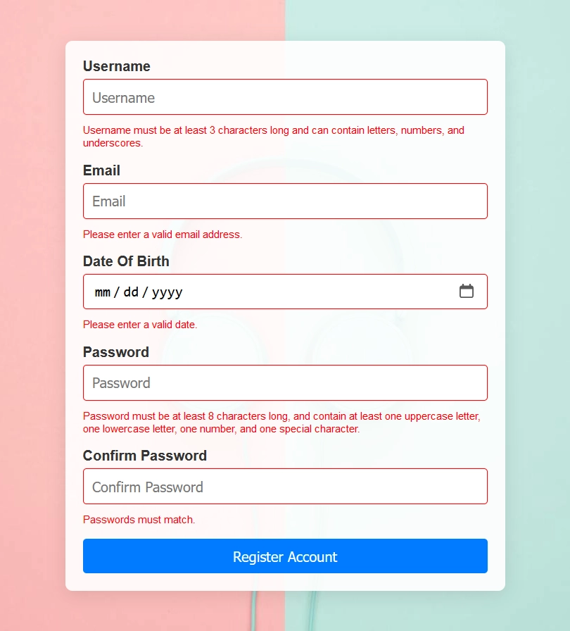
Username– Username must be at least 3 characters long and can contain letters, numbers, and underscores.Email– Please enter a valid email address.Date Of Birth– Please enter a valid date.Password– Password must be at least 8 characters long, and contain at least one uppercase letter, one lowercase letter, one number, and one special character.Confirm Password– Passwords must match.
Validation errors for each input will only be displayed when the user unfocuses the field, provided the entered data does not match the required format. Below is an example illustrating the validation errors for all the input fields.

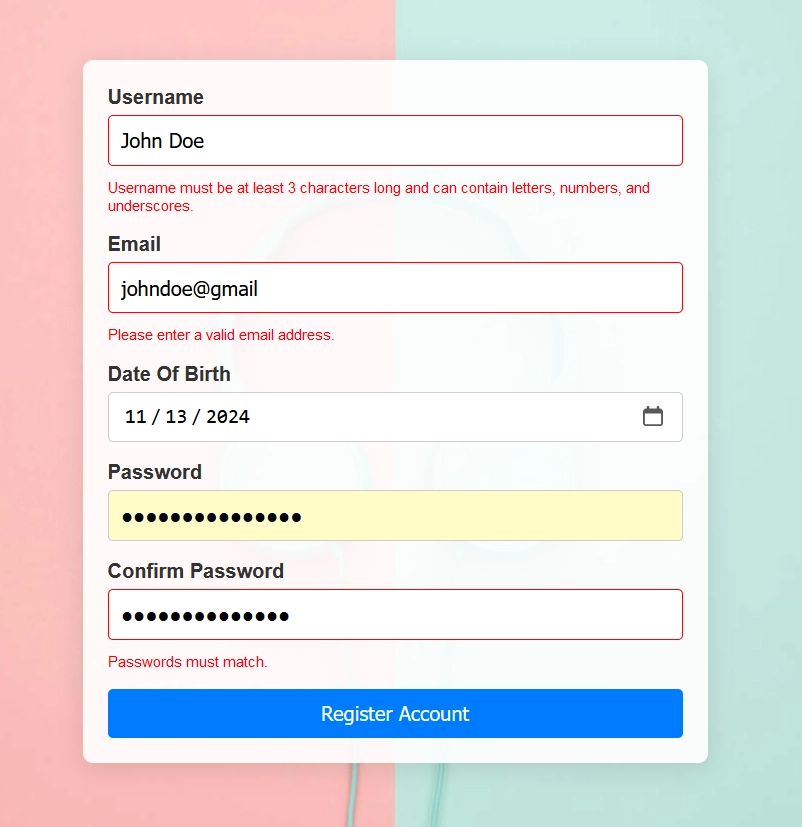
Fields that meet the required format will not display validation errors, as illustrated in the image below.

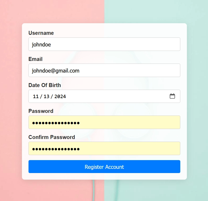
When the data entered into the input fields is valid, there won’t be any validation errors, as shown in the image below.

Creating the Form Input React Component
Let’s begin by creating a reusable input component. To make it more versatile, we’ll use React.forwardRef to forward its ref to the underlying input element. This will allow parent components to directly access the input DOM element.
components/form-input.tsx
import React, { useState } from 'react';

export interface InputProps
  extends React.InputHTMLAttributes<HTMLInputElement> {
  error?: string;
  label?: string;
}

const FormInput = React.forwardRef<HTMLInputElement, InputProps>(
  ({ type = 'text', name, label, error, className, ...props }, ref) => {
    const [focused, setFocus] = useState(false);
    const handleFocus = () => {
      setFocus(true);
    };
    return (
      <div className={`form-input ${className}`}>
        {label && <label htmlFor={name}>{label}</label>}
        <input
          ref={ref}
          type={type}
          name={name}
          className={`input ${error ? 'input-error' : ''} ${
            focused ? 'input-focused' : ''
          }`}
          onFocus={() => name === 'confirmPassword' && setFocus(true)}
          onBlur={handleFocus}
          {...props}
        />
        {error && <span className='error-message'>{error}</span>}
      </div>
    );
  }
);

FormInput.displayName = 'FormInput';

export { FormInput };
We defined a focus state and created a function called handleFocus to set this state to true. Then, we assigned handleFocus to the onBlur attribute of the input element.
In React, the onBlur event is triggered when an input field loses focus, meaning the user clicks or tabs out of it. Here, onBlur helps manage the focus state, which is used to show or hide error messages accordingly.
Creating the Form in React
Now that we’ve defined the input component, let’s use it to render the various input elements in the form. To reduce redundancy and improve code readability, we’ll define each input’s attributes in an array of objects, then map through them to render each input using our reusable component. Below is an example demonstrating this approach.
src/App.tsx
import './App.css';
import { FormInput } from '../components/form-input';

type FormValues = {
  username: string;
  email: string;
  dateOfBirth: string;
  password: string;
  confirmPassword: string;
};

type InputFieldData = {
  id: number;
  type: string;
  name: keyof FormValues;
  placeholder: string;
  label: string;
};

const inputFieldData: InputFieldData[] = [
  {
    id: 1,
    type: 'text',
    name: 'username',
    placeholder: 'Username',
    label: 'Username',
  },
  {
    id: 2,
    type: 'email',
    name: 'email',
    placeholder: 'Email',
    label: 'Email',
  },
  {
    id: 3,
    type: 'date',
    name: 'dateOfBirth',
    placeholder: 'Date Of Birth',
    label: 'Date Of Birth',
  },
  {
    id: 4,
    type: 'password',
    name: 'password',
    placeholder: 'Password',
    label: 'Password',
  },
  {
    id: 5,
    type: 'password',
    name: 'confirmPassword',
    placeholder: 'Confirm Password',
    label: 'Confirm Password',
  },
];

function App() {
  return (
    <div className='wrapper'>
      <form>
        {inputFieldData.map(({ id, name, ...props }) => {
          return <FormInput key={id} name={name} {...props} />;
        })}
        <button type='submit'>Register Account</button>
      </form>
    </div>
  );
}

export default App;
Styling the Form with CSS
Before diving into the validation logic, let’s start by styling the form and adding a background image to enhance its appearance. If you’re following along, add the following CSS to the src/App.css file.
src/App.css
* {
  box-sizing: border-box;
}

:root {
  --primary-color: #007bff;
  --primary-color-hover: #0056b3;
  --border-color: #ccc;
  --error-color: #ff0000;
  --font-family: Arial, sans-serif;
}

body {
  margin: 0;
  font-family: var(--font-family);
  background-image: url('bg.jpg');
  background-size: cover;
  background-position: center;
  color: #333;
}

.wrapper {
  display: flex;
  justify-content: center;
  align-items: center;
  height: 100vh;
  max-width: 500px;
  margin: 0 auto;
}

form {
  display: flex;
  flex-direction: column;
  width: 100%;
  padding: 20px;
  background-color: rgba(255, 255, 255, 0.9);
  border-radius: 8px;
  box-shadow: 0 4px 20px rgba(0, 0, 0, 0.1);
}

.form-input {
  display: flex;
  flex-direction: column;
  margin-bottom: 15px;
}

label {
  margin-bottom: 5px;
  font-weight: bold;
}

input {
  padding: 10px;
  border: 1px solid var(--border-color);
  border-radius: 4px;
  font-size: 16px;
  transition: border-color 0.3s ease;
}

input:focus {
  border-color: var(--primary-color);
  outline: none;
}

.error-message {
  color: var(--error-color);
  font-size: 12px;
  margin-top: 10px;
  display: none;
}

input:invalid.input-focused {
  border-color: var(--error-color);
}

input:invalid.input-focused ~ span {
  display: block;
}

button {
  padding: 10px;
  background-color: var(--primary-color);
  color: white;
  border: none;
  border-radius: 4px;
  cursor: pointer;
  font-size: 16px;
  transition: background-color 0.3s ease;
}

button:hover {
  background-color: var(--primary-color-hover);
}

button:focus {
  outline: 2px solid var(--primary-color);
}

@media (max-width: 600px) {
  .wrapper {
    max-width: 90%;
  }
}
Looking through the CSS, you’ll notice that validation styling is applied directly to the input field. When an input has an invalid value, it checks for the presence of the input-focused class. If this class is present, the input’s border colour changes to red, and the error message becomes visible.
Writing the Validation Logic
With the styling for the input elements complete, we can now proceed to implement the validation logic. We’ll leverage HTML5’s pattern and required attributes to handle validation. In the input data object, add fields for errorMessage, required, and pattern, each with appropriate values. To make this easier, simply copy the code below and replace it with the existing code:
src/App.tsx
import './App.css';
import { FormInput } from '../components/form-input';
import React, { useState } from 'react';

type FormValues = {
  username: string;
  email: string;
  dateOfBirth: string;
  password: string;
  confirmPassword: string;
};

type InputFieldData = {
  id: number;
  type: string;
  name: keyof FormValues;
  placeholder: string;
  label: string;
  error: string;
  pattern?: string;
  required: boolean;
};

const inputFieldData: InputFieldData[] = [
  {
    id: 1,
    type: 'text',
    name: 'username',
    placeholder: 'Username',
    label: 'Username',
    error:
      'Username must be at least 3 characters long and can contain letters, numbers, and underscores.',
    pattern: '^[a-zA-Z0-9_]{3,}$',
    required: true,
  },
  {
    id: 2,
    type: 'email',
    name: 'email',
    placeholder: 'Email',
    label: 'Email',
    error: 'Please enter a valid email address.',
    pattern: '^[^\\s@]+@[^\\s@]+\\.[^\\s@]+$',
    required: true,
  },
  {
    id: 3,
    type: 'date',
    name: 'dateOfBirth',
    placeholder: 'Date Of Birth',
    label: 'Date Of Birth',
    error: 'Please enter a valid date.',
    pattern: '^\\d{4}-\\d{2}-\\d{2}$',
    required: true,
  },
  {
    id: 4,
    type: 'password',
    name: 'password',
    placeholder: 'Password',
    label: 'Password',
    error:
      'Password must be at least 8 characters long, and contain at least one uppercase letter, one lowercase letter, one number, and one special character.',
    pattern: '^(?=.*[A-Z])(?=.*[a-z])(?=.*[\\d\\W])[A-Za-z\\d\\W]{8,}$',
    required: true,
  },
  {
    id: 5,
    type: 'password',
    name: 'confirmPassword',
    placeholder: 'Confirm Password',
    label: 'Confirm Password',
    error: 'Passwords must match.',
    required: true,
  },
];

function App() {
  const [values, setValues] = useState<FormValues>({
    username: '',
    email: '',
    dateOfBirth: '',
    password: '',
    confirmPassword: '',
  });

  const handleChange = (e: React.ChangeEvent<HTMLInputElement>) => {
    const { name, value } = e.target;
    setValues((prevValues) => ({
      ...prevValues,
      [name]: value,
    }));
  };

  const handleSubmit = (e: React.FormEvent<HTMLFormElement>) => {
    e.preventDefault();

    console.log('Form submitted:', values);
  };

  return (
    <div className='wrapper'>
      <form onSubmit={handleSubmit}>
        {inputFieldData.map(({ id, name, ...props }) => {
          const dynamicPattern =
            name === 'confirmPassword' ? `^${values.password}$` : props.pattern;
          return (
            <FormInput
              key={id}
              name={name}
              value={values[name]}
              onChange={handleChange}
              pattern={dynamicPattern}
              {...props}
            />
          );
        })}
        <button type='submit'>Register Account</button>
      </form>
    </div>
  );
}

export default App;
To ensure the password-matching logic functions correctly, we dynamically set the pattern attribute of the confirm password input to match the value of the password input field.
Conclusion
As we wrap up this comprehensive guide, you’ve learned how to implement form validation in React.js using the built-in HTML5 pattern and required attributes, which means there’s no need for any advanced validation libraries. However, if you wish to handle more complex client-side validation logic, you will need to incorporate a validation library.
I hope you found this article both informative and enjoyable. If you have any questions or feedback, please don’t hesitate to leave a comment below. Thank you for reading!

