
Setting up MUI v5 with React and Typescript can be a little challenging especially when you’re now starting out your React, Material UI, and TypeScript career.
In this guide, you’ll learn how to set up Material-UI v5 with React and TypeScript and also learn more about some useful tools you can leverage to minimize the bundle size using a technique called tree-shaking.
To make sure the MUI and React development setup is correct, we are going to run some code snippets that make use of Material UI components like Container, Grid, Typography, etc.
You can also read:
- Top 21 VS Code Shortcuts Every Programmer
- Top 10 Best VS Code Extensions for React Developers
- 16 Complicated Programming Terms You Need To Know
Introduction
In this crash course, you’ll learn how to set up React Typescript project with Material-UI v5.
Before we get into the nitty-gritty stuff, let’s take some time to talk about React, Material UI, and Typescript in brief.
React
React is an open-source JavaScript-based UI library developed and maintained by Facebook. Although React is a library rather than a framework, it’s very popular and widely used in web development.
React first appeared in May 2013 and has grown to become one of the most popular front-end libraries for building large-scale websites.
Material UI
Material UI is an open-source React UI library for building React applications that follow Google’s guidelines for creating components.
Material UI gives you the luxury to follow your own design system or kick-start with Material Design which is a design language developed by Google in 2014.
At the time of writing this article, MUI has over 70,400 GitHub stars which is a true indicator of how popular it is in the React community.
Material UI is based on Google’s Material Design System which is an adaptable system of accessibility guidelines, tools, and components that support the best practices of user interface design.
TypeScript
TypeScript is a superset of JavaScript. In brief, TypeScript adds optional types to JavaScript. This allows the TypeScript compiler to perform static type checking during development.
TypeScript is also an open-source programming language developed and maintained by Microsoft. It first appeared on 1 October 2012 and has grown to become the default language for building front-end applications.
When we combine React with TypeScript, it makes frontend development easier and allows us to write predictable, error-free web applications.
Why use React with Material UI and TypeScript?
Using TypeScript in a React project comes with a lot of benefits.
Since TypeScript performs static type checking during development, it can help you catch potential errors that may cause your application to crash.
TypeScript has now become the default programming language for JavaScript developers.
In order for you to spot development or compile-time errors with TypeScript, you need to use an IDE that supports TypeScript.
Most developers use VS Code because of its excellent support for a lot of languages and TypeScript in particular. In addition to that, it was also developed by Microsoft.
Material UI is one of the most popular UI libraries for React developers. Material UI has a lot of UI components that follow Google’s Material Design System guidelines.
This makes it easier for front-end developers to import those components into their projects and customize them to fit their style.
Installing Node and a Package Manager (NPM, Yarn, or PNPM)
Before we can start building a JavaScript project we first need to install Node.js and a package manager on our machine. This will allow us to initialize JavaScript projects and install dependencies easily with the package manager.
Please feel free this skip this section if you already have Node and a Package manager installed on your machine.
There are many ways to get Node onto your system but am going to show the easiest and fastest way.
- Navigate to the official homepage of NodeJs and download the latest stable version of Node.
Feel free to download the LTS (Long Term Support) or Current version, it doesn’t really matter in this mini-project. - After the download is complete, run the installer and accept the default settings on the Setup Wizard.
- Now open your terminal and run
node --versionandnpm --versionand you should see the corresponding versions.
In this project am going to use Yarn as my package manager but you can use NPM if you feel more comfortable with NPM.
If you also want to use Yarn run this command in your terminal to install Yarn globally.
npm install yarn -g
Yarn is a package manager developed by Facebook. I mostly use Yarn in all my projects because of the benefits it comes with.
- Yarn is optimized to fetch and install multiple packages simultaneously.
- Yarn has a well-managed offline caching system.
Now I think we have everything to initialize our React application.
Create React App Boilerplate with TypeScript
There are many ways to initiate a React project but in this course am going to use Create React App.
You can skip this section if you already have a React project and your goal is to get it running with Material UI and TypeScript.
Open your terminal and run this command with the --template typescript flag to tell Create React App to create a TypeScript project.
yarn create react-app mui-app --template typescript
After Create React App has finished setting up the React boilerplate project, change directory (cd) into the project and run code . to open the project with VS Code.
cd mui-app
code .
You can use any text editor or IDE of your choice but in this course am going to use VS Code.
Before we start setting up MUI with our React app we need to make sure the React app was properly set up.
Open the built-in terminal in VS Code using CTRL + ` and run yarn start to start the React development server.
After the server has started, it should open a new tab in your browser and run the React app.
If your React app was not automatically opened in the browser, you can copy the server URL and paste it into your browser address bar.
If you see a React spinning logo then we can move to the next step by setting up MUI with our React app.
Setting Up Material UI v5
Now let’s begin Material UI setup with our React app. There are a couple of things you need to know before we start installing the Material UI dependencies.
- Material UI now uses emotion as a styling engine by default.
- Please note that react >= 17.0.0 and react-dom >= 17.0.0 are peer dependencies for MUI.
With that out of the way, open the VS Code terminal and run this command to install the dependencies of MUI v5.
// with npm
npm install @mui/material @emotion/react @emotion/styled

// with yarn
yarn add @mui/material @emotion/react @emotion/styled
Please you can also check the MUI installation docs for more details.
If you want to use Styled-Components in place of emotion then you can run this command.
// with npm
npm install @mui/material @mui/styled-engine-sc styled-components

// with yarn
yarn add @mui/material @mui/styled-engine-sc styled-components
I prefer emotion in my React projects but you can also use Styled-Components if that is what you’re comfortable with.
You can read more about the styled engine guide on how to configure Styled-Components as the styled engine.
Next, you’ll definitely use icons in your React project, there are many icons libraries like Font Awesome, Boxicons, React icons (which combines most of the popular icons libraries ), Material icons, etc
You can choose any of the icon libraries but it makes a lot of sense to use Material icons in this project.
Run this command to install the Material icons package
// with npm
npm install @mui/icons-material

// with yarn
yarn add @mui/icons-material
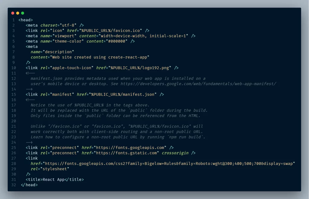
Another thing to note is Material UI uses the Roboto font under the hood so we need to include the Roboto font in our React app.
Open the public folder in the project directory then open the HTML file and paste the Roboto font CDN in the head tag above the title tag.
<link rel="preconnect" href="https://fonts.googleapis.com">
<link rel="preconnect" href="https://fonts.gstatic.com" crossorigin>
<link href="https://fonts.googleapis.com/css2?family=Bigelow+Rules&family=Roboto:wght@300;400;500;700&display=swap" rel="stylesheet">
Next, let’s get rid of the CSS files Create React App included in the project since we are going to use Material UI and Styled-Components in this project.
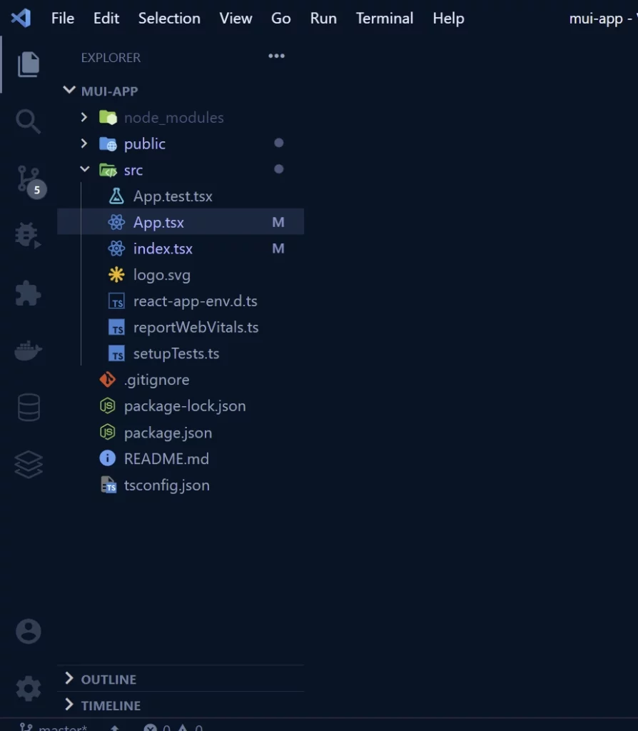
Open the src folder in the root directory and delete all the CSS files, also open Index.tsx and App.tsx and remove the corresponding CSS imports.
You should likely have a folder structure that looks like this.
Minimizing Material-UI Bundle Size with Tree Shaking
The MUI bundle size is very critical.
The Material UI development bundles contain the full library which can lead to slower startup times.
One scenario where it’s noticeable is when you use ES6 import for icons from @mui/icons-material. Startup times can be approximately 6x slower than without named imports from the top-level API.
From MUI docs, tress-shaking of MUI works out of the box with modern frameworks when the framework is using a bundler that supports tree-shaking.
There are a few ways to go about minimizing MUI bundle size but am going to show you only one option.
This option provides the best User Experience and Developer Experience. I normally set up the tree-shaking logic manually because I don’t trust Webpack.
We are going to use a Babel Plugin to support tree-shaking even if the bundler doesn’t support tree-shaking.
Note: the steps we are about to perform must be done correctly.
Configure Babel Plugin with Create React App
Step 1: Open the VS Code terminal and run this command to install the Babel Pluginyarn add -D babel-plugin-import
Step 2: Create a new .babelrc.js file in the root directory and paste these code snippets into it.
const plugins = [
  [
    'babel-plugin-import',
    {
      libraryName: '@mui/material',
      libraryDirectory: '',
      camel2DashComponentName: false,
    },
    'core',
  ],
  [
    'babel-plugin-import',
    {
      libraryName: '@mui/icons-material',
      libraryDirectory: '',
      camel2DashComponentName: false,
    },
    'icons',
  ],
];

module.exports = { plugins };
You know Create React App hides the Babelrc configuration and we need a way to include our Babelrc configuration.
We are going to use a couple of projects to help us use our .babelrc configuration without ejecting.
Step 3: Run this command in your terminal to install both React-App-Rewired and Customize-cra.yarn add -D react-app-rewired customize-cra
Step 4: Create a config-overrides.js file in the root directory on the same level as package.json and paste these code snippets into it.
/* config-overrides.js */
/* eslint-disable react-hooks/rules-of-hooks */
const { useBabelRc, override } = require('customize-cra');

module.exports = override(useBabelRc());
Step 5: Open package.json and modify the script commands:
{
    "start": "react-app-rewired start",
    "build": "react-app-rewired build",
    "test": "react-app-rewired test",
    "eject": "react-scripts eject"
  }
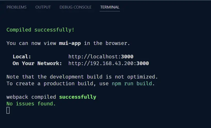
In your terminal, run yarn start to start the development server. If you don’t see any errors in the terminal then it means you did everything correctly.
In case you see errors in the terminal then repeat the steps again or contact me on my Contact page so that I can help you.
Now we can import the material icons and components with ES6 import without sacrificing the development startup time.
import { Button, TextField } from '@mui/material';
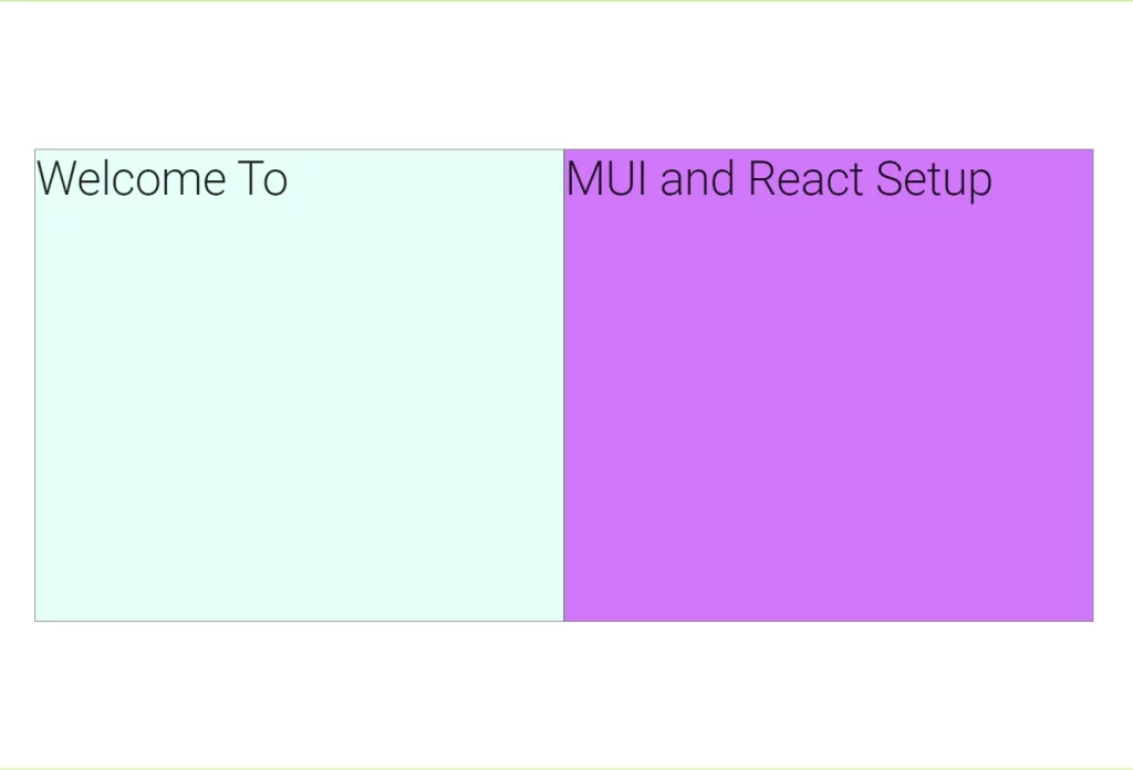
Let’s check if we configured Material UI with React correctly. Paste the code snippets below into App.tsx.
import { Container, CssBaseline, Grid, Typography } from '@mui/material';

function App() {
  return (
    <>
      <CssBaseline />
      <Container maxWidth={false}>
        <Grid
          container
          justifyContent='center'
          alignItems='center'
          sx={{ height: '100vh', border: '1px solid #9eff49' }}
        >
          <Grid item container maxWidth='70vw'>
            <Grid
              item
              xs={6}
              sx={{
                border: '1px solid grey',
                height: 600,
                backgroundColor: '#d6fff9',
              }}
            >
              <Typography variant='h2'>Welcome To</Typography>
            </Grid>
            <Grid
              item
              xs={6}
              sx={{
                border: '1px solid grey',
                height: 600,
                backgroundColor: '#e481ff',
              }}
            >
              <Typography variant='h2'>MUI and React Setup</Typography>
            </Grid>
          </Grid>
        </Grid>
      </Container>
    </>
  );
}

export default App;
After saving the App.tsx file you should see a preview in the browser that looks like this:
Now we have Material UI set up correctly with React and Typescript so let’s write our own custom MUI theme for the React app.
Adding a Custom Theme to Material UI
Material UI gives us the luxury to customize MUI with our own theme. We can change the colors, typography, breakpoints, transitions, and more.
The theme specifies the typography and color of the components, level of elevation, opacity of link elements, etc.
Configuring Material UI Theme
Writing a custom theme for Material UI is really simple. To create a custom theme we need to utilize the createTheme function provided by MUI.
Create a new theme.ts file in the src folder and paste the code snippets below into it.
import { red } from '@mui/material/colors';
import { createTheme } from '@mui/material/styles';

// Create a theme instance.
const theme = createTheme({
  palette: {
    primary: {
      main: '#556cd6',
    },
    secondary: {
      main: '#19857b',
    },
    error: {
      main: red.A400,
    },
  },
});

export default theme;
This is just a simple customized theme setting, there are more configurations you can add.
Now we need to provide the custom theme to our React app so that it can be available in the entire app.
In App.tsx, import ThemeProvider from MUI then import the custom theme and include it in the ThemeProvider.
import { Container, CssBaseline, Grid, Typography } from '@mui/material';
import { ThemeProvider } from '@mui/material/styles';
import theme from './theme';

function App() {
  return (
    <ThemeProvider theme={theme}>
      <CssBaseline />
      <Container maxWidth={false}>
        <Grid
          container
          justifyContent='center'
          alignItems='center'
          sx={{ height: '100vh', border: '1px solid #9eff49' }}
        >
          <Grid item container maxWidth='70vw'>
            <Grid
              item
              xs={6}
              sx={{
                border: '1px solid grey',
                height: 600,
                backgroundColor: '#d6fff9',
              }}
            >
              <Typography variant='h2'>Welcome To</Typography>
            </Grid>
            <Grid
              item
              xs={6}
              sx={{
                border: '1px solid grey',
                height: 600,
                backgroundColor: 'secondary.main',
              }}
            >
              <Typography variant='h2'>MUI and React Setup</Typography>
            </Grid>
          </Grid>
        </Grid>
      </Container>
    </ThemeProvider>
  );
}

export default App;
Congratulations if you made it this far. We now have a configured React, TypeScript, and Material UI v5 project and we can now use any MUI components in our React project.
Conclusion
In this mini-course, we created a new React project with Create React App and TypeScript and also added Material UI.
Using Material UI and TypeScript in your React project gives you a lot of benefits, you will get proper IntelliSense and type checking to avoid development errors.