

In this article, you’ll learn how to customize the Material-UI Rating Component color, size, and icon with React and TypeScript and also build a custom Rating component with MUI and React.
The default Material-UI Rating component is great and can be integrated into any project with ease.
The Rating component has built-in props that can be used to further customize it with your own size, color, and icons.

The props give you the luxury to customize the Rating component to meet your need but after some examination, I realized there were some limitations that come with using the default Rating component.
- You can’t set the icon size with the size prop when you use a custom icon
- The hover-fill will no longer work correctly when you use CSS to change the margin of the Rating component.
Quick note, am not saying the MUI Rating component is bad but you can use it if you can live within its limitations.
The MUI Rating component has everything you need so you can import it into your React application and add some customizations.
You can also read:
- Form Validation with React Hook Form, Material UI, React and TypeScript
- How to Setup Material-UI v5 with React JS and TypeScript
A Quick look at the MUI Rating Component
To use the MUI Rating component, you need to import the Rating component into your project.
Below are some of the important MUI Rating props you should be aware of:
- name – The name of the Rating input. It must be a unique value on the entire page. MUI uses this name to generate IDs
- size – Specifies the size of the rating component
- icon – The icon to display
- defaultValue – set a default value, used when the Rating component is not controlled
- precision – The minimum increment value change allowed. Useful when you want to have a half rating icon.
- readOnly – Removes all pointer-events and hover effects
- disabled – if true the Rating component will be disabled
- value – The rating value
Now, create a Rating.tsx file in your components folder then copy and paste the code snippets below into your React project.
import Box from '@mui/material/Box';
import Rating from '@mui/material/Rating';
import Typography from '@mui/material/Typography';
import { useState } from 'react';
export default function BasicRating() {
const [value, setValue] = useState<number | null>(3.5);
return (
<Box>
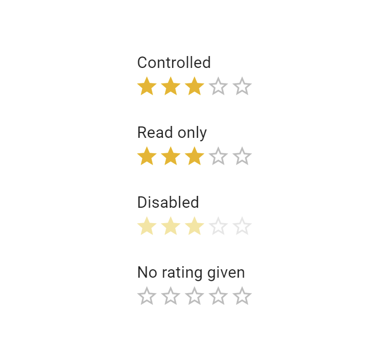
<Typography component='legend'>Controlled</Typography>
<Rating
name='simple-controlled'
value={value}
onChange={(event, newValue) => {
setValue(newValue);
}}
/>
<Typography component='legend'>Read only</Typography>
<Rating name='read-only' value={value} readOnly />
<Typography component='legend'>Disabled</Typography>
<Rating name='disabled' value={value} disabled />
<Typography component='legend'>No rating given</Typography>
<Rating name='no-value' value={null} />
<Typography component='legend'>No rating given</Typography>
<Rating
name='custom-no-value'
value={3.5}
precision={0.1}
sx={{
fontSize: '3rem',
}}
/>
</Box>
);
}
Now include the Rating component from the components folder in your code and you should see something like this in your browser.
How to Change Material-UI Rating Color
The color of the Rating icons can be customized in many ways but here are some of the ways you can easily change the color of the component.
- Use the
sxprop - Use the CSS classes that exist on the spans that get inserted into the DOM
- Use the
styledutility function that has the MUI theme
Here is the list of some of the most important CSS classes you can target to change the color of the rating component.
- MuiRating-iconFilled
- MuiRating-iconHover
- MuiRating-iconEmpty
- MuiRating-iconFocus
- MuiRating-icon
- MuiRating-iconDecimal
When you inspect the Rating component in the DOM you should see a label and input elements with the label element having nested span elements.
One of the nested span elements has an SVG which is the actual SVG icon.
Since the Rating icon can have different states, we can target and change the color of the icons in those different states.
We can say when the icon is filed then the color should be red and when hover or focus on the icon then the color should be green.
Here is how I changed the color of the Rating icon in three different states – hover state, focused state, and the filled state.
<Rating
        name='custom-no-value'
        value={3.5}
        sx={{
          '& .MuiRating-iconFilled': {
            color: 'red',
          },
          '& .MuiRating-iconFocus': {
            color: 'orange',
          },
          '& .MuiRating-iconHover': {
            color: 'green',
          },
        }}
      />
How to Change Material-UI Rating Size
The size of the Rating component can be adjusted with the size prop. The downside of the size prop is it has only three values (small, medium, and large) and it doesn’t also work when you use a custom icon.
Note: don’t use width and height CSS properties to increase the size of the Rating icons because the width and height will increase the container in which the icons are.
The safe way to increase the size of the Rating icons is by using fontSize . The default font size of the icons is about 1.8rem.
<Rating
        name='custom-no-value'
        value={3.5}
        precision={0.5}
        sx={{
          fontSize: '3rem',
        }}
      />
How to Change Material-UI Rating Icon
You can use the icon and empty props to change the default icons of the Rating component.
You can use any kind of icon for the Rating component. You can use an emoji with smiley faces if that’s what you want.
How to Customize MUI Rating to Display any float number
Out of the box, the MUI Rating component doesn’t display a floating-point value icon. You need to explicitly give it a precision prop if you want to display a truncated icon like a half icon.
The default precision value for a Rating component is 1 so when you have a Rating value of 3.5, Material UI will round the number to 4.
To instruct MUI to show floating values you need to set the precision value to a floating value.
You can experiment with a precision value of 0.1, I was amazed at how MUI was adjusting the icon fill when I hover over the icons.
Build a Custom MUI Rating Component (Optional)
In this section, we are going to learn how to build our own custom Rating Component with React, MUI, and TypeScript.
Am going to use a Star icon, you can replace the star icons with your icon of choice.
Step 1: Create an interface listing the various props our Rating component needs.
interface IRating {
  value: number;
  text?: string;
  color?: string;
  size?: string;
}
Step 2: Let’s create a new span element from the styled utility function of MUI. We will also dynamically set the color of the icons based on the color props the user passes to the Rating component.
const StyledSpan = styled.span`
  display: flex;
  justify-content: center;
  align-items: center;
  color: ${({ color }) => color};
`;
Step 3: Copy and paste the code snippet for the actual Rating component below, I will explain it later.
const Rating: FC<IRating> = ({
  value,
  text,
  color = '#ffc600',
  size = '1.4rem',
}) => {
  return (
    <Box display='flex' alignItems='center'>
      <StyledSpan color={color}>
        {value >= 1 ? (
          <Star sx={{ fontSize: size }} />
        ) : value >= 0.5 ? (
          <StarHalf sx={{ fontSize: size }} />
        ) : (
          <StarOutline sx={{ fontSize: size }} />
        )}
      </StyledSpan>
      <StyledSpan color={color}>
        {value >= 2 ? (
          <Star sx={{ fontSize: size }} />
        ) : value >= 1.5 ? (
          <StarHalf sx={{ fontSize: size }} />
        ) : (
          <StarOutline sx={{ fontSize: size }} />
        )}
      </StyledSpan>
      <StyledSpan color={color}>
        {value >= 3 ? (
          <Star sx={{ fontSize: size }} />
        ) : value >= 2.5 ? (
          <StarHalf sx={{ fontSize: size }} />
        ) : (
          <StarOutline sx={{ fontSize: size }} />
        )}
      </StyledSpan>
      <StyledSpan color={color}>
        {value >= 4 ? (
          <Star sx={{ fontSize: size }} />
        ) : value >= 3.5 ? (
          <StarHalf sx={{ fontSize: size }} />
        ) : (
          <StarOutline sx={{ fontSize: size }} />
        )}
      </StyledSpan>
      <StyledSpan color={color}>
        {value >= 5 ? (
          <Star sx={{ fontSize: size }} />
        ) : value >= 4.5 ? (
          <StarHalf sx={{ fontSize: size }} />
        ) : (
          <StarOutline sx={{ fontSize: size }} />
        )}
      </StyledSpan>

      {text && (
        <Typography variant='body1' sx={{ marginLeft: 1 }}>
          {text}
        </Typography>
      )}
    </Box>
  );
};

export default Rating;
We have three varieties of rating icons – a full icon, a half icon, and an empty icon.
For the first icon when the value is greater than or equal to 1 we will display a full icon – when the value is greater than or equal to 0.5 we will display a half icon else we display an empty icon.
After this first logic, we only need to duplicate the StyledSpan four times and change the values respectively.
Conclusion
In this article, we learned how to use the Material UI Rating component and how to customize it to meet our style.
There are a lot of customizations we can add to the Rating component but for the sake of this article, I made things simple to avoid writing more content than a viewer can consume.
We also learned how to build a custom Rating with MUI and React. If you face any issues don’t forget to contact me so that I can help you.