
Web and App Development is becoming more popular and complicated due to the rapid release of frameworks like Flutter, React Native, React JS, Angular JS, Vue JS, Next JS and many more.
A decade ago, websites only comprised of HTML, CSS and JavaScript which made it easy to create static web pages without adding advanced dynamic functionalities that frameworks make possible.
Having a good knowledge of bare HTML, SCSS, CSS and JavaScript can give you the willpower to easily transition into more advanced frameworks and libraries.
If you have been struggling to build a beautiful landing page website with HTML, SCSS, CSS and JavaScript then I will advise you to follow this article from the beginning to the end to understand some of the tips and tricks in HTML5 and CSS3.
In this tutorial, we’ll build a food ordering website step by step for a fictional company called FDelivery. You’ll leverage the power of SCSS to create this beautiful Food Ordering Website from a Figma File Design.
At the End of this Article, you will learn:
- How to setup SCSS in your project
- How to build a Navigation Menu with a search form
- How to add sliders with the SwiperJS library
- How to build a custom slider with JavaScript
In a previous article in this series, How to Build a Squid Game Landing Page, You’ll learn how to build a Squid Game Landing Page Website with HTML, CSS and JavaScript.
The name of our fictional Food Ordering Company is FDelivery, its purpose is to deliver food or groceries to customers.
The purpose of creating this static landing page for the Food Ordering Company is to allow their customers to register for an account and make orders through the website.
After completing this tutorial, I will be glad if you add more sections and features to the food ordering website to further solidify the knowledge you obtained from this article.
The source code of the food ordering website will be provided at the end of the article so feel free to download and play with it.
Folder Structure
I designed the folder structure to follow the convention that most frontend developers use when working on SCSS projects.
The folder structure is quite simple since we are not building multiple pages having different styles, this project has only one page which is the homepage.
First, download the starter files on GitHub, extract the project from the zip file and open the project with your favourite text editor which in my case is Visual Studio Code.
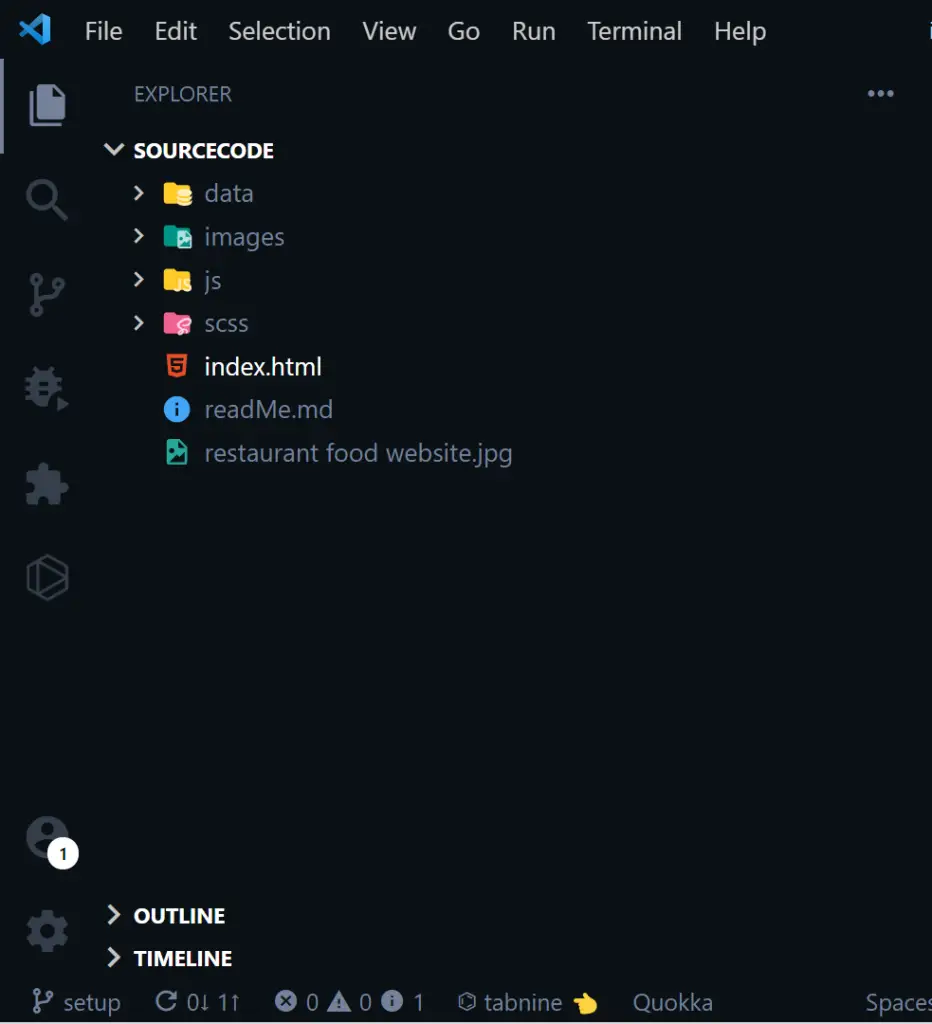
The folder structure consists of four folders and two files in the root directory. The Data folder contains two JSON files that will serve as our database.
The SCSS folder also consists of an SCSS file that we will later compile to a CSS file in the CSS folder using an NPM package.
The JavaScript folder consists of three JS files that will help us make the food ordering website dynamic.
Finally, we have an images folder containing all the images we’ll need throughout the project.
In the index.html file, you can see the HTML boilerplate code snippets with the project outline in the comments.
I have also linked the external stylesheet, the three JavaScript files and the SwiperJS script and CSS.
External Libraries We Need
Here is a list of external libraries we are going to include in this project to save us time instead of reinventing the wheel.
- Google Fonts – to get the font used in the Figma file design
- SwiperJS – for the slider
- Boxicons – for the icons
- Favicon.io – for the website favicon
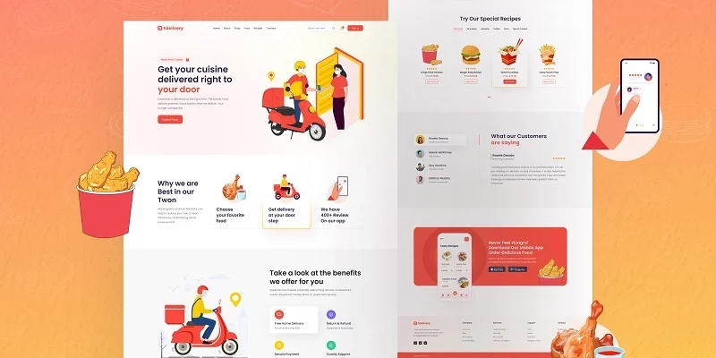
The Food Ordering Website Figma File Design
As a web developer, you must have the skills to convert any design whether Figma file, PSD file, Illustrator file, adobe XD file to code using HTML, CSS, SCSS, and JavaScript.
Sometimes we want to keep our code DRY (Don’t Repeat Yourself) so we choose CSS frameworks or libraries like Bootstrap, Tailwind CSS, Material UI and so on.
This project has a Figma File design that you can take a look at to have a picture of what we are actually working towards.
The HTML Boilerplate of the Food Ordering Website
The basic HTML boilerplate looks like this:
<!DOCTYPE html>
<html lang="en">
  <head>
    <meta charset="UTF-8" />
    <meta http-equiv="X-UA-Compatible" content="IE=edge" />
    <meta name="viewport" content="width=device-width, initial-scale=1.0" />
    <!--=============== Favicon ===============-->
    <link
      rel="shortcut icon"
      href="./images/favicon-32x32.png"
      type="image/png"
    />
    <!--=============== Swiper CSS ===============-->
    <link
      rel="stylesheet"
      href="https://unpkg.com/swiper/swiper-bundle.min.css"
    />
    <!--=============== Boxicons ===============-->
    <link
      href="https://unpkg.com/boxicons@2.0.9/css/boxicons.min.css"
      rel="stylesheet"
    />
    <!--=============== Custom StyleSheet ===============-->
    <link rel="stylesheet" href="./css/styles.css" />
    <title>FDelivery</title>
  </head>
  <body>
    <!--=============== Header ===============-->
    <header class="header">
      <!--=============== Home ===============-->

      <!--=============== SignIn Form ===============-->
    </header>

    <!--=============== Services ===============-->

    <!--=============== About ===============-->

    <!--=============== Recipes ===============-->

    <!--=============== Testimonials ===============-->

    <!--=============== App ===============-->

    <!--=============== Footer ===============-->

    <!--=============== Swiper JS ===============-->
    <script src="https://unpkg.com/swiper/swiper-bundle.min.js"></script>

    <!--=============== Custom JS ===============-->
    <script src="./js/testimonial.js"></script>
    <script src="./js/products.js"></script>
    <script src="./js/main.js"></script>
  </body>
</html>
I decided to use the section by section approach in building the food Ordering website so it doesn’t become complicated to comprehend.
How to Setup SCSS in the Food Ordering Website
There are a lot of benefits that you get when you use SCSS or SASS in your projects instead of using plain CSS.
Throughout this tutorial, we’ll be writing the styles in SCSS and also the font we are using is Poppins.
I have also included all the SCSS variables, reset code, Poppins font, and some reusable SCSS snippets in the styles.scss file.
I assume you already have a good understanding of how to use the various HTML tags and how to select those tags in CSS.
If you are not comfortable with HTML, CSS and SCSS then please take a break and search for some tutorials on HTML and SCSS on YouTube to get your hands dirty.
Once you feel you are confident and comfortable with the basics of HTML and SCSS then you can come back to this tutorial.
/* ========== Google Fonts =========== */
@import url("https://fonts.googleapis.com/css2?family=Poppins:wght@300;400;500;600;700&display=swap");

/* ========== CSS Variables =========== */
:root {
  --primary-color: #f94a3d;
  --yellow-color: #ffcf03;
  --black-color: #212244;
  --default-color: #69697b;
  --deep-yellow: #ff9401;
  --yellow-color-1: #ffe507;
  --red-color-1: #e83b2e;
  --red-color-2: #ee3e32;
  --light-red-color: #fdecec;
  --grey-color: #eaeaea;
  --grey-color-1: #f8f8f8;
  --white-color: #fff;
  --box-shadow: 0 5px 15px rgba(0, 0, 0, 0.1);
}

*,
*::after,
*::before {
  box-sizing: inherit;
  margin: 0;
  padding: 0;
  border: none;
  outline: none;
}

html {
  font-size: 62.5%;
  box-sizing: border-box;
}

body {
  font-family: "Poppins", sans-serif;
  font-size: 1.6rem;
  font-weight: 400;
  color: var(--default-color);
}

h1,
h2,
h3,
h4 {
  color: var(--black-color);
  line-height: 1.2;
  font-weight: 500;
}

a {
  text-decoration: none;
  color: inherit;
}

li {
  list-style-type: none;
}

section {
  padding: 5rem 0 5rem;
  overflow: hidden;
}

p {
  line-height: 3rem;
}

img {
  max-width: 100%;
  height: auto;
}

/* ========== Custom Classes =========== */
.container {
  max-width: 120rem;
  padding: 0 3rem;
  margin: auto;
}

@media (min-width: 1500px) {
  .container {
    max-width: 135rem;
  }
}

.d-flex {
  display: flex;
  align-items: center;
}

/* ========== Header =========== */

/* ========== Home =========== */

/* ========== Services =========== */

/* ========== about =========== */

/* ========== Recipes =========== */

/* ========== Testimonials =========== */

/* ========== App =========== */

/* ========== Footer =========== */
In the SCSS snippet above, I’ve removed the default margin and padding assigned to every element by browsers.
How to Compile SCSS to CSS
Step 1: Download the SASS package and install it as a global package. You need to add the -g flag to install the package globally.
npm install sass -g
Step 2: Run this command in the terminal to compile the SCSS to CSS and add the watch flag so that the SASS package will recompile the SCSS code whenever we save an SCSS file.
sass ./scss/styles.scss ./css/styles.css --watch
After running the above command, a new CSS folder will be created with a styles.css file containing the compiled SCSS code.
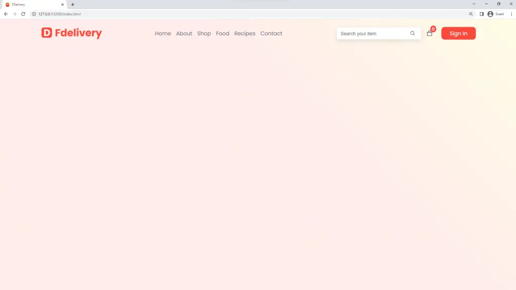
How to Add a Navigation Menu to the Food Ordering Website
When you get stuck at any point in the tutorial, please download the source code of the food ordering website and compare your code to find the mistake or error.
Now, let’s begin by creating the navigation menu of the food ordering website by looking at how it is implemented in the Figma file design.
The navbar will have a logo at the far left, the navigation menu in the middle, and a search bar at the right with some buttons.
For the logo, we are going to use the logo image I downloaded from the Figma file instead of using pure SCSS to achieve the same design.
Copy and paste the HTML snippets within the header element. I also included the hamburger icon that will be hidden on desktop screens and visible on mobile devices.
<nav class="navbar">
        <div class="row d-flex container">
          <a href="" class="logo d-flex">
            <img src="./images/logo.png" alt="" />
          </a>

          <ul class="nav-list d-flex">
            <a href="">Home</a>
            <a href="">About</a>
            <a href="">Shop</a>
            <a href="">Food</a>
            <a href="">Recipes</a>
            <a href="">Contact</a>
            <span class="close d-flex"><i class="bx bx-x"></i></span>
          </ul>

          <div class="col d-flex">
            <form>
              <input type="search" placeholder="Search your item" />
              <button class="d-flex"><i class="bx bx-search"></i></button>
            </form>
            <div class="cart-icon d-flex">
              <i class="bx bx-shopping-bag"></i>
              <span>0</span>
            </div>
            <a class="btn signin">Sign In</a>
          </div>

          <!-- Hamburger -->
          <div class="hamburger d-flex">
            <i class="bx bx-menu"></i>
          </div>
        </div>
      </nav>
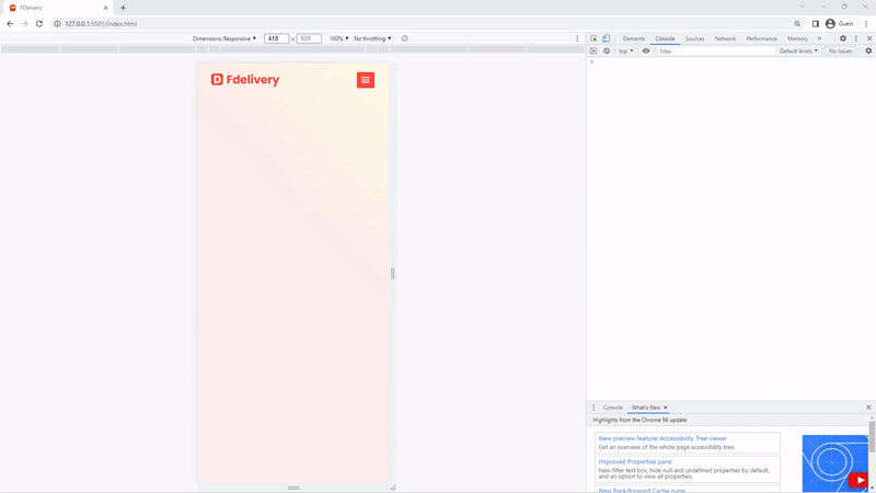
Now, open the project in the browser with the live-server extension if you are using VS Code.
The navbar looks ugly so we need to add some styles to make it resemble the one in the design.
We’ll use CSS Flexbox to position the logo, nav menu, and search bar horizontally.
.header {
  min-height: 100vh;
  background: linear-gradient(
    45deg,
    rgba(#f94a3d, 10%) 60%,
    rgba(#ffe507, 10%)
  );
}

.navbar {
  padding: 2rem 0;

  .row {
    justify-content: space-between;
  }

  .logo {
    justify-content: center;
  }

  .nav-list a {
    display: inline-block;
    padding: 1rem 0.5rem 1rem;

    &:not(:last-child) {
      margin-right: 0.5rem;
    }
  }

  .col form {
    background-color: var(--white-color);
    border-radius: 0.5rem;
    box-shadow: var(--box-shadow);
    border: 1px solid rgba(#69697b, 10%);
    padding: 0.5rem 0;
    margin-right: 1.5rem;
    width: 25rem;
    position: relative;

    input {
      text-indent: 1rem;
      font-size: 1.4rem;
      width: 100%;

      &::placeholder {
        color: var(--default-color);
      }
    }

    button {
      justify-content: center;
      padding: 0.5rem;
      background-color: transparent;
      border-left: 1px solid rgba(#69697b, 10%);
      font-size: 1.7rem;
      color: var(--default-color);
      position: absolute;
      top: 50%;
      right: 1rem;
      transform: translateY(-50%);
    }
  }

  .cart-icon {
    justify-content: center;
    color: var(--default-color);
    font-size: 2rem;
    margin-right: 1.5rem;
    position: relative;

    span {
      position: absolute;
      top: -1.3rem;
      right: -1rem;
      padding: 0.1rem 0.5rem;
      color: var(--white-color);
      background-color: var(--primary-color);
      border-radius: 50%;
      font-size: 1.2rem;
      font-weight: 600;
    }
  }
}

.btn {
  display: inline-block;
  background-color: var(--primary-color);
  color: var(--white-color);
  padding: 0.7rem 2.5rem;
  border-radius: 1rem;
  font-size: inherit;
}

.navbar .btn {
  margin-left: 1rem;
  cursor: pointer;
}

.hamburger {
  font-size: 2.5rem;
  background-color: var(--primary-color);
  border-radius: 0.3rem;
  color: var(--white-color);
  padding: 0.5rem 0.7rem;
  justify-content: center;
  cursor: pointer;
  display: none;
}

.nav-list .close {
  display: none;
}
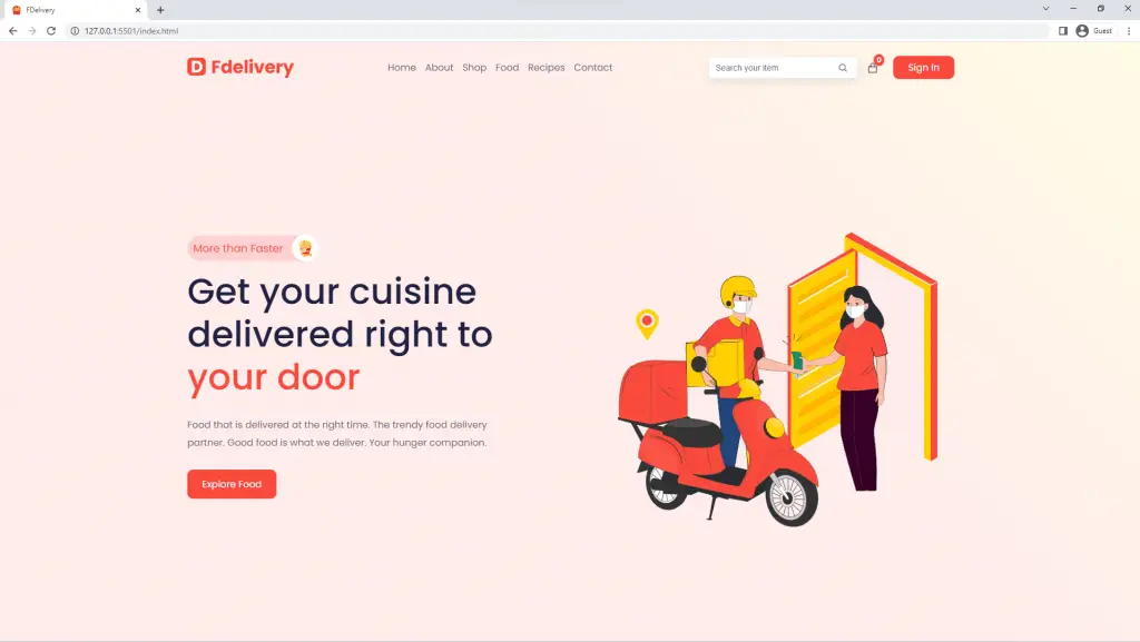
Here is how it looks like in the browser
Since we are not using a CSS framework like Bootstrap or Tailwind CSS, we need to write the styles ourselves and make them responsive.
To make the nav menu responsive on all devices, we are going to utilize the old-school CSS positioning property and Flexbox.
On large screens, I’ve set the left property to -100% to hide the nav menu, and on smaller screens like mobile devices, I’ve set the left property back to zero to make it visible.
With the help of JavaScript, we’ll dynamically add a show class to the .nav-list class whenever the hamburger icon is clicked.
When the .nav-list class has a second class of .show then we want to make the nav menu visible.
@media (max-width: 1300px) {
  .navbar .col form {
    display: none;
  }
}

@media (max-width: 800px) {
  .navbar .col {
    display: none;
  }

  .navbar .nav-list {
    position: fixed;
    top: 0;
    left: -100%;
    width: 100%;
    max-width: 35rem;
    height: 100%;
    background-color: var(--white-color);
    z-index: 999;
    flex-direction: column;
    align-items: flex-start;
    padding: 5rem 2rem;
    transition: left 300ms linear;
  }

  .hamburger {
    display: flex;
  }

  .nav-list a {
    text-transform: uppercase;
    font-weight: 600;
  }

  .nav-list a:not(:last-child) {
    margin: 0 0 1rem 0;
  }

  .nav-list .close {
    position: absolute;
    top: 2rem;
    right: 2rem;
    font-size: 3rem;
    cursor: pointer;
    padding: 0.5rem 0.7rem;
    display: flex;
    justify-content: center;
  }

  .nav-list.show {
    left: 0;
  }

  .navbar .logo img {
    width: 15rem;
  }
}
Here is the JavaScript to toggle the .show on the nav-list. Copy and paste the JavaScript snippets below into the main.js file.
const hamburger = document.querySelector(".hamburger");
const close = document.querySelector(".nav-list .close");
const menu = document.querySelector(".nav-list");

hamburger.addEventListener("click", () => {
  menu.classList.add("show");
});

close.addEventListener("click", () => {
  menu.classList.remove("show");
});
Here is what it looks like:
How to Add a Hero Header to the Food Ordering Website
The hero section will contain an image at the right and some text content at the left.
The text content will consist of a span with an image, an H1, a paragraph, and a call-to-action button.
You need to copy and paste the HTML for the hero section immediately after the navbar HTML within the header tag.
 <div class="home">
        <div class="row container">
          <div class="col">
            <div class="faster">
              More than Faster
              <div class="image d-flex">
                <img src="./images/french-fries.svg" alt="" />
              </div>
            </div>
            <h1>
              Get your cuisine <br />
              delivered right to <br />
              <span class="color">your door</span>
            </h1>
            <p>
              Food that is delivered at the right time. The trendy food delivery
              partner. Good food is what we deliver. Your hunger companion.
            </p>
            <a href="" class="btn">Explore Food</a>
          </div>
          <div class="col">
            <img src="./images/delivery-guy.svg" alt="" />
          </div>
        </div>
      </div>
Here are the styles for the Hero section. In the SCSS I used CSS Grid layouts instead of Flexbox to make our lives simple.
I also included the media queries to make the hero section adapt to any screen size.
.header .home {
  height: calc(100vh - 8.5rem);

  .row {
    display: grid;
    grid-template-columns: 1fr 1fr;
    align-items: center;
    height: 100%;

    .faster {
      width: 22rem;
      background-color: #fdd1d1;
      color: var(--primary-color);
      font-size: 1.8rem;
      padding: 0.8rem 1rem;
      border-radius: 5rem;
      position: relative;
      margin-bottom: 1.5rem;

      .image {
        position: absolute;
        top: 50%;
        right: -0.1rem;
        transform: translateY(-50%);
        background-color: var(--white-color);
        border-radius: 50%;
        width: 4.5rem;
        height: 4.5rem;
        justify-content: center;

        img {
          height: 3rem;
        }
      }
    }

    h1 {
      font-size: 6rem;
      margin-bottom: 3rem;

      span {
        color: var(--primary-color);
      }
    }

    p {
      margin-bottom: 3rem;
      width: 80%;
    }

    .btn {
      padding: 1.2rem 2.5rem;
    }
  }
}

@media (max-width: 1300px) {
  .header .home .row {
    h1 {
      font-size: 4.5rem;
      margin-bottom: 2rem;
    }

    .faster {
      width: 20rem;
      font-size: 1.5rem;
      margin-bottom: 1.5rem;

      .image {
        width: 4rem;
        height: 4rem;
      }
    }
  }
}

@media (max-width: 996px) {
  .header .home .row {
    .col img {
      width: 40rem;
    }

    h1 {
      font-size: 3.5rem;
      margin-bottom: 1rem;
    }

    .btn {
      padding: 0.7rem 1.5rem;
    }
  }
}

@media (max-width: 800px) {
  .header .home {
    height: calc(100vh + 12rem);
    padding-top: 4rem;

    .row {
      grid-template-columns: 1fr;

      h1 {
        font-size: 3rem;
        br {
          display: none;
        }
      }

      p {
        width: 100%;
        font-size: 1.5rem;
        margin-bottom: 1rem;
      }

      .btn {
        font-size: 1.5rem;
      }

      .col:last-child {
        text-align: center;
      }
    }
  }
}
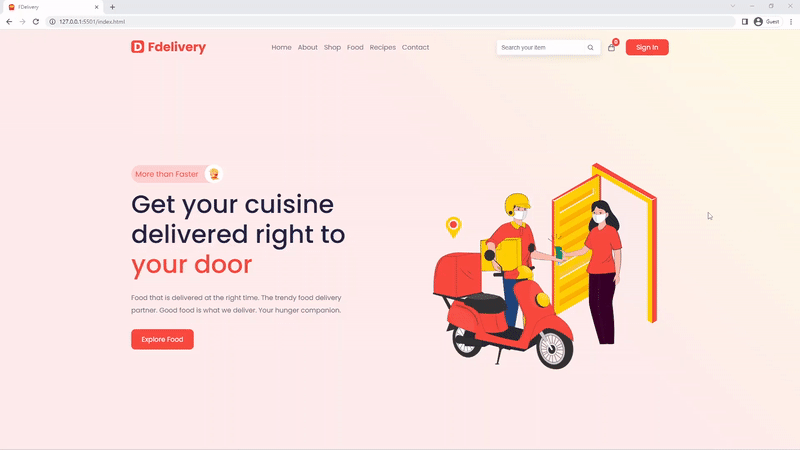
Here is a preview in the browser
How to Add A Registration and Login Form to the Food Ordering Website
Here is the HTML for the Login Form, I decided to exclude the registration form to make things simple.
Once you know how to code the Login Form then the registration form will be similar, you just need to add a password confirm field and other relevant fields you want.
<div class="wrapper">
        <form action="" class="form">
          <h2>SIGN IN</h2>

          <div class="control">
            <label for="">Enter Email:</label>
            <input type="email" placeholder="Enter Your Email" />
          </div>
          <div class="control">
            <label for="">Password:</label>
            <input type="password" placeholder="Password" />
          </div>
          <div class="checkbox d-flex">
            <input type="checkbox" />
            <span>Remember Me</span>
          </div>
          <button class="btn">Sign In</button>
          <div class="links">
            <span>Forgot Password? <a href="">Click Here</a></span>
            <span>Don't Have An Account? <a href="">Create One</a></span>
          </div>
        </form>

        <div class="close-form">
          <i class="bx bx-x"></i>
        </div>
      </div>
Here are the SCSS styles for the Login Form. When a user lands on the website, the login form will be hidden but once they click on the sign-in button on the navbar then the login form will appear with some animations.
.header .wrapper {
  position: fixed;
  top: 0;
  right: 0;
  width: 100%;
  height: 100%;
  display: flex;
  align-items: center;
  justify-content: center;
  background-color: rgba(255, 255, 255, 0.9);
  z-index: 10000;
  transition: 0.5s;
  transform: scale(0);
  opacity: 0;
  visibility: hidden;

  &.active {
    transform: scale(1);
    opacity: 1;
    visibility: visible;
  }

  form {
    background-color: var(--white-color);
    border: 1px solid var(--grey-color);
    max-width: 50rem;
    width: 100%;
    padding: 2rem;
    box-shadow: var(--box-shadow);
    border-radius: 0.5rem;
    margin: 2rem;

    h2 {
      font-size: 2.5rem;
      text-align: center;
      margin-bottom: 2rem;
      padding-top: 2rem;
    }

    .control {
      margin-bottom: 2rem;
    }

    label {
      display: block;
      font-size: 2rem;
      margin-bottom: 1rem;
    }

    input {
      font-family: "Poppins", sans-serif;
      font-size: 1.8rem;
      display: block;
      border: 1px solid var(--grey-color);
      padding: 1.3rem 0;
      text-indent: 1rem;
      border-radius: 0.5rem;
      width: 100%;
    }

    .checkbox {
      margin-bottom: 2rem;
      input {
        width: auto;
        margin-right: 0.5rem;
        cursor: pointer;
      }
    }

    button {
      display: block;
      width: 100%;
      padding: 1.3rem 0;
      font-size: 1.8rem;
      cursor: pointer;
    }

    .links {
      margin-top: 2rem;
      span {
        display: block;
        margin-bottom: 1rem;
        font-size: 1.8rem;

        a {
          color: var(--primary-color);

          &:hover {
            text-decoration: underline;
          }
        }
      }
    }
  }

  .close-form {
    position: absolute;
    top: 3rem;
    right: 4rem;
    color: var(--default-color);
    font-size: 4rem;
    cursor: pointer;
  }
}
Here are the JavaScript snippets to hide and show the login popup when we click on the sign-in button on the navbar.
const signInForm = document.querySelector("header .wrapper");

document.querySelector(".signin").onclick = () => {
  signInForm.classList.add("active");
};

document.querySelector(".close-form").onclick = () => {
  signInForm.classList.remove("active");
};
Here is the preview of the login form popup in the browser
How to Make the Services Section
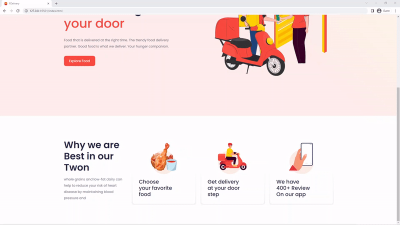
The services section will do what the name implies – it details what services the fictional food ordering company will provide to customers.
The services section consists of four columns comprising text content and three services cards.
The HTML of the services section
<section class="section services" id="services">
      <div class="row container">
        <div class="col">
          <h2>Why we are Best in our Twon</h2>
          <p>
            whole grains and low-fat dairy can help to reduce your risk of heart
            disease by maintaining blood pressure and
          </p>
        </div>
        <div class="col">
          <div class="card">
            <img src="./images/meat-icon.svg" alt="" />
            <h3>
              Choose <br />
              your favorite <br />
              food
            </h3>
          </div>
        </div>
        <div class="col">
          <div class="card">
            <img src="./images/delivery-icon.svg" alt="" />
            <h3>
              Get delivery <br />
              at your door <br />
              step
            </h3>
          </div>
        </div>
        <div class="col">
          <div class="card">
            <img src="./images/phone-icon.svg" alt="" />
            <h3>
              We have <br />
              400+ Review <br />
              On our app
            </h3>
          </div>
        </div>
      </div>
    </section>
The SCSS styles for the services section are somehow unique since I utilized CSS Grid minmax() to make the cards responsive without media queries.
Also, the cards have some nice colorful borders around them, and the way I achieved that was through the CSS ::before selector.
.services {
  padding: 10rem 0 10rem;

  .row {
    display: grid;
    grid-template-columns: repeat(auto-fit, minmax(25rem, 1fr));
    gap: 3rem;
    align-items: center;

    h2 {
      font-size: 4.5rem;
      font-weight: 600;
      margin-bottom: 1.5rem;
    }

    h3 {
      font-size: 2.5rem;
      margin-top: 1.5rem;
      text-align: left;
    }

    .col img {
      height: 15rem;
    }

    .card {
      padding: 3rem;
      border-radius: 0 0 1rem 1rem;
      background-color: var(--white-color);
      position: relative;
      text-align: center;

      &::before {
        content: "";
        position: absolute;
        top: -1.5%;
        left: -1.5%;
        width: calc(100% + 1rem);
        height: calc(100% + 1rem);
        border-radius: 1rem;
        background: linear-gradient(to bottom, transparent 50%, #f3f3f3);
        z-index: -1;
      }

      &:hover::before {
        background: linear-gradient(to bottom, transparent 50%, #ffcf03);
      }
    }
  }
}

@media (max-width: 567px) {
  .services .row h2 {
    font-size: 3.5rem;
  }
}
Here is what it looks like in the browser:
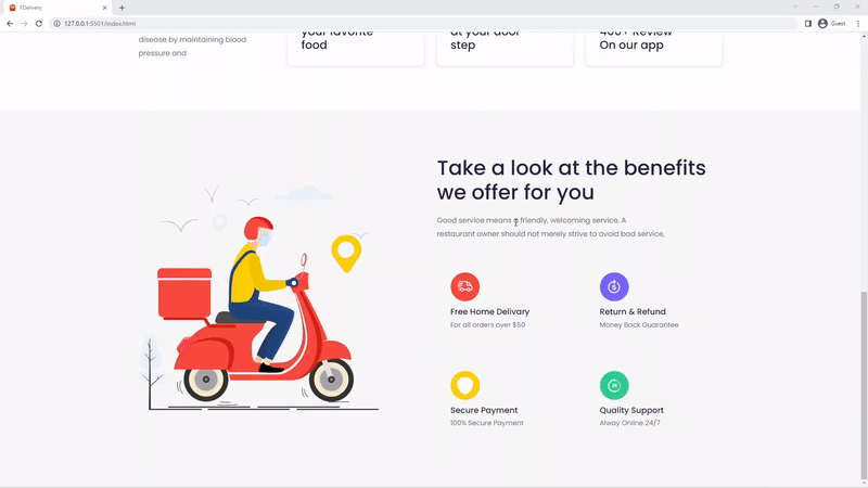
How to Make the About Section
The about section contains important information about the fictional food ordering website.
Customers who visit the food ordering website will like to know the history of the fictional food ordering company without asking anyone.
The about section consists of two columns with an image at the left and some content at the right.
Here is the HTML for the about section:
<section class="section about" id="about">
      <div class="row container">
        <div class="col">
          <img src="./images/delivery-guy-2.svg" alt="" />
        </div>
        <div class="col">
          <h2>Take a look at the benefits we offer for you</h2>
          <p>
            Good service means a friendly, welcoming service. A restaurant owner
            should not merely strive to avoid bad service,
          </p>
          <div class="d-grid">
            <div class="card">
              <img src="./images/car-icon.svg" alt="" />
              <h4>Free Home Delivary</h4>
              <span>For all orders over $50</span>
            </div>
            <div class="card">
              <img src="./images/dollar-icon.svg" alt="" />
              <h4>Return & Refund</h4>
              <span>Money Back Guarantee</span>
            </div>
            <div class="card">
              <img src="./images/security-icon.svg" alt="" />
              <h4>Secure Payment</h4>
              <span>100% Secure Payment</span>
            </div>
            <div class="card">
              <img src="./images/time-icon.svg" alt="" />
              <h4>Quality Support</h4>
              <span>Alway Online 24/7</span>
            </div>
          </div>
        </div>
      </div>
    </section>
We are going to give the about section some background color and with the help of CSS Grid, we will align the image and the text content horizontally.
.about {
  background-color: var(--grey-color-1);
  padding: 10rem 0 10rem;

  .row {
    display: grid;
    grid-template-columns: 1fr 1fr;
    align-items: center;
    gap: 3rem;

    .col:first-child img {
      height: 50rem;
    }

    .col {
      h2 {
        font-size: 4.5rem;
        margin-bottom: 2rem;
      }

      p {
        margin-bottom: 4rem;
        width: 80%;
      }

      .d-grid {
        display: grid;
        grid-template-columns: 1fr 1fr;
        gap: 3rem;

        .card {
          padding: 3rem;
          border-radius: 1rem;
          transition: all 300ms ease-in-out;

          h4 {
            font-size: 1.8rem;
            margin: 0.5rem 0 0.5rem;
          }

          span {
            font-size: 1.5rem;
          }

          &:hover {
            background-color: var(--white-color);
            box-shadow: var(--box-shadow);
          }
        }
      }
    }
  }
}

@media (max-width: 1200px) {
  .about .row {
    .col {
      h2 {
        font-size: 3.5rem;
        margin-bottom: 1rem;
      }

      p {
        margin-bottom: 1rem;
        width: 100%;
      }

      .d-grid {
        gap: 1rem;

        .card {
          padding: 1rem;

          img {
            height: 5rem;
          }
        }
      }
    }
  }
}

@media (max-width: 800px) {
  .about {
    padding: 5rem 0 10rem;

    .row {
      grid-template-columns: 1fr;
      gap: 3rem 0;
    }
  }
}
The content on the right side of the about section will have an H2 with a paragraph text and four cards below it.
Here is what it looks like:
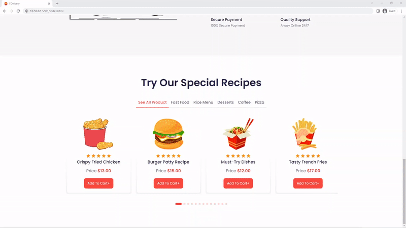
How to Make the Special Recipes Section with Animations
The recipes section can be considered a products section on an e-commerce website.
The recipes section consists of a slider of different recipes in our fictional food delivery company and their respective prices and names.
Since the recipes section has a slider, I decided to use a library called SwiperJS to implement the slider in an easier way.
There are other libraries I could have used like GlideJS which is also written in pure JavaScript.
Here is the HTML of the recipes section
<section class="section recipes" id="recipes">
      <h2>Try Our Special Recipes</h2>
      <div class="row container">
        <div class="filters d-flex">
          <span data-filter="All Product">See All Product</span>
          <span data-filter="Fast Food">Fast Food</span>
          <span data-filter="Rice Menu">Rice Menu</span>
          <span data-filter="Desserts">Desserts</span>
          <span data-filter="Coffee">Coffee</span>
          <span data-filter="Pizza">Pizza</span>
        </div>
        <div class="products">
          <div class="swiper mySwiper">
            <div class="swiper-wrapper" id="products-wrapper">
              <!-- <div class="swiper-slide">
                <div class="card">
                  <div class="image"><img src="./images/meat-2.svg" alt=""></div>
                  <div class="rating">
                  <span><i class="bx bxs-star"></i></span>
                  <span><i class="bx bxs-star"></i></span>
                  <span><i class="bx bxs-star"></i></span>
                  <span><i class="bx bxs-star"></i></span>
                  <span><i class="bx bxs-star"></i></span>
                  </div>
                  <h4>Crispy Fried Chicken</h4>
                  <div class="price">
                    <span>Price</span><span class="color">$13.00</span>
                  </div>
                  <div class="button">Add To Cart+</div>
                </div>
              </div> -->
            </div>
          </div>
          <div class="pagination">
            <div class="custom-pagination"></div>
          </div>
        </div>
      </div>
    </section>
You can see how simple the recipes section HTML is because later we will use JavaScript to fetch the recipes data from the JSON file and dynamically display them on the screen.
Here are the styles for the recipes section:
.recipes {
  padding: 10rem 0 10rem;

  h2 {
    text-align: center;
    font-size: 4.8rem;
    font-weight: 600;
    margin-bottom: 4rem;
  }

  .filters {
    justify-content: center;
    flex-wrap: wrap;
    margin-bottom: 4rem;

    span {
      font-size: 1.8rem;
      font-weight: 500;
      padding: 1rem;
      border-bottom: 2px solid var(--grey-color);
      cursor: pointer;

      &.active {
        color: var(--primary-color);
        border-color: var(--primary-color);
      }
    }
  }

  .products {
    .swiper-wrapper {
      padding: 0 1rem 1rem;
    }

    .card {
      position: relative;
      padding: 1rem 1rem 2rem;
      border-radius: 0 0 1rem 1rem;
      background-color: var(--white-color);
      flex-direction: column;

      &::before {
        content: "";
        position: absolute;
        top: -1%;
        left: -1.5%;
        width: calc(100% + 1rem);
        height: calc(100% + 1rem);
        border-radius: 1rem;
        background: linear-gradient(to bottom, transparent 50%, #f3f3f3);
        z-index: -1;
      }

      &:hover::before {
        background: linear-gradient(to bottom, transparent 50%, #ffcf03);
      }

      .image {
        height: 15rem;
        width: 15rem;
        margin-bottom: 1.5rem;
        img {
          height: 100%;
          object-fit: contain;
        }
      }

      .rating {
        span {
          color: var(--deep-yellow);
          font-size: 2rem;
        }
      }

      h4 {
        font-size: 2rem;
        margin-bottom: 1.5rem;
      }

      .price {
        font-size: 2rem;
        margin-bottom: 2rem;

        .color {
          color: var(--primary-color);
          font-weight: 600;
          margin-left: 0.5rem;
        }
      }

      .button {
        outline: none;
        border: none;
        padding: 1.2rem 1.7rem;
      }
    }
  }

  .pagination {
    text-align: center;
    margin-top: 3rem;

    .swiper-pagination-bullet {
      background-color: var(--primary-color);
      height: 1rem;
      width: 1rem;
    }

    .swiper-pagination-bullet-active {
      width: 3rem;
      border-radius: 1.5rem;
    }
  }
}

@media (max-width: 800px) {
  .recipes {
    padding: 10rem 0 10rem;

    h2 {
      font-size: 3.5rem;
      margin-bottom: 2rem;
    }
  }
}
To implement the slider with SwiperJS, we need to create an instance of the Swiper class and pass two arguments, the class selector of the slider in the HTML and the options object to further customize the slider.
const swiper = new Swiper(".mySwiper", {
  grabCursor: true,
  slidesPerView: 1,
  spaceBetween: 30,
  pagination: {
    el: ".custom-pagination",
    clickable: true,
  },
  breakpoints: {
    567: {
      slidesPerView: 2,
    },
    996: {
      slidesPerView: 3,
    },
    1200: {
      slidesPerView: 4,
    },
  },
});
Here is the JavaScript to fetch the recipes data from the JSON file, display it on the screen and add some filtering.
/* ========== Fetch the Products =========== */

const getProducts = async () => {
  try {
    const results = await fetch("./data/products.json");
    const data = await results.json();
    const products = data.products;
    return products;
  } catch (err) {
    console.log(err);
  }
};

const ProductsWrapper = document.getElementById("products-wrapper");

window.addEventListener("DOMContentLoaded", async function () {
  const products = await getProducts();
  displayProductItems(products);
});

/* ========== Display Products =========== */
const displayProductItems = (items) => {
  let displayProduct = items.map(
    (product) => `
                <div class="swiper-slide">
                <div class="card d-flex">
                  <div class="image"><img src=${product.url} alt=""></div>
                  <div class="rating">
                  <span><i class="bx bxs-star"></i></span>
                  <span><i class="bx bxs-star"></i></span>
                  <span><i class="bx bxs-star"></i></span>
                  <span><i class="bx bxs-star"></i></span>
                  <span><i class="bx bxs-star"></i></span>
                  </div>
                  <h4>${product.title}</h4>
                  <div class="price">
                    <span>Price</span><span class="color">$${product.price}</span>
                  </div>
                  <div class="button btn">Add To Cart+</div>
                </div>
              </div>
                  `
  );

  displayProduct = displayProduct.join("");
  if (ProductsWrapper) {
    ProductsWrapper.innerHTML = displayProduct;
  }
};

/* ========== Filter Products =========== */
const filters = [...document.querySelectorAll(".filters span")];

filters.forEach((filter) => {
  filters[0].classList.add("active");
  filter.addEventListener("click", async (e) => {
    const id = e.target.getAttribute("data-filter");
    const target = e.target;
    const products = await getProducts();
    filters.forEach((btn) => {
      btn.classList.remove("active");
    });
    target.classList.add("active");

    let menuCategory = products.filter((product) => {
      if (product.category === id) {
        return product;
      }
    });

    if (id === "All Product") {
      displayProductItems(products);
      swiper.update();
    } else {
      displayProductItems(menuCategory);
      swiper.update();
    }
  });
});
Am so happy we successfully implemented the recipes section, here is what it looks like in the browser
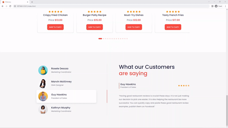
How to Build the Testimonials Section
The testimonials section is another difficult part of the food ordering website and requires a similar implementation to the recipes section.
Most websites have a testimonial section where some of the most relevant reviews left by customers who enjoyed the service are displayed to attract new customers.
This is the HTML code for the testimonials section
<section class="section testimonials" id="testimonials">
      <div class="row container">
        <div class="col">
          <div class="card" data-filter="rosele">
            <div class="d-flex">
              <div class="image">
                <img src="./images/profile-1.jpg" alt="" />
              </div>
              <div>
                <h4>Rosele Desoza</h4>
                <span>Marketing Coordinator</span>
              </div>
            </div>
          </div>
          <div class="card" data-filter="marvin">
            <div class="d-flex">
              <div class="image">
                <img src="./images/profile-2.jpg" alt="" />
              </div>
              <div>
                <h4>Marvin McKinney</h4>
                <span>Web Designer</span>
              </div>
            </div>
          </div>
          <div class="card" data-filter="guy">
            <div class="d-flex">
              <div class="image">
                <img src="./images/profile-3.jpg" alt="" />
              </div>
              <div>
                <h4>Guy Hawkins</h4>
                <span>President of Sales</span>
              </div>
            </div>
          </div>
          <div class="card" data-filter="kathryn">
            <div class="d-flex">
              <div class="image">
                <img src="./images/profile-4.jpg" alt="" />
              </div>
              <div>
                <h4>Kathryn Murphy</h4>
                <span>Marketing Coordinator</span>
              </div>
            </div>
          </div>
        </div>
        <div class="col">
          <h2>
            What our Customers <br />
            <span>are saying</span>
          </h2>
          <div class="test-wrapper">
            <div class="testimonial active" data-id="rosele">
              <div class="d-flex">
                <div>
                  <h4>Rosele Desoza</h4>
                  <span>Marketing Coordinator</span>
                </div>

                <div class="rating">
                  <span><i class="bx bxs-star"></i></span>
                  <span><i class="bx bxs-star"></i></span>
                  <span><i class="bx bxs-star"></i></span>
                  <span><i class="bx bxs-star"></i></span>
                  <span><i class="bx bxs-star"></i></span>
                </div>
              </div>

              <p>
                “Having good restaurant reviews is crucial these days. It is not
                just making our decision to pick one easier, it is also helping
                the restaurant be more successful. You can quickly copy and
                paste these good restaurant review examples, publish them on
                Facebook”
              </p>
            </div>
          </div>
        </div>
      </div>
    </section>
Similar to the recipes section, we are going to use JavaScript to dynamically fetch the testimonials from the JSON file and display them on the screen.
Here are the SCSS styles for the testimonials section
.testimonials {
  padding: 10rem 0 10rem;
  background-color: var(--grey-color-1);

  .row {
    display: grid;
    grid-template-columns: 1fr 1fr;
    gap: 3rem 10rem;
    align-items: flex-start;

    .card {
      border-right: 2px solid #eaeaea;

      &.active {
        border-color: var(--primary-color);

        .d-flex {
          background-color: var(--white-color);
          box-shadow: var(--box-shadow);
        }
      }

      .d-flex {
        border-radius: 1rem;
        width: 85%;
        padding: 1.5rem;
        cursor: pointer;

        &:not(:last-child) {
          margin-bottom: 0.5rem;
        }
      }

      .image {
        height: 8rem;
        width: 8rem;
        border-radius: 50%;
        overflow: hidden;
        margin-right: 3rem;

        img {
          height: 100%;
          object-fit: cover;
        }
      }

      h4 {
        font-size: 2rem;
        margin-bottom: 0.5rem;
      }

      span {
        font-size: 1.5rem;
      }
    }

    .col:last-child {
      position: relative;
      overflow: hidden;
      height: 44rem;

      h2 {
        font-size: 4.5rem;
        margin-bottom: 3rem;

        span {
          color: var(--primary-color);
        }
      }

      .testimonial {
        position: absolute;
        bottom: -80%;
        transform: translateY(-30%);
        transition: 0.5s;

        &.active {
          bottom: 0%;
        }

        .d-flex {
          justify-content: space-between;
          border-bottom: 1px solid var(--grey-color);
          padding-bottom: 1.5rem;
          margin-bottom: 3rem;

          div {
            &:first-child {
              border-left: 2px solid var(--primary-color);
              padding-left: 1rem;

              h4 {
                font-size: 2rem;
              }

              span {
                font-size: 1.5rem;
              }
            }
          }

          .rating {
            span {
              color: var(--deep-yellow);
            }
          }
        }
      }
    }
  }
}

@media (max-width: 1200px) {
  .testimonials {
    .row {
      gap: 5rem 0;

      .col:last-child {
        h2 {
          font-size: 3.5rem;
        }

        .testimonial {
          bottom: -90%;
          transform: translateY(-10%);
        }
      }

      .card {
        border: none;
      }
    }
  }
}

@media (max-width: 996px) {
  .testimonials {
    .row {
      .col:last-child {
        .testimonial {
          transform: translateY(0%);
        }
      }
    }
  }
}

@media (max-width: 800px) {
  .testimonials {
    .row {
      grid-template-columns: 1fr;

      .card {
        .d-flex {
          width: 100%;
        }
      }
    }
  }
}

@media (max-width: 567px) {
  .testimonials {
    .row {
      .col:last-child {
        h2 {
          font-size: 2.5rem;
        }
      }
    }
  }
}
Here is the JavaScript code to fetch, display and filter the testimonials.
JavaScript snippets to fetch the testimonials from the JSON file
const getTestimonials = async () => {
  try {
    const results = await fetch('./data/testimonials.json');
    const data = await results.json();
    const testimonials = data.testimonials;
    return testimonials;
  } catch (err) {
    console.log(err);
  }
};

const testimonialsWrapper = document.querySelector('.test-wrapper');
const cards = [...document.querySelectorAll('.testimonials .card')];

window.addEventListener('DOMContentLoaded', async function () {
  const testimonials = await getTestimonials();
  displayTestimonials(testimonials);
  filter();
});
Here are the JavaScript snippets to display the testimonials on the screen
const displayTestimonials = (items) => {
  let testimonials = items.map(
    (
      item
    ) => `<div class="testimonial" data-id="${item.firstName}">
            <div class="d-flex">
              <div>
                <h4>${item.name}</h4>
                <span>${item.position}</span>
              </div>

              <div class="rating">
                <span><i class="bx bxs-star"></i></span>
                <span><i class="bx bxs-star"></i></span>
                <span><i class="bx bxs-star"></i></span>
                <span><i class='bx bxs-star-half' ></i></i></span>
                <span><i class='bx bxs-star-half' ></i></i></span>
              </div>
            </div>

            <p>
             ${item.info}
            </p>
          </div>`
  );

  testimonials = testimonials.join('');
  testimonialsWrapper.innerHTML = testimonials;
};
Here are the JavaScript snippets to filter the testimonials
function filter() {
  const testimonial = [...document.querySelectorAll('.testimonial')];
  for (let i = 0; i < cards.length; i++) {
    cards[0].classList.add('active');
    testimonial[0].classList.add('active');
    cards[i].onclick = function () {
      for (let x = 0; x < cards.length; x++) {
        cards[x].classList.remove('active');
      }
      this.classList.add('active');
      const filter = this.getAttribute('data-filter');
      for (let z = 0; z < testimonial.length; z++) {
        testimonial[z].style.bottom = '-80%';
        testimonial[z].style.opacity = 0;

        if (testimonial[z].getAttribute('data-id') === filter) {
          testimonial[z].style.bottom = '0%';
          testimonial[z].style.opacity = 1;
        }
      }
    };
  }
}
Here is the preview in the browser
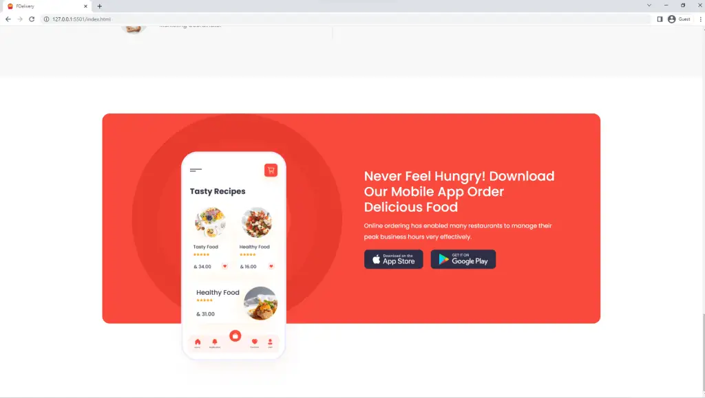
How to Build the Download App Section
The app section is the place where customers who want to download the fictional company’s app can either download the android or IOS app.
Here is the HTML of the App Section
 <section class="section app">
      <div class="row container">
        <div class="col">
          <div class="circle">
            <div class="inner-circle"></div>
            <img src="./images/mobile.png" alt="" />
          </div>
        </div>
        <div class="col">
          <h2>
            Never Feel Hungry! Download Our Mobile App Order Delicious Food
          </h2>
          <p>
            Online ordering has enabled many restaurants to manage their peak
            business hours very effectively.
          </p>
          <div class="d-flex">
            <img src="./images/app-store.png" alt="" />
            <img src="./images/google-play.png" alt="" />
          </div>
        </div>
      </div>
    </section>
Here are the SCSS styles of the App Section
.app {
  padding: 10rem 0 20rem;
}

.app .row {
  background-color: var(--primary-color);
  border-radius: 2rem;
  position: relative;

  .col:first-child {
    margin-left: 5rem;
    .circle {
      border-radius: 50%;
      height: 57rem;
      width: 57rem;
      border: 7rem solid var(--red-color-1);
      position: relative;

      .inner-circle {
        border-radius: 50%;
        height: 43rem;
        width: 43rem;
        border: 7rem solid var(--red-color-2);
      }

      img {
        position: absolute;
        top: 80%;
        left: 50%;
        transform: translate(-50%, -50%);
        width: 40rem;
      }
    }
  }

  .col:last-child {
    position: absolute;
    top: 50%;
    right: 10rem;
    transform: translateY(-50%);
    width: 40%;

    h2 {
      color: var(--white-color);
      font-size: 3.5rem;
      margin-bottom: 1.5rem;
    }

    p {
      color: var(--white-color);
      margin-bottom: 2rem;
    }

    .d-flex {
      img:first-child {
        margin-right: 2rem;
      }
    }
  }
}

@media (max-width: 1300px) {
  .app {
    .row {
      .col:first-child {
        margin-left: 0;
      }

      .col:last-child {
        h2 {
          font-size: 3.5rem;
        }
      }
    }
  }
}

@media (max-width: 996px) {
  .app {
    background-color: var(--primary-color);
    padding: 10rem 0 10rem;
    height: 40rem;

    .row {
      height: 100%;
      .col:first-child {
        display: none;
      }

      .col:last-child {
        left: 50%;
        transform: translate(-50%, -50%);
        width: 90%;
        h2 {
          font-size: 3rem;
        }

        img {
          height: 4rem;
        }
      }
    }
  }
}

@media (max-width: 567px) {
  .app .row .col:last-child h2 {
    font-size: 2.5rem;
  }
}
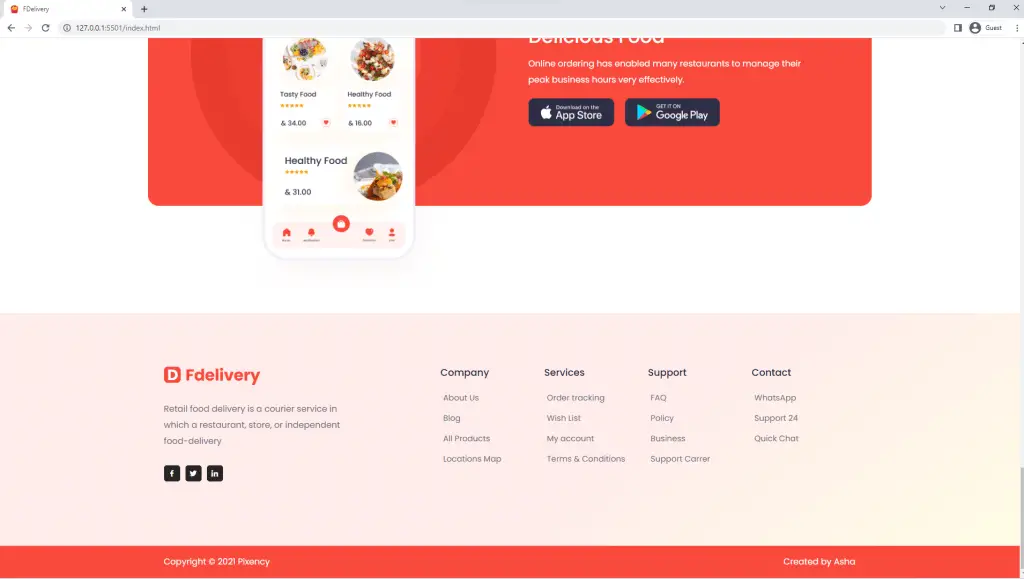
Here is what it looks like in the browser
How to Build the Footer Section
Now we have come to the last section of the food ordering website.
The footer has four columns which will align horizontally on large viewports using CSS Grid and give them one column on mobile devices.
The footer has links to navigate to other pages of the food ordering website and some social buttons leading to the respective social media handles.
Here is the HTML for the footer
<footer class="footer">
      <div class="row container">
        <div class="col">
          <div class="logo d-flex">
            <img src="./images/logo.png" alt="logo" />
          </div>
          <p>
            Retail food delivery is a courier service in which a restaurant,
            store, or independent food-delivery
          </p>
          <div class="icons d-flex">
            <div class="icon d-flex">
              <i class="bx bxl-facebook"></i>
            </div>
            <div class="icon d-flex"><i class="bx bxl-twitter"></i></div>
            <div class="icon d-flex"><i class="bx bxl-linkedin"></i></div>
          </div>
        </div>
        <div class="col">
          <div>
            <h4>Company</h4>
            <a href="">About Us</a>
            <a href="">Blog</a>
            <a href="">All Products</a>
            <a href="">Locations Map</a>
          </div>
          <div>
            <h4>Services</h4>
            <a href="">Order tracking</a>
            <a href="">Wish List</a>
            <a href="">My account</a>
            <a href="">Terms & Conditions</a>
          </div>
          <div>
            <h4>Support</h4>
            <a href="">FAQ</a>
            <a href="">Policy </a>
            <a href="">Business</a>
            <a href="">Support Carrer</a>
          </div>
          <div>
            <h4>Contact</h4>
            <a href="">WhatsApp</a>
            <a href="">Support 24 </a>
            <a href="">Quick Chat</a>
          </div>
        </div>
      </div>
    </footer>
    <div class="footer-bottom">
      <div class="row container d-flex">
        <p>Copyright © 2021 Pixency</p>
        <p>Created by Asha</p>
      </div>
    </div>
Here are the styles for the footer section. I used CSS Grid to put the different columns into five on desktop screens and one on mobile devices
.footer {
  background: linear-gradient(
    145deg,
    rgba(#f94a3d, 10%) 60%,
    rgba(#ffe507, 10%)
  );
  padding: 10rem 3rem 10rem;

  .row {
    display: grid;
    grid-template-columns: 1fr 1.5fr;
  }

  .col:first-child {
    .logo {
      margin-bottom: 3rem;
    }

    p {
      margin-bottom: 3rem;
      width: 70%;
    }

    .icons {
      margin-bottom: 2rem;
    }

    .icon {
      color: var(--white-color);
      justify-content: center;
      height: 3rem;
      width: 3rem;
      border-radius: 0.5rem;
      background-color: #252525;
      cursor: pointer;

      &:not(:last-child) {
        margin-right: 1rem;
      }
    }
  }

  .col:last-child {
    display: grid;
    grid-template-columns: repeat(4, 1fr);

    div {
      display: flex;
      flex-direction: column;

      a {
        font-size: 1.5rem;
        padding: 0.5rem;
        margin-bottom: 0.5rem;
      }
    }

    h4 {
      font-size: 1.8rem;
      font-weight: 500;
      margin-bottom: 2rem;
    }
  }
}

.footer-bottom {
  background-color: var(--primary-color);
  padding: 1.5rem 0;

  .row {
    justify-content: space-between;
    p {
      color: var(--white-color);
    }
  }
}

@media (max-width: 768px) {
  .footer {
    padding: 20rem 0 10rem;

    .col:first-child {
      display: none;
    }

    .row {
      display: block;
    }
  }
}

@media (max-width: 567px) {
  .footer .col:last-child {
    grid-template-columns: 1fr 1fr;
    gap: 3rem 0;
  }
}
Here is what the footer looks like in the browser
Conclusion
In this tutorial, you have learned how to make a:
- a navigation menu with a search bar
- responsive landing page
- Add sliders with SwiperJS
- testimonials section with data from a JSON file
This is how you can create a responsive food ordering website using HTML, SCSS, CSS, and JavaScript. You can easily integrate these functionalities into new or existing projects to make them modern.
If you find this article helpful, please don’t hesitate to share it on any social media network.
Click on the button below to download the complete source code of the food ordering website.
Note: You need to run the food ordering website with a live server extension in your text editor before all the functionalities can work properly in the browser.