
Squid Game is a South Korean survival drama series created by Hwang Dong-hyuk for Netflix. Lately, it has gained more popularity and a lot of people have created resources (Squid Cryptocurrency, Squid Game, Squid Websites, etc).
It’s a good challenge for web developers and designers to also join the trend by creating a Squid Game website just for practice.
In this article, we are going to build a responsive squid game website by setting up our project correctly and writing the required HTML, CSS, and JavaScript codes.
By the end of this tutorial, you will be able to make:
- a responsive hamburger nav menu
- a slider with SwiperJs library
- a responsive web page
- a dynamic video popup
As a beginner, you will be able to level up your CSS skills and get familiar with modern CSS techniques.
I will provide you with the Squid Website Figma file design so that you don’t have to search the internet for images, videos, and so on.
Recommended Articles to Read
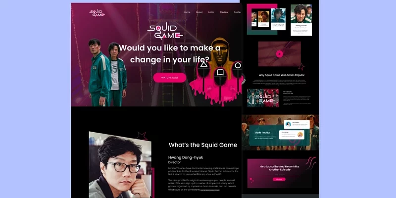
Here is the Figma File Design of the Squid Game Website, also don’t forget to grab the complete source code from this GitHub repo
Resources needed to Build the Squid Game Website:
- Boxicons – Library for the icons
- SwiperJs – Library for the sliders
- Google Fonts – Library for the font
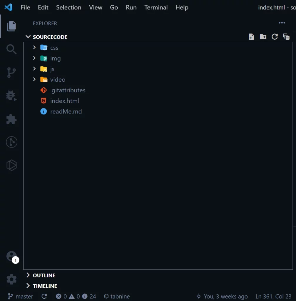
The Project Folder Structure
The folder structure follows the convention that most frontend developers use in their projects.
In the root directory, there is an HTML, readMe, and .gitattributes files. The CSS file, JavaScript File, images, and videos are also in their respective folders in the root directory.
Why the .gitattributes file? The .gitattributes file contains text paths or pointers to the large files such as audio, videos, datasets, and graphics inside Git while storing the file contents on a remote server like GitHub.
Why the readMe.md file? The readMe file is the text documentation about the projects we build, it often contains instructions, details, patches, and updates of a particular library or project.
The Basic HTML Boilerplate of the Squid Game Website
The basic HTML boilerplate looks like this:
<!DOCTYPE html>
<html lang="en-US">
  <head>
    <meta charset="UTF-8" />
    <meta http-equiv="X-UA-Compatible" content="IE=edge" />
    <meta
      name="viewport"
      content="width=device-width, initial-scale=1.0, shrink-to-fit=no"
    />

    <!-- Boxicons -->
    <link
      href="https://unpkg.com/boxicons@2.1.1/css/boxicons.min.css"
      rel="stylesheet"
    />

    <!-- Link Swiper's CSS -->
    <link
      rel="stylesheet"
      href="https://unpkg.com/swiper/swiper-bundle.min.css"
    />

    <!--Custom StyleSheet-->
    <link rel="stylesheet" href="css/style.css" />

    <title>SQUID GAME</title>
  </head>
  <body>
    <!-------------------header------------------->

    <!-------------------about area------------------->

    <!-------------------actor area------------------->

    <!-------------------popular area------------------->

    <!-------------------review area------------------->

    <!-------------------contact area------------------->

    <!-------------------footer area------------------->

    <!-- Swiper JS -->
    <script src="https://unpkg.com/swiper/swiper-bundle.min.js"></script>
    <script src="./js/main.js"></script>
  </body>
</html>
We will be coding the Squid Game landing page section by section so it doesn’t get too complicated to comprehend.
How to Build the Squid Game Website Navbar
The navbar will have the squid logo at the left and a list of menu items at the right for navigating the web page.
We are going to use an image for the logo because of its complexity, don’t get too anxious, I know the logo design can be achieved with CSS but I went with an image to save time.
The HTML for the logo looks like this:
<a href="#header" class="logo">
            <img src="img/logo.png" alt="website-logo" />
          </a>
The nav menu items are generic links placed in an unordered list tag as shown below:
<ul class="navigation">
            <li><a href="#header">Home</a></li>
            <li><a href="#about">About</a></li>
            <li><a href="#actor">Actor</a></li>
            <li><a href="#review">Review</a></li>
            <li><a href="#footer">Footer</a></li>
            <div class="close">
              <i class="bx bx-x"></i>
            </div>
          </ul>
In addition, we need some hamburger icons for the mobile nav menu. The hamburger icon will be hidden on desktop screens and visible on mobile screens.
<div class="hamburger">
            <i class="bx bx-menu"></i>
          </div>
To accomplish this, I will utilize JavaScript to dynamically toggle a class attribute of “show” and with the help of CSS we can show the hamburger when the class show is there and also hide it on the class isn’t there.
Here is the preview of the navbar in the browser:
How to Style the Squid Game Website Navbar
The doesn’t look great at this point, so we need to style it. With the help of Flexbox, we will align the logo, nav menu items, and the hamburger horizontally from their centers.
My font choice for this landing page is Poppins. I also have some CSS variables and some CSS resets to override the browser’s default styles.
@import url('https://fonts.googleapis.com/css2?family=Poppins:wght@400;500;600;700&display=swap');

/*------------- Css Variables -------------*/
:root {
  --main-bg-color: #000000;
  --primary-txt-color: #ffffff;
  --secondary-txt-color: #999999;
  --btn-bg-color: #e60065;
  --actor-txt-color: #2c3847;
  --video-bg-color: #3d0a21;
  --review-bg-color: #03494d;
  --review-hading-color: #272727;
  --review-para-color: #949da3;
  --footer-bg-color: #23262b;
  --actor-gradient-color: linear-gradient(#e60065, #0c5445);
  --hero-gradient-color: linear-gradient(
    297.49deg,
    #0a0a0a 32.71%,
    #97215d 93.59%
  );
}

* {
  margin: 0;
  padding: 0;
  box-sizing: border-box;
}

html {
  font-size: 62.5%;
  scroll-behavior: smooth;
  scroll-padding-top: 10rem;
}

body {
  font-family: 'Poppins', sans-serif;
  transition: all 0.2s ease-out;
  background: var(--main-bg-color);
  color: var(--primary-txt-color);
  font-size: 1.6rem;
}

.container {
  max-width: 116.8rem;
  width: 100%;
  margin: 0 auto;
  padding: 0 3rem;
}

section {
  overflow: hidden;
}

img {
  max-width: 100%;
  height: auto;
}
In the CSS snippets above, I first included the Poppins font using @import and added all the colors we are going to need in the “: root” selector. I also removed the default margin and padding assigned to all elements by browsers by setting “box-sizing” to “border-box”, “margin” to zero, and “padding” to zero.
Another important convention most CSS gurus use is to set a root “font-size” of 62.5% to the “HTML” selector. This way we can then set a “font size” of 1.6rem which is equivalent to 16px on the “body” selector.
Before we begin the styling of the navbar, add this reusable code snippet into the CSS file.
h1 {
  font-size: 6rem;
  font-weight: 600;
  margin: -5.5rem 0 3.5rem 0;
}

h2 {
  font-size: 4.4rem;
  font-weight: 500;
  text-transform: capitalize;
}

h4 {
  font-size: 2.8rem;
  font-weight: 600;
}

p {
  font-size: 1.6rem;
  font-weight: 400;
  color: var(--secondary-txt-color);
}

span {
  display: block;
  font-size: 2.4rem;
  font-weight: 400;
}

a {
  text-decoration: none;
  color: var(--primary-txt-color);
}
Remember to always have reusable CSS styles in your project in order to save time. In the above CSS snippets, we implemented the styles for our typography in the h1, h2, h3, span, and p tags.
I think we are now ready to style the navbar. One thing to note is the navbar div is contained in a header element so we will style the header class first.
For this Squid Game Website, I designed the navbar to be simple in order for the tutorial not to be too long.
.header {
  position: relative;
  width: 100%;
  height: 100%;
  overflow: hidden;
}

.nav-bar {
  position: fixed;
  top: 0;
  left: 0;
  width: 100%;
  z-index: 10000;
  transition: 0.5s;
}

.nav-bar .row {
  display: flex;
  justify-content: space-between;
  align-items: center;
  height: 9rem;
}

ul li {
  list-style: none;
  font-size: 1.6rem;
  font-weight: 400;
  display: inline-block;
  margin-right: 4.6rem;
}

ul li:last-child {
  margin-right: 0;
}

.nav-bar .navigation {
  position: relative;
}

.nav-bar .navigation li:hover a {
  color: var(--btn-bg-color);
}

.nav-bar.sticky {
  background: var(--hero-gradient-color);
  box-shadow: 0 0 0.8rem 0.3rem #fff;
  height: 9rem;
}

.nav-bar .navigation .close {
  position: absolute;
  top: 1.5rem;
  right: 1.5rem;
  color: var(--main-bg-color);
  font-size: 2.5rem;
}

.hamburger {
  background-color: var(--primary-txt-color);
  color: var(--main-bg-color);
  padding: 0.3rem 0.5rem;
  font-size: 2.2rem;
  display: none;
  align-items: center;
  justify-content: center;
  cursor: pointer;
}
So far the navbar looks like this:
I applied box-shadow and gradient color to the navbar when the class of sticky is added to the navbar div with JavaScript anytime the user scrolls down.
To hide the hamburger icon on larger screens, I selected the .hamburger class and gave it a display none.
How to Make the Navbar Responsive
We started by reducing the size of the logo on screens with a max-width of 996px then made the nav menu have a position fixed on viewports having their max-width equal to 768px.
Apart from giving the .navigation class position fixed, I also gave it a top of zero and a left of -100% to hide it.
Later, we will make it have left of zero when we use JavaScript to add the class of show to the .navigation class.
@media (max-width: 996px) {
  .logo {
    width: 9rem;
  }

  ul li {
    margin-right: 2rem;
  }
}

@media (max-width: 768px) {
  .nav-bar .navigation {
    position: fixed;
    top: 0;
    left: -100%;
    height: 100%;
    width: 100%;
    max-width: 30rem;
    background-color: var(--primary-txt-color);
    padding: 3rem 0;
    display: flex;
    flex-direction: column;
    transition: left 0.5s ease-in-out;
  }

  .nav-bar .row,
  .nav-bar.sticky {
    height: 8rem;
  }

  .nav-bar .navigation a {
    color: var(--main-bg-color);
    padding: 1rem;
    font-size: 1.8rem;
  }

  .nav-bar .navigation li {
    margin: 0 0 1rem 0;
  }

  .hamburger {
    display: flex;
  }

  .nav-bar .navigation.show {
    left: 0;
  }
}
Below are the snippets of JavaScript to add and remove the class of show from the .navigation class div.
const menu = document.querySelector('.navigation');

document.querySelector('.hamburger').onclick = function () {
  menu.classList.add('show');
};

document.querySelector('.close').onclick = function () {
  menu.classList.remove('show');
};

addEventListener('scroll', function () {
  const header = document.querySelector('.nav-bar');
  header.classList.toggle('sticky', window.scrollY > 0);
});
I also added a scroll event listener to the window object, a class of sticky showed be toggled when window.scrollY is greater than zero.
How to Build the Squid Game Website Hero Section
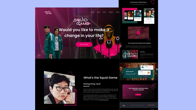
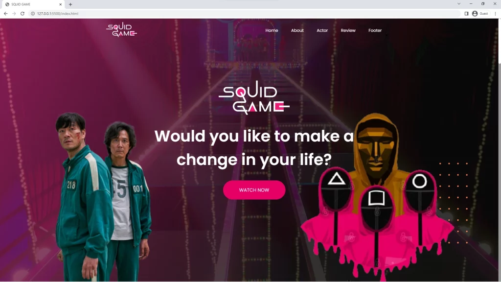
The hero section is going to contain text content (a logo, description, and a call to action (CTA)) and a background image. In addition, we are going to position two images on opposite sides of the text content with the CSS position property.
In short, this is what we are going to achieve:
The HTML for the hero section is in the code snippet below:
<div class="hero-area">
        <div class="hero-text">
          <img class="img-one" src="img/bg-logo.png" alt="bg-logo" />
          <h1>
            Would you like to make a <br />
            change in your life?
          </h1>
          <a class="button watch-button">Watch Now</a>
        </div>
        <div class="hero-img">
          <img
            class="img-four"
            src="img/shapes-svg/bg-shape.svg"
            alt="round-shape"
          />
          <img class="img-two" src="img/bg-one.png" alt="round-shape" />
          <img class="img-three" src="img/bg-two.png" alt="round-shape" />
        </div>
      </div>
The code snippets for the hero section will also be contained in the header element which has a class of .header .
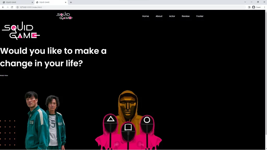
With the HTML above this is the preview in the browser:
How to Style the Squid Game Website Hero Section
To properly position the text content and the three images, we are going to utilize the CSS position property and also use the CSS background property to add the background image.
The background property is a shorthand for:
- background-color
- background-image
- background-position
- background-size
- background-repeat
- background-origin
- background-clip
- background-attachment
Below is the CSS snippets for the hero area, since we wanted to position the text content and the three images with CSS position property and its helpers like left, right, top and bottom.
.hero-area {
  background: url(../img/bg-img.jpg) no-repeat;
  background-size: cover;
  width: 100%;
  min-height: 100vh;
  position: relative;
}

.hero-area::before {
  content: '';
  background: var(--hero-gradient-color);
  opacity: 0.83;
  width: 100%;
  height: 100%;
  position: absolute;
}

.hero-area .hero-text {
  text-align: center;
  position: absolute;
  top: 42%;
  left: 51%;
  transform: translate(-50%, -50%);
  width: 100%;
  z-index: 1;
}

.button {
  border-radius: 4rem;
  border: none;
  background: var(--btn-bg-color);
  color: var(--primary-txt-color);
  text-transform: uppercase;
  text-align: center;
  padding: 2.3rem 6.2rem;
  font-size: 1.8rem;
  font-weight: 400;
  display: inline-block;
  cursor: pointer;
}

.hero-area .hero-img .img-two {
  position: absolute;
  bottom: 0;
  left: 13rem;
  height: 75%;
}

.hero-area .hero-img .img-three {
  position: absolute;
  bottom: 0;
  right: 10rem;
  height: 76%;
}

.hero-area .hero-img .img-four {
  position: absolute;
  bottom: 14.5rem;
  right: 11.7rem;
}
And this is the preview of the Squid Game Website Hero Section in the browser:
How to Make the Hero Section Responsive with Media Queries
To make the Hero section responsive, we need to reduce the sizes of the elements while the viewport decreases.
At a max-width of 1300px, we will reduce the font size of the text content description, and also reduce the width and height of the text content logo and the three images.
@media (max-width: 1300px) {
  .hero-area .hero-text h1 {
    font-size: 4rem;
    margin-top: 0.5rem;
  }

  .hero-area .hero-text .img-one {
    width: 14rem;
  }

  .hero-area .hero-text .button {
    padding: 1.5rem 5.5rem;
  }

  .hero-area .hero-img .img-two {
    left: 0;
    height: 40rem;
  }

  .hero-area .hero-img .img-three {
    height: 40rem;
    right: 0;
  }

  .hero-area .hero-img .img-four {
    bottom: 7.5rem;
    right: 0;
  }
}

@media (max-width: 567px) {
  .hero-area .hero-img .img-three {
    display: none;
  }

  .hero-area .hero-text h1 {
    font-size: 2.5rem;
    margin-top: 0;
  }

  .hero-area .hero-text h1 br {
    display: none;
  }

  .hero-area .hero-text .button {
    padding: 1.3rem 4.5rem;
    font-size: 1.6rem;
  }
}
I gave the display property of one of the images to none in order to hide it on mobile devices.
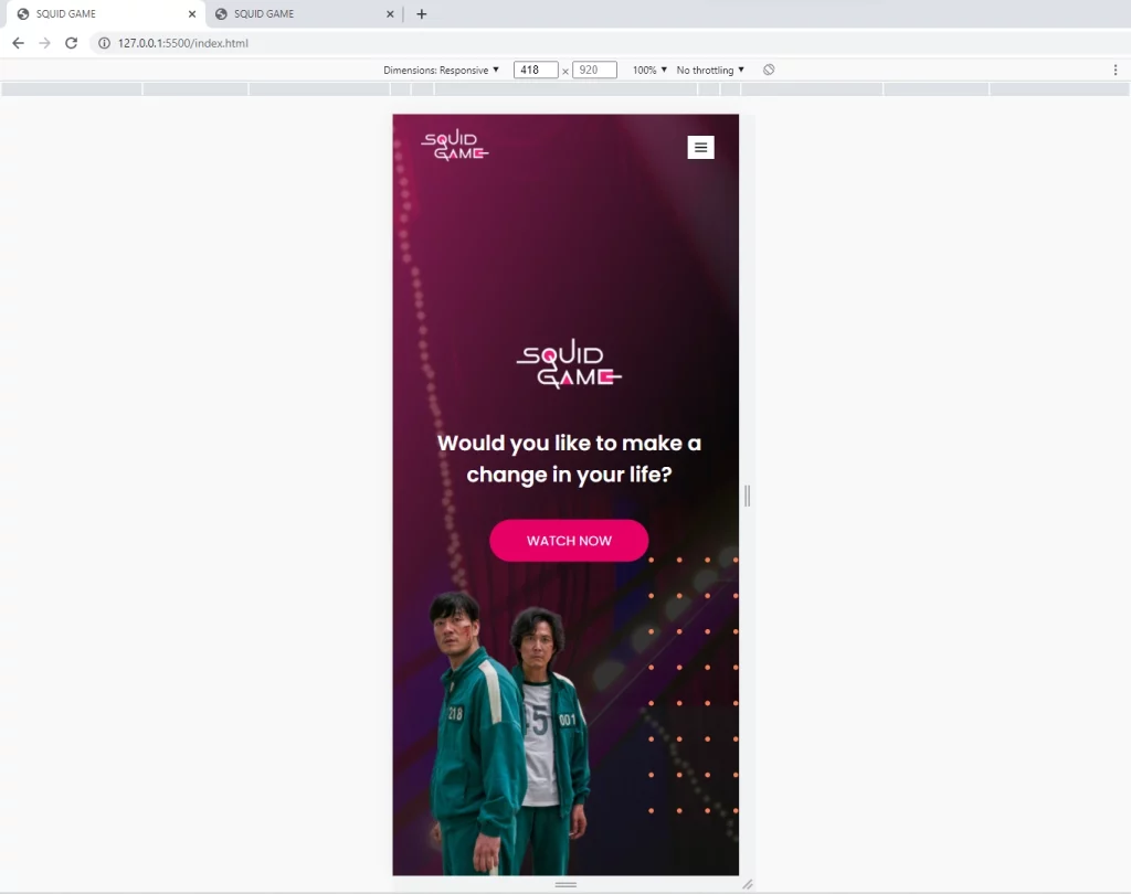
Here is the preview on mobile devices:
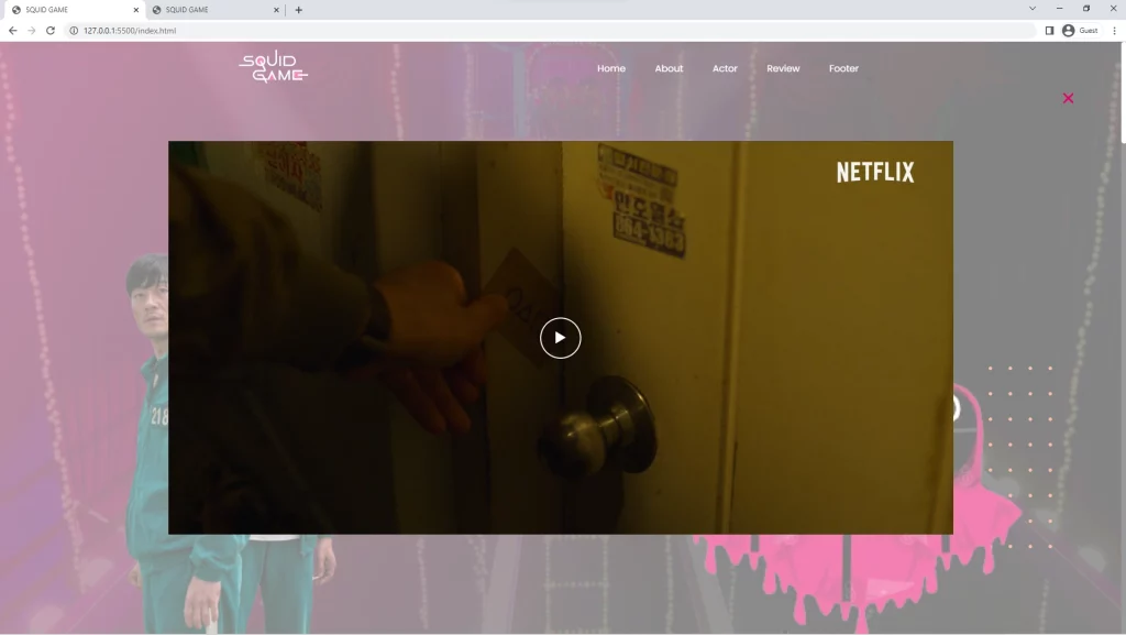
How to Make a Video Popup
For the video popup, we will use HTML5 video and source tags to add the video in two formats (mp4 and webm). The video with “mp4” will play on browsers that accept “mp4” videos and the video with “webm” will also play on browsers that accept “webm”.
The HTML for the Video Popup of the Squid Game Website
<div class="video-wrapper">
        <video class="video">
          <source src="./video/Squid Game.m4v" type="video/mp4" />
          <source src="./video/Squid Game.webm" type="video/webm" />
        </video>
        <div class="close-video">
          <i class="bx bx-x"></i>
        </div>
        <span class="video-control"><i class="bx bx-play"></i></span>
      </div>
Since I didn’t want to show the default video controls, I decided to use my own custom play and pause button to control the video. We will later use JavaScript to play and pause the video and also dynamically change the icons.
How to Style the Squid Game Website Video Popup
.video-wrapper {
  position: fixed;
  top: 0;
  right: 0;
  bottom: 0;
  width: 100%;
  height: 100%;
  display: flex;
  justify-content: center;
  align-items: center;
  background-color: rgba(255, 255, 255, 0.5);
  z-index: 10000;
  transition: 0.5s;
  transform: scale(0);
  opacity: 0;
  visibility: hidden;
}

.video-wrapper.active {
  transform: scale(1);
  opacity: 1;
  visibility: visible;
}

.video-wrapper video {
  width: 70%;
  max-width: 135rem;
}

.video-wrapper .video-control {
  display: flex;
  justify-content: center;
  align-items: center;
  border: 2px solid var(--primary-txt-color);
  border-radius: 50%;
  color: var(--primary-txt-color);
  font-size: 4rem;
  width: 7rem;
  height: 7rem;
  margin: 0 auto;
  cursor: pointer;
  position: absolute;
}

.video-wrapper .close-video {
  position: absolute;
  top: 7rem;
  right: 7rem;
  color: var(--btn-bg-color);
  font-size: 4rem;
  cursor: pointer;
}
How to Make the Video Popup Responsive
@media (max-width: 1200px) {
  .video-wrapper video {
    width: 90%;
    max-width: 135rem;
  }
}

@media (max-width: 567px) {
  .video-wrapper .video-control {
    font-size: 2.5rem;
    width: 4rem;
    height: 4rem;
  }
  .video-wrapper .close-video {
    font-size: 2.5rem;
    top: 10rem;
    right: 3rem;
  }
}
How to Add JavaScript to Control the Video
To implement the play and pause functionalities with JavaScript, we need to select the .video, .video-control, .video-wrapper classes.
We also need a way to add a click event listener to two classes and to achieve this, we need to put the two classes in an array and then loop through them.
During each iteration, we will pass the current element to document.querySelector() .
const video = document.querySelector('.video');
const button = document.querySelector('.video-control');
const videoWrapper = document.querySelector('.video-wrapper');

['.watch-button', '.actor-video'].forEach((el) => {
  document.querySelector(el).onclick = () => {
    videoWrapper.classList.add('active');
  };
});

document.querySelector('.close-video').onclick = () => {
  videoWrapper.classList.remove('active');
};

function playpausevideo() {
  if (video.paused) {
    button.innerHTML = "";
    video.play();
  } else {
    button.innerHTML = "";
    video.pause();
  }
}

button.addEventListener('click', playpausevideo);
In addition, we need to dynamically change the play icon to the pause icon when the video is playing, the reverse is correct when the video has been paused.
To achieve this, we will change the innerHTML of the button to the right icon based on the state of the video.
How to Build the Squid Game Website About Section
The about section is going to be simple, it will comprise of an image at the left and text content at the right.
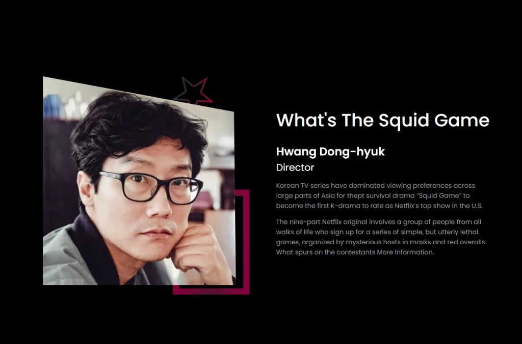
Here is the HTML for the About Section of the Squid Game Website
<section id="about">
      <div class="main-about container">
        <div class="about-img">
          <img src="img/about-img.png" alt="About-Img" />
        </div>
        <div class="about-text">
          <h2>What's the Squid Game</h2>
          <h4>Hwang Dong-hyuk</h4>
          <span>Director</span>
          <p>
            Korean TV series have dominated viewing preferences across large
            parts of Asia for thept survival drama “Squid Game” to become the
            first K-drama to rate as Netflix’s top show in the U.S.
          </p>
          <p>
            The nine-part Netflix original involves a group of people from all
            walks of life who sign up for a series of simple, but utterly lethal
            games, organized by mysterious hosts in masks and red overalls. What
            spurs on the contestants More Information.
          </p>
        </div>
      </div>
    </section>
The image at the left is somehow difficult because we will use the position property to place two images below it.
How to Style the Squid Game Website About Section
With the help of CSS Flexbox, we will align both the image and the text content horizontally.
Also, we will use the before and after pseudo selectors to add two images below the .about-img class.
Note: we will be using the CSS background property to add the images in the before and after pseudo selectors.
.main-about {
  display: flex;
  align-items: center;
  margin: 19rem auto 14rem;
  justify-content: space-between;
}

.about-img {
  position: relative;
}

.about-img::before {
  position: absolute;
  left: 320px;
  top: 0px;
  content: '';
  background: url(../img/shapes-svg/about-star.svg) no-repeat;
  width: 100%;
  height: 100%;
  z-index: -1;
}

.about-img::after {
  position: absolute;
  left: 320px;
  top: 280px;
  content: '';
  background: url(../img/shapes-svg/about-frame.svg) no-repeat;
  width: 100%;
  height: 100%;
  z-index: -1;
}

.about-img img {
  width: 100%;
  height: 100%;
  clip-path: polygon(0 0, 99% 17%, 100% 100%, 0% 100%);
}

.about-text {
  flex-basis: 48%;
}

.about-text h2 {
  margin-bottom: 2.5rem;
}

.about-text p {
  margin: 1.5rem 0;
}

.about-text p:last-child {
  margin: 0;
}
Here is how it looks so far:
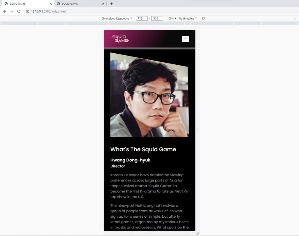
How to Make the About Section Responsive with Media Queries
To make the about section responsive, we will be working on viewports with a max-width of 1200px and 996px.
@media (max-width: 1200px) {
  .about-img img {
    width: 80%;
  }

  .about-text h2 {
    font-size: 3rem;
  }

  .about-text h4 {
    font-size: 2rem;
  }

  .about-text span {
    font-size: 1.7rem;
  }

  .about-img::after {
    left: 250px;
    top: 200px;
  }
}

@media (max-width: 996px) {
  .about-img::after {
    background-size: 15rem;
  }
}

@media (max-width: 768px) {
  .about-img::after {
    background-size: 15rem;
  }

  .main-about {
    flex-direction: column;
    gap: 3rem 0;
  }
}

@media (max-width: 567px) {
  .about-img img {
    width: 100%;
  }

  .about-img::after,
  .about-img::before {
    display: none;
  }

  .about-text h2 {
    font-size: 2.5rem;
    margin-bottom: 1.5rem;
  }

  .about-text h4 {
    font-size: 1.9rem;
  }
}
Here is the responsive preview of the about section:
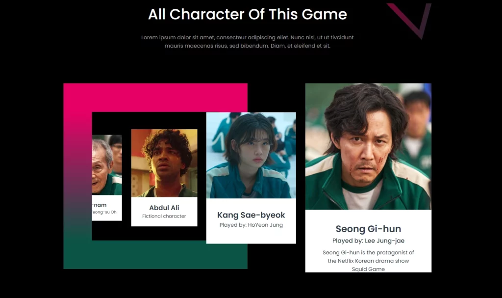
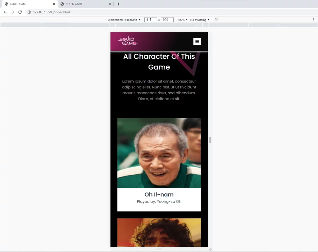
How to Make the Squid Game Website Actor Section
The actor section is the most important part of the Squid Game Website because this section contains the featured actors of Squid Game.
It’s a little bit complicated since we went with the old way of aligning elements with CSS positioning.
Here is the HTML for the About Section of the Squid Game Website.
The actor section will also have a button to show the Squid Game trailer when clicked, the video trailer will be in a video popup.
 <section id="actor">
      <div class="container">
        <div class="title">
          <h2>All character of this game</h2>
          <p>
            Lorem ipsum dolor sit amet, consecteur adipiscing eliet. Nunc nisl,
            ut ut tivcidunt mauris maecenas risus, sed bibendum. Diam, et
            eleifend et sit.
          </p>
          <img
            class="polygon"
            src="img/shapes-svg/title-polygon.svg"
            alt="polygon-shape"
          />
        </div>
        <div class="all-actor">
          <div class="actor-one actor-box">
            <div class="actor-img">
              <img src="img/actor-0.jpg" alt="actor-img" />
            </div>
            <div class="actor-text">
              <h4>Oh Il-nam</h4>
              <span>Played by: Yeong-su Oh</span>
            </div>
          </div>
          <div class="actor-two actor-box">
            <div class="actor-img">
              <img src="img/actor-1.jpg" alt="actor-img" />
            </div>
            <div class="actor-text">
              <h4>Abdul Ali</h4>
              <span>Fictional character</span>
            </div>
          </div>
          <div class="actor-three actor-box">
            <div class="actor-img">
              <img src="img/actor-2.jpg" alt="actor-img" />
            </div>
            <div class="actor-text">
              <h4>Kang Sae-byeok</h4>
              <span>Played by: HoYeon Jung</span>
            </div>
          </div>
          <div class="actor-four actor-box">
            <div class="actor-img">
              <img src="img/actor-3.jpg" alt="actor-img" />
            </div>
            <div class="actor-text">
              <h4>Seong Gi-hun</h4>
              <span>Played by: Lee Jung-jae</span>
              <p>
                Seong Gi-hun is the protagonist of the Netflix Korean drama show
                Squid Game
              </p>
            </div>
          </div>
        </div>
        <div class="actor-video">
          <img
            class="acter-sape"
            src="img/shapes-svg/actor-star.svg"
            alt="polygon-shape"
          />
        </div>
      </div>
    </section>
How to Style the Squid Game Website Actor Section
For the actor section, we will use CSS Flexbox and CSS position property to implement the design with code.
Each of the actor boxes will have a different width and height that is the boxes will be in an increased width and height fashion.
.title {
  text-align: center;
  position: relative;
  margin-bottom: 10rem;
}

.title h2 {
  margin-bottom: 2.5rem;
}

.title p {
  width: 60%;
  margin: 0 auto;
}

.title .polygon {
  position: absolute;
  top: -8rem;
  right: -2.2rem;
}

.all-actor {
  display: flex;
  justify-content: space-between;
  align-items: center;
  text-align: center;
  position: relative;
  margin-bottom: 10rem;
}

.all-actor::before {
  content: '';
  background: transparent;
  width: 38.2rem;
  height: 38.6rem;
  border: 8.6rem solid transparent;
  border-image: var(--actor-gradient-color);
  border-image-slice: 1;
  position: absolute;
  left: 0;
  top: 0;
}

.all-actor .actor-box {
  background: var(--primary-txt-color);
  color: var(--actor-txt-color);
}

.actor-box .actor-text {
  padding-top: 1rem;
}

.actor-one {
  width: 17.6rem;
  height: 25.8rem;
}

.actor-one .actor-text h4 {
  font-size: 1.6rem;
}

.actor-one .actor-text span {
  font-size: 1.2rem;
}

.actor-two {
  width: 19.9rem;
  height: 29.2rem;
}

.actor-two .actor-text h4 {
  font-size: 2rem;
}

.actor-two .actor-text span {
  font-size: 1.4rem;
}

.actor-three {
  width: 27rem;
  height: 39.5rem;
  z-index: 1;
}

.actor-three .actor-text {
  padding: 2.5rem 0 0;
}

.actor-three .actor-text h4 {
  font-size: 2.4rem;
}

.actor-three .actor-text span {
  font-size: 1.6rem;
}

.actor-four {
  width: 38rem;
  height: 56.8rem;
}

.actor-four .actor-text {
  padding: 3rem 4.4rem;
}

.actor-four .actor-text p {
  color: var(--actor-txt-color);
}

.actor-four .actor-text span {
  font-size: 1.8rem;
  font-weight: 500;
  margin-bottom: 1rem;
}

.actor-video {
  border-radius: 0.6rem;
  text-align: center;
  position: relative;
  background: url(../img/video-img.jpg) no-repeat center;
  background-size: cover;
  max-width: 77rem;
  width: 100%;
  height: 45.5rem;
  margin: 0 auto 12.6rem;
}

.actor-video::before {
  content: '';
  width: 100%;
  height: 100%;
  position: absolute;
  left: 0;
  top: 0;
  background: var(--video-bg-color);
  opacity: 0.78;
  border-radius: 0.6rem;
}

.actor-video::after {
  content: '';
  width: 100%;
  height: 100%;
  position: absolute;
  left: 0;
  top: 0;
  background: url(../img/play-button.png) no-repeat center;
  cursor: pointer;
}

.actor-video .actor-shape {
  position: absolute;
  bottom: -7rem;
  right: -9rem;
  z-index: -1;
}
Here is how it looks so far:
How to Make the Squid Game Website Actor Section Responsive
To make the actor section responsive, we are going to use CSS Grid to align the actor boxes in one column and also give them the same width and height.
@media (max-width: 768px) {
  .title {
    margin-bottom: 7rem;
  }

  h2 {
    font-size: 3rem;
  }

  .title p {
    width: 100%;
  }

  .all-actor::before {
    display: none;
  }

  .actor-four .actor-text {
    padding: 3rem 0.5rem;
  }

  .all-actor {
    display: grid;
    grid-template-columns: 1fr 1fr;
    gap: 3rem;
  }

  .all-actor .actor-box {
    width: 100%;
    height: 47rem;
  }

  .all-actor .actor-box .actor-img {
    height: 35rem;
  }

  .all-actor .actor-box .actor-img img {
    width: 100%;
    height: 100%;
  }

  .all-actor .actor-box .actor-text p {
    display: none;
  }

  .all-actor .actor-box .actor-text h4 {
    font-size: 2.4rem;
  }

  .all-actor .actor-box .actor-text span {
    font-size: 1.6rem;
  }
}

@media (max-width: 567px) {
  .all-actor {
    grid-template-columns: 1fr;
    gap: 3rem 0;
  }

  .all-actor .actor-box {
    width: 100%;
    height: 40rem;
  }

  .all-actor .actor-box .actor-img {
    height: 30rem;
  }

  .actor-video::after {
    background-size: 5rem;
  }
}
Here is how it looks
How to Make the Squid Game Popular Section
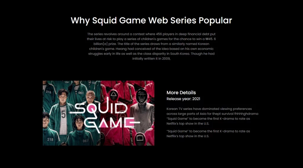
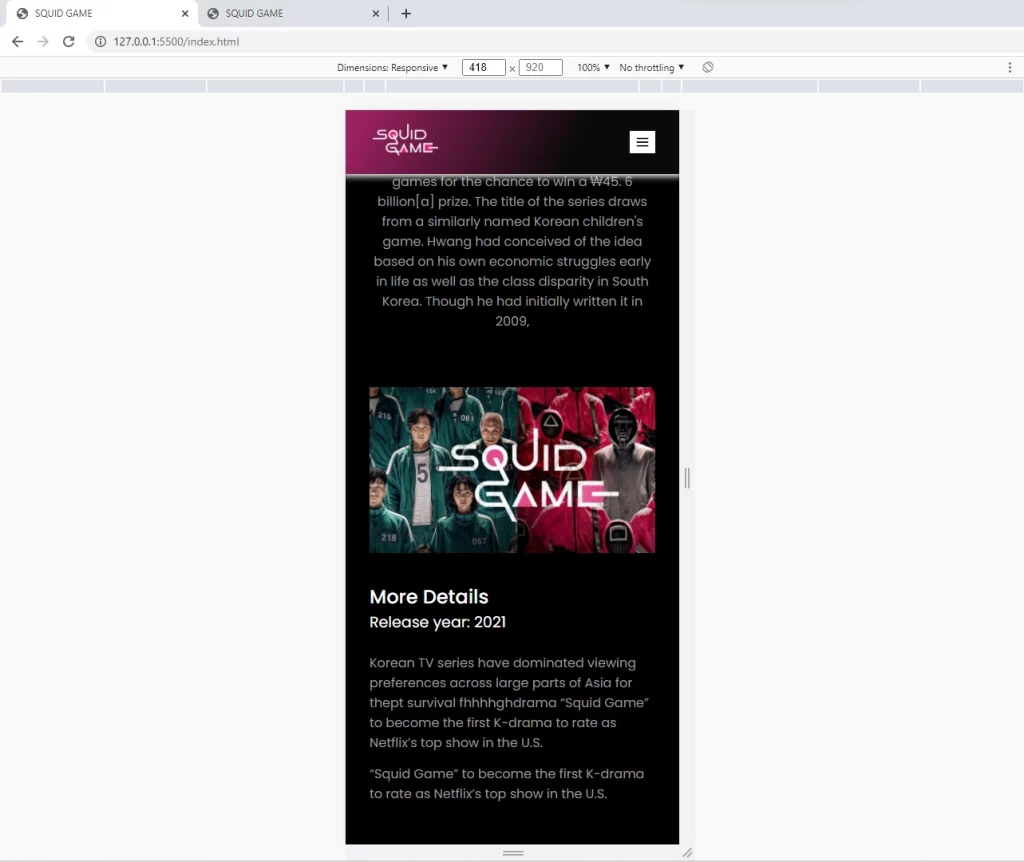
The Squid Game Website Popular section contains information on how Squid Game became so popular.
The popular section contains a title with a subtitle and a flex container below it. The flex container contains an image on the left and text content on the right.
<section class="popular-area">
      <div class="container">
        <div class="title">
          <h2>Why Squid Game web Series Popular</h2>
          <p>
            The series revolves around a contest where 456 players in deep
            financial debt put their lives at risk to play a series of
            children's games for the chance to win a ₩45. 6 billion[a] prize.
            The title of the series draws from a similarly named Korean
            children's game. Hwang had conceived of the idea based on his own
            economic struggles early in life as well as the class disparity in
            South Korea. Though he had initially written it in 2009,
          </p>
        </div>
        <div class="popular-bar">
          <div class="popular-img">
            <img src="img/popular-img.jpg" alt="video-img" />
          </div>
          <div class="popular-text">
            <h4>More Details</h4>
            <span>Release year: 2021</span>
            <p>
              Korean TV series have dominated viewing preferences across large
              parts of Asia for thept survival fhhhhghdrama “Squid Game” to
              become the first K-drama to rate as Netflix’s top show in the U.S.
            </p>
            <p>
              “Squid Game” to become the first K-drama to rate as Netflix’s top
              show in the U.S.
            </p>
          </div>
        </div>
      </div>
      <img
        class="round-shape"
        src="img/shapes-svg/popular-shape.svg"
        alt="polygon-shape"
      />
    </section>
How to Style the Squid Game Website Popular Section
Like the other sections, we are also going to use CSS Flexbox to align both the image and text content side by side.
.popular-area {
  position: relative;
  margin-bottom: 13.5rem;
}

.popular-area .round-shape {
  position: absolute;
  top: 0;
  z-index: -1;
}

.popular-bar {
  display: flex;
  justify-content: space-between;
  align-items: center;
  gap: 3rem;
}

.popular-bar .popular-text {
  flex-basis: 43%;
}

.popular-text h4 {
  font-size: 2.4rem;
  font-weight: 500;
}

.popular-text span {
  font-size: 1.9rem;
  margin-bottom: 2.4rem;
}

.popular-text p {
  margin-bottom: 1.4rem;
}

.popular-text p:last-child {
  margin-bottom: 0;
}
Here is the preview in the browser
How to Make the Squid Game Popular Section Responsive
To make the popular section responsive, we need to change the flex direction to the column to override the default flexbox direction.
@media (max-width: 768px) {
  .popular-bar {
    flex-direction: column;
  }

  .round-shape {
    width: 5rem;
  }
}

@media (max-width: 567px) {
  .round-shape {
    width: 3rem;
  }
}
Here is the preview in the browser
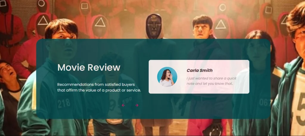
How to Make the Squid Game Review Section
The review section will consist of a background image and a vertical slider. With the vertical slider, we are going to use a library called SwiperJs since we don’t want to reinvent the wheel.
Here is the HTML for the Review Section
<section class="review" id="review">
      <div class="container">
        <div class="main-review">
          <div class="review-area">
            <div class="review-heading">
              <h2>Movie Review</h2>
              <p>
                Recommendations from satisfied buyers that affirm the value of a
                product or service.
              </p>
            </div>
            <div class="swiper review-slide">
              <div class="swiper-wrapper">
                <div class="swiper-slide">
                  <div class="review-child">
                    <div class="review-img">
                      <img src="img/review-client-1.png" alt="client-img" />
                    </div>
                    <div class="review-text">
                      <h4>Carla Smith</h4>
                      <p>
                        I just wanted to share a quick note and let you know
                        that..
                      </p>
                    </div>
                  </div>
                </div>
                <div class="swiper-slide">
                  <div class="review-child">
                    <div class="review-img">
                      <img src="img/review-client-2.png" alt="client-img" />
                    </div>
                    <div class="review-text">
                      <h4>Carla Smith</h4>
                      <p>
                        I just wanted to share a quick note and let you know
                        that..
                      </p>
                    </div>
                  </div>
                </div>
                <div class="swiper-slide">
                  <div class="review-child">
                    <div class="review-img">
                      <img src="img/review-client-3.png" alt="client-img" />
                    </div>
                    <div class="review-text">
                      <h4>Carla Smith</h4>
                      <p>
                        I just wanted to share a quick note and let you know
                        that..
                      </p>
                    </div>
                  </div>
                </div>
              </div>
            </div>

            <div class="review-button">
              <span class="prev-btn">
                <i class="bx bx-left-arrow-alt"></i>
              </span>
              <span class="next-btn">
                <i class="bx bx-right-arrow-alt"></i>
              </span>
            </div>
          </div>
        </div>
      </div>
    </section>
How to Style the Squid Game Website Review Section
We need to give the review section a background image using the CSS background property.
The review section has an inner div that holds both textual content and the review slider. With the help of flexbox, we will align the text content and the review slider side by side.
.review {
  background: url(../img/review-bg.jpg) no-repeat;
  background-size: cover;
  padding: 18.4rem 0 8rem;
  margin-bottom: 12.5rem;
}

.main-review {
  background: var(--review-bg-color);
  opacity: 0.86;
  border-radius: 3rem;
  padding: 10rem 10rem 12rem 10rem;
  position: relative;
}

.review-area {
  display: flex;
  justify-content: space-between;
  align-items: center;
  gap: 3rem;
  position: relative;
}

.review-heading {
  flex-basis: 45%;
}

.review-slide {
  position: relative;
  max-width: 476px;
  width: 100%;
  height: 160px;
  overflow: hidden;
  border-radius: 1rem;
}

.review-heading p {
  font-size: 1.8rem;
  margin-top: 3.5rem;
  color: var(--primary-txt-color);
}

.review-child {
  height: 160px;
  display: flex;
  justify-content: space-between;
  align-items: center;
  background: var(--primary-txt-color);
  padding: 3.5rem 4rem;
  box-sizing: border-box;
}

.review-child .review-img {
  width: 9.5rem;
  height: 9.5rem;
  border-radius: 50%;
  text-align: center;
  overflow: hidden;
}

.review-img img {
  width: 100%;
  height: 100%;
}

.review-child .review-text {
  flex-basis: 65%;
}

.review-text h4 {
  font-size: 2rem;
  font-style: italic;
}

.review-text h4 {
  font-size: 2rem;
  font-weight: 700;
  font-style: italic;
  color: var(--review-hading-color);
  margin-bottom: 1rem;
}

.review-text p {
  font-style: italic;
  color: var(--review-para-color);
}

.review-button {
  position: absolute;
  left: 300px;
  bottom: -75px;
}

.review-button span {
  display: inline-block;
  margin-right: 3.5rem;
  color: var(--btn-bg-color);
  cursor: pointer;
}
Here is what it looks like:
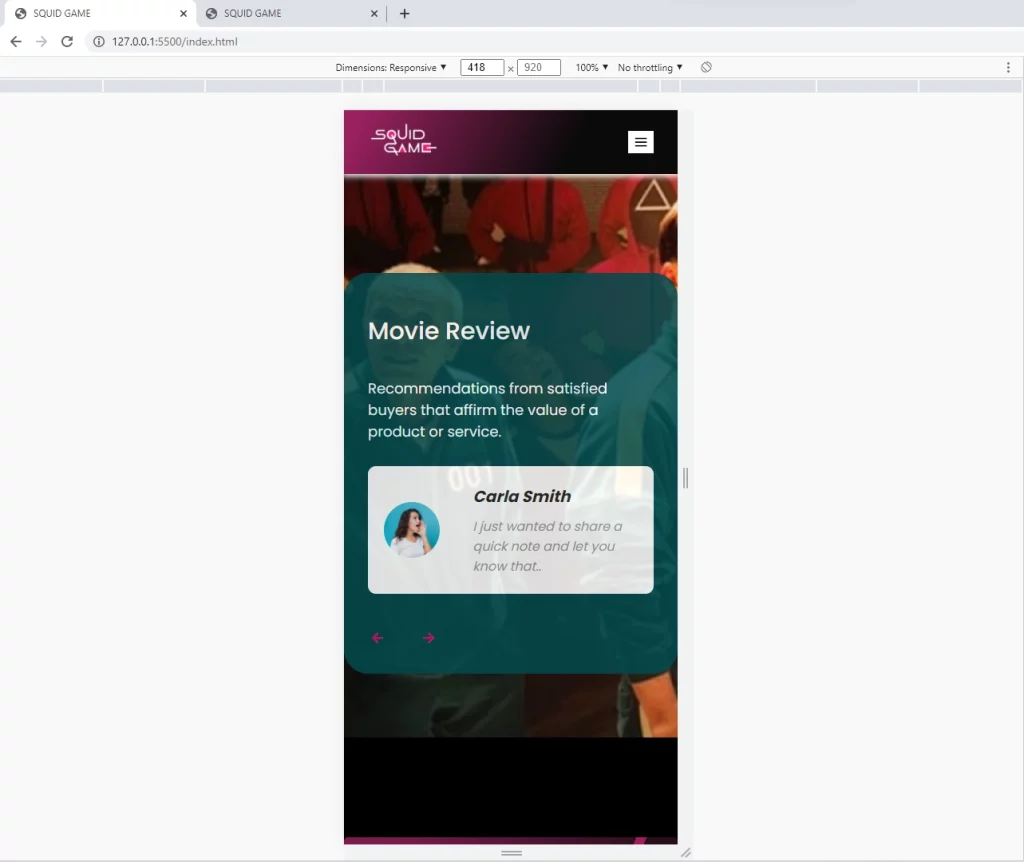
How to Make the Squid Game Website Review Section Responsive
We are going to be working with three max-widths, at a max-width of 996px we will only change the paddings.
At a max-width of 768px, we will change the flex-direction of the review area to a column to have them on top of each other.
@media (max-width: 996px) {
  .main-review {
    padding: 10rem 3rem 10rem;
  }
}

@media (max-width: 768px) {
  .review-area {
    flex-direction: column;
  }

  .review-button {
    left: 0;
  }
}

@media (max-width: 567px) {
  .review .container {
    padding: 0;
  }

  .main-review {
    padding: 5rem 3rem 10rem;
  }

  .review-child .review-img {
    width: 7rem;
    height: 7rem;
  }

  .review-child {
    padding: 3.5rem 2rem;
  }
}
Here is what it looks like:
JavaScript for the Review Section
The javascript is pretty simple since we are using the SwiperJs library to reduce our workload.
To activate the slider, we need to create an instance of the Swiper class and pass two arguments to the constructor function.
The first argument is the swiper div which we gave a class of .review-slide and the second argument is an object containing the options.
var swiper = new Swiper('.review-slide', {
  direction: 'vertical',

  navigation: {
    nextEl: '.next-btn',
    prevEl: '.prev-btn',
  },
});
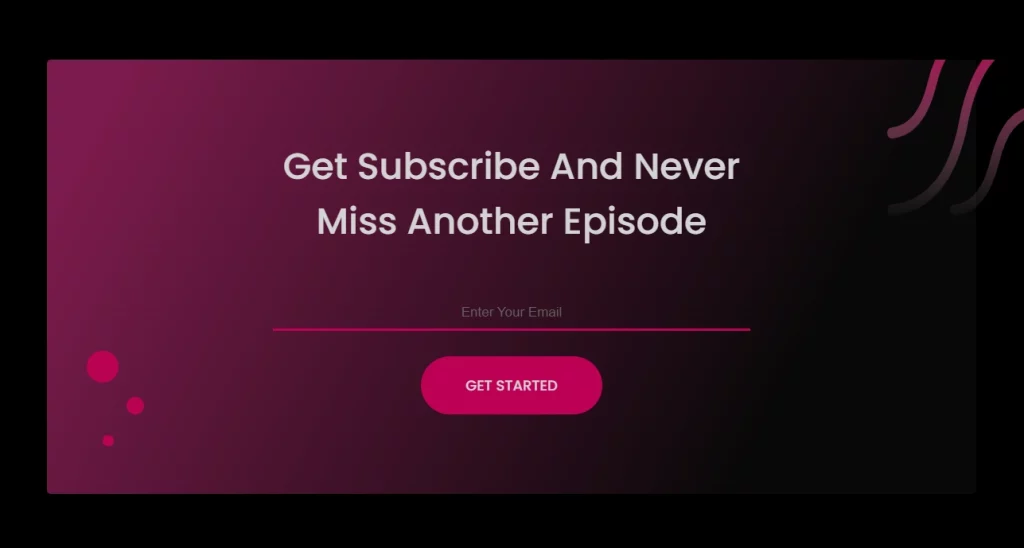
How to Make the Squid Website Contact Section
The contact section can also be considered the newsletter section. The main purpose of this section is to collect users emails so that we can send them periodic newsletters.
Here is the HTML of the Newsletter section
<section class="contact-area">
      <div class="row container">
        <div class="contact-box">
          <h2>get subscribe and never miss another episode</h2>
          <input type="email" placeholder="Enter Your Email" />
          <a class="button" href="#">Get Started</a>
          <div class="contact-shape">
            <img
              class="cShape-one"
              src="img/shapes-svg/contect-sape.svg"
              alt="round-shape"
            />
            <img
              class="cShape-two"
              src="img/shapes-svg/contect-shape-1.svg"
              alt="round-shape"
            />
            <img
              class="cShape-three"
              src="img/shapes-svg/contect-shape-2.svg"
              alt="round-shape"
            />
            <img
              class="cShape-four"
              src="img/shapes-svg/contect-vector.svg"
              alt="square-shape"
            />
          </div>
        </div>
      </div>
    </section>
How to Style the Squid Game Website Contact Section
The only difficult part of this section is that we need to use the CSS positioning property to position two “svgs” on the contact section.
.contact-area .row {
  text-align: center;
  padding: 10rem 0;
  background: linear-gradient(297.49deg, #0a0a0a 21.25%, #97215d 93.59%);
  opacity: 0.83;
  border-radius: 0.5rem;
  margin-bottom: 10.9rem;
  position: relative;
}

.contact-box {
  width: 100%;
  max-width: 60rem;
  margin: 0 auto;
}

.contact-box h2 {
  font-size: 4.6rem;
  margin-bottom: 6rem;
}

.contact-box input {
  display: block;
  text-align: center;
  width: 100%;
  margin-bottom: 3.2rem;
  padding: 1rem 0;
  border: 0;
  outline: 0;
  border-bottom: 0.3rem solid var(--btn-bg-color);
  background: transparent;
  color: var(--primary-txt-color);
  font-size: 1.7rem;
}

.contact-box a {
  padding: 2.3rem 5.6rem;
  font-weight: 500;
}

.contact-shape .cShape-one {
  position: absolute;
  left: 7rem;
  bottom: 6rem;
}

.contact-shape .cShape-two {
  position: absolute;
  left: 10rem;
  bottom: 10rem;
}

.contact-shape .cShape-three {
  position: absolute;
  left: 5rem;
  bottom: 14rem;
}

.contact-shape .cShape-four {
  position: absolute;
  top: -4rem;
  right: -8rem;
}
Here is the preview in the browser
How to Make the Squid Game Website Contact Section Responsive
@media (max-width: 768px) {
  .contact-box h2 {
    font-size: 3rem;
    margin-bottom: 6rem;
  }

  .contact-box a {
    padding: 2rem 3.5rem;
  }
}
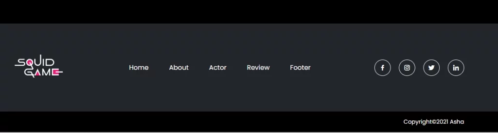
How to Make the Footer Section
The footer also consists of the squid logo at the left, the menu links in the middle, and some icons at the far right.
Here is the HTML for the Footer:
<footer id="footer">
<div class="footer-area">
<div class="main-footer container">
<div class="footer-logo">
<img src="img/logo.png" alt="website-logo" />
</div>
<ul class="footer-menu">
<li><a href="#header">Home</a></li>
<li><a href="#about">About</a></li>
<li><a href="#actor">Actor</a></li>
<li><a href="#review">Review</a></li>
<li><a href="#footer">Footer</a></li>
</ul>
<ul class="footer-icons">
<li>
<i class="bx bxl-facebook"></i>
</li>
<li>
<i class="bx bxl-instagram"></i>
</li>
<li>
<i class="bx bxl-twitter"></i>
</li>
<li>
<i class="bx bxl-linkedin"></i>
</li>
</ul>
</div>
</div>
<div class="copy-right">
<div class="container">
<p>Copyright©2021 Asha</p>
</div>
</div>
</footer>
How to Style the Squid Game Website Footer
We will simply apply our flexbox knowledge to align the logo, nav menu, and icons horizontally.
Also, we need to give the footer some background color using the CSS background shorthand property.
.footer-area {
  background: var(--footer-bg-color);
  padding: 4rem 0;
}

.main-footer {
  display: flex;
  justify-content: space-between;
  align-items: center;
}

.footer-menu li a {
  position: relative;
}

.footer-menu li a::after {
  content: '';
  position: absolute;
  left: 0;
  bottom: 0;
  width: 0;
  border-bottom: 2px solid var(--btn-bg-color);
  transition: 0.5s;
}

.footer-menu li:hover a::after {
  width: 100%;
}

.footer-icons {
  display: flex;
  align-items: center;
}

.footer-icons li {
  font-size: 1.8rem;
  border: 0.1rem solid var(--primary-txt-color);
  border-radius: 50%;
  width: 4rem;
  height: 4rem;
  margin-right: 2rem;
  display: flex;
  align-items: center;
  justify-content: center;
}

.footer-icons li:hover {
  background: var(--btn-bg-color);
}

.copy-right {
  text-align: right;
  padding: 1.5rem 0;
}

.copy-right p {
  color: var(--primary-txt-color);
  font-size: 1.4rem;
  font-weight: 400;
}
Here is what it looks like:
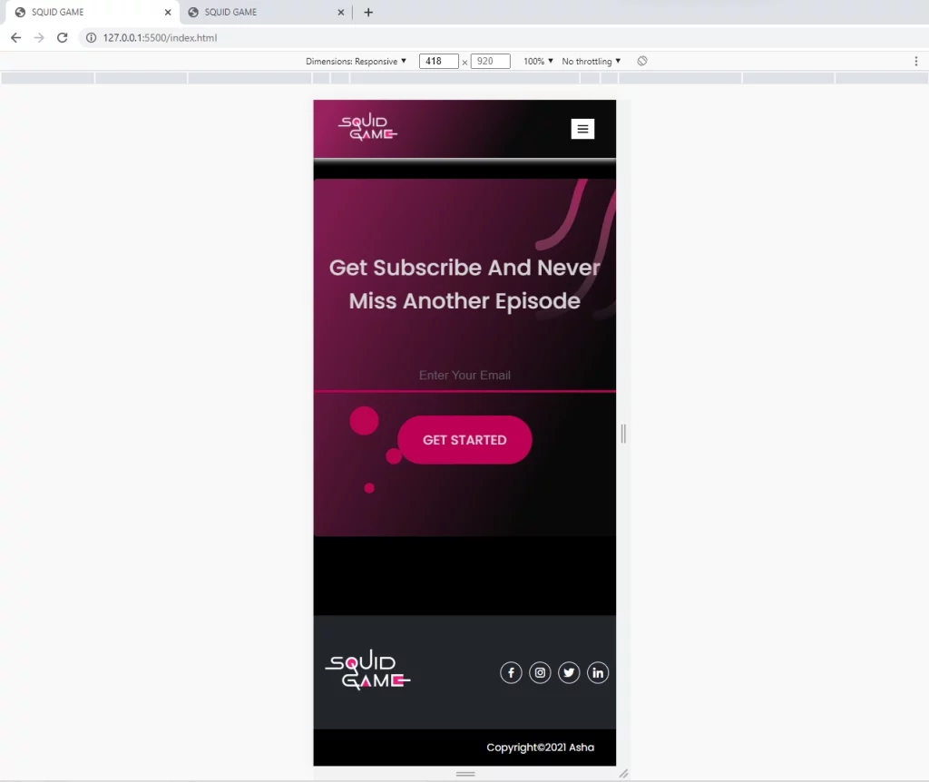
How to Make the Squid Game Website Footer Responsive
To make the footer responsive, we need to hide the menu links on smaller devices and reduce the various paddings on the elements.
@media (max-width: 768px) {
  .footer-area {
    padding: 1rem 0;
  }

  .main-footer {
    padding: 0 1rem;
  }

  .footer-menu {
    display: none;
  }

  .footer-icons li {
    font-size: 1.8rem;
    width: 3rem;
    height: 3rem;
    margin-right: 1rem;
  }
}
Here is how the footer looks like
How to change the Styles of the default Scroll-bar
The CSS code snippets below will change the width, background color, and border radius of the scroll bar.
html::-webkit-scrollbar {
  width: 1rem;
}

html::-webkit-scrollbar-track {
  background: var(--secondary-txt-color);
}

html::-webkit-scrollbar-thumb {
  background: var(--primary-txt-color);
  border-radius: 5rem;
}
Thanks for reading, please leave a comment down if you find this article helpful or when you get stuck at any point in the tutorial.
Very helpful article.
I’ve got to known as my CSS skill is perfect but there were some new knowledges I’ve acquired.
I recommend this article when we start making new awesome landing page.
Thanks for you effort.
You are welcome! I’m glad you found the article helpful.