
If you are a developer or a designer, it’s essential to learn how to build landing pages with HTML, CSS, SCSS, and JavaScript.
Once you become comfortable with CSS and SCSS you can extend your knowledge by adding some CSS frameworks like Bootstrap, Tailwind CSS, Foundation, Bulma, and many more to your stack.
Some of these CSS frameworks prevent you from writing redundant code and focus more on the logical part of the landing page.
These responsive front-end frameworks provide a grid, HTML, SASS or SCSS, and CSS UI elements, templates, and code that covers layouts, navigation, alerts, buttons, typography, forms, and so on.
After having a good understanding and practice with HTML, SASS, CSS, JavaScript, and some of the CSS front-end frameworks then you can easily transition into the more advanced aspects of front-end development by learning some of the popular JavaScript front-end frameworks.
You might have heard some developers say you don’t need a JavaScript frontend framework but I can boldly say these JavaScript frameworks are here to help us by automating the frontend development process.
If you are a beginner who hasn’t built any landing pages with HTML, SASS, CSS, and JavaScript then I will advise you to follow this article in order to learn some of the tips and tricks in SASS, CSS3, and HTML5.
In this tutorial, we’ll build a fashion eCommerce website step by step for a fictional company called Codevo. We’ll leverage the power of SASS to create this beautiful fashion eCommerce website from a Figma file design.
At the End of this Article, you’ll learn:
- How to set up a SASS project
- How to build a Login and Registration Form
- How to add product filtering with pure JavaScript
In a previous article in this series, How to build a food ordering website, You’ll learn how to build a food ordering website with HTML, SCSS, CSS, and JavaScript.
The purpose of this fictional company is to sell fashion and handmade products to customers.
The client asked us to build a beautiful responsive static landing page for the fashion eCommerce company so that customers can take action either by buying a product or opting into the newsletter when they land on it.
The source code of the fashion eCommerce website will be provided at the end of the article for download.
File Structure
I structured the project to follow the convention that most frontend developers use when working with SASS projects.
The folder structure is simple since we are only working on the homepage of this fashion eCommerce website.
To follow up with this tutorial, download the starter files on GitHub, extract the project from the zip file and open it with your favorite text editor(Visual Studio Code).
GitHub starter files if you came from the YouTube video.
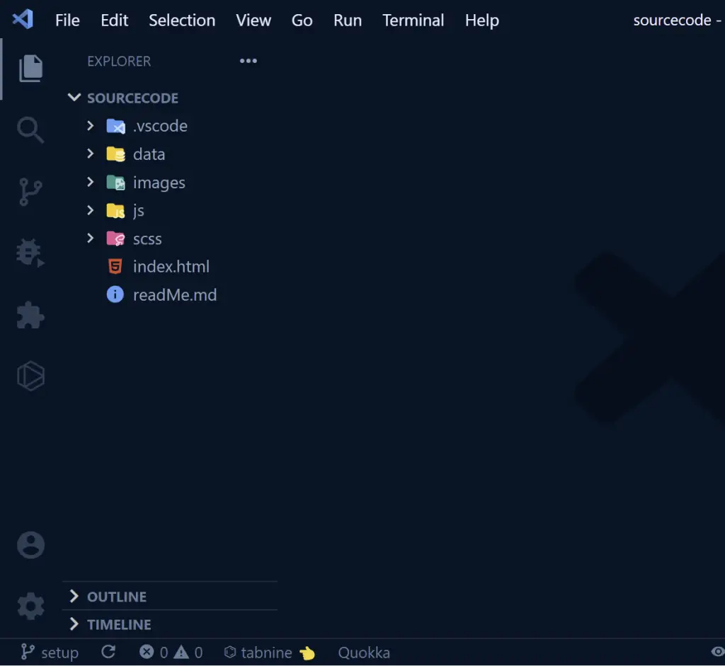
The project directory consists of four main folders and two files. The .vscode folder is a configuration added automatically by VSCode.
The data folder contains two JSON files that we will use to simulate a real database.
The SCSS folder contains an SCSS file in which we will write all the SASS styles and compile them to CSS using a SASS NPM package.
The JavaScript folder consists of two Javascript files (main.js & product.js) that will enable us to add more functionalities to the fashion eCommerce website.
Lastly, the images folder contains all the images we’ll need throughout the eCommerce project.
In the index.html file, I wrote some HTML boilerplate code snippets and outlined the various sections of the fashion eCommerce website in the comments.
I also linked the external Javascript files, stylesheet, SwiperJS script, and CSS CDN.
External Libraries We Need
These are the external libraries we are going to include in this eCommerce project:
- Google Font – add the font used in the Figma file
- SwiperJS – add sliders
- Boxicons – for the icons
- Favicon.io – generate a favicon for the website
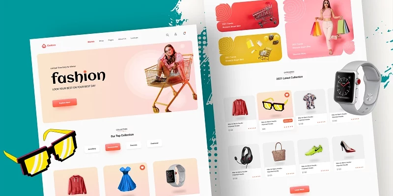
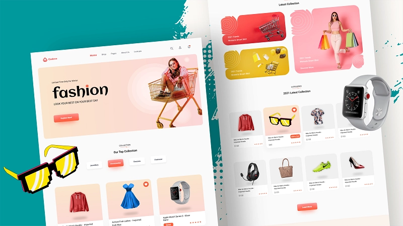
The Fashion Ecommerce Website Figma File Design
As a web developer or designer, it’s recommended to have the skills to convert any design whether an adobe XD file, PSD file, or Figma file to HTML, CSS, and JavaScript.
This eCommerce website has a Figma File Design that you can take a look at to have an idea about what we are building.
The HTML Boilerplate of the Fashion Ecommerce Website
The HTML boilerplate of the fashion eCommerce website
<!DOCTYPE html>
<html lang="en">
  <head>
    <meta charset="UTF-8" />
    <meta http-equiv="X-UA-Compatible" content="IE=edge" />
    <meta name="viewport" content="width=device-width, initial-scale=1.0" />
    <!-- ====== Favicon ====== -->
    <link
      rel="shortcut icon"
      href="images/favicon-32x32.png"
      type="image/png"
    />
    <!-- ====== Boxicons ====== -->
    <link
      href="https://unpkg.com/boxicons@2.0.9/css/boxicons.min.css"
      rel="stylesheet"
    />
    <!-- ====== Swiper CSS ====== -->
    <link
      rel="stylesheet"
      href="https://unpkg.com/swiper/swiper-bundle.min.css"
    />
    <!-- ====== Custom CSS ====== -->
    <link rel="stylesheet" href="css/styles.css" />
    <title>Fashion Shop</title>
  </head>
  <body>
    <!-- ====== Header ====== -->

    <!-- ====== Collection ====== -->

    <!-- ====== New Arrival ====== -->

    <!-- ====== Categories ====== -->

    <!-- ====== Statistics ====== -->

    <!-- ====== Blogs ====== -->

    <!-- ====== Footer ====== -->

    <!-- ====== Login and Signup Form ====== -->

    <!-- ====== SwiperJs ====== -->
    <script src="https://unpkg.com/swiper/swiper-bundle.min.js"></script>

    <!-- ====== Custom Script ====== -->
    <script src="./js/product.js"></script>
    <script src="./js/main.js"></script>
  </body>
</html>
We are going to build the fashion eCommerce website section by section so that it doesn’t become complicated in the process.
How to Setup SASS in the Fashion Ecommerce Website
Adding SASS to our projects gives us more features like working with mixins, and components, which are not included in plain CSS.
We are going to write the styles in SCSS throughout this tutorial and also the fonts we’ll use are Roboto and Aclonica.
In the styles.scss file, I already included the Roboto and Aclonica fonts, added some SCSS variables, basic browser reset code, and some reusable SCSS snippets.
Am assuming you already have a good grasp of SASS, HTML, and CSS but in case you’re not comfortable with SASS, HTML and CSS then read some blogs about them or watch some helpful tutorials on YouTube.
Here is the SASS starter code:
/* ========== Google Fonts =========== */
@import url('https://fonts.googleapis.com/css2?family=Roboto:wght@300;400;500;700&display=swap');
@import url('https://fonts.googleapis.com/css2?family=Aclonica&display=swap');

/* ========== CSS Variables =========== */
:root {
  --primary-color: #ff5e3a;
  --default-color: #4f5665;
  --black-color: #000;
  --grey-color: #f0f0f0;
  --white-color: #fff;
  --lightpink: #ffcce0;
  --blue: #1a1aff;
  --custom: #1a1aff;
  --color: #4d4d4d;
  --lightblue: #ccccff;
  --box-shadow-1: 0 5px 15px rgba(0, 0, 0, 0.1);
  --box-shadow-2: 0 5px 15px rgba(255, 94, 58, 0.2);
  --gradient: linear-gradient(to bottom, #fccb90, #ff9a9e);
  --btn-gradient: linear-gradient(to bottom, #ff5151 50%, #ff5e3a);
}

*,
*::after,
*::before {
  box-sizing: inherit;
  margin: 0;
  padding: 0;
  border: none;
  outline: none;
}

html {
  font-size: 62.5%;
  box-sizing: border-box;
}

body {
  font-family: 'Roboto', sans-serif;
  font-size: 1.6rem;
  font-weight: 400;
  color: var(--black-color);
  background-color: var(--white-color);
}

h1,
h2,
h3,
h4 {
  color: var(--black-color);
  line-height: 1.2;
  font-weight: 500;
}

a {
  text-decoration: none;
  color: inherit;
}

li {
  list-style-type: none;
}

section {
  padding: 5rem 0 5rem;
  overflow: hidden;
}

p {
  line-height: 3rem;
}

img {
  max-width: 100%;
  height: auto;
}

/* ========== Custom Classes =========== */
.container {
  max-width: 120rem;
  padding: 0 3rem;
  margin: auto;
}

@media (min-width: 1600px) {
  .container {
    max-width: 160rem;
  }
}

@media (max-width: 567px) {
  .container {
    padding: 0 1rem;
  }
}

.d-flex {
  display: flex;
  align-items: center;
}

/* ========== Header =========== */

/* ========== Navigation =========== */

/* ========== Hero Area =========== */

/* ========== Collection =========== */

/* ========== Arrivals =========== */

/* ========== Categories Product =========== */

/* ========== Statistics =========== */

/* ========== Blog =========== */

/* ========== Footer =========== */

/* ========== User Form =========== */
In the above SASS snippets, I removed the default margin and padding assigned to all elements by browsers.
How to Compile SCSS to CSS
Step 1: Open your terminal and run this command to install the SASS package. Include the -g flag to install the package globally.
npm install sass -g
Step 2: After the SASS package has been installed, run this command to compile the SASS codes to CSS. Include the –watch flag to tell SASS to watch the file for any changes.
sass ./scss/styles.scss ./css/styles.css --watch
After completing the two steps above you should see a new CSS folder containing a styles.css file.
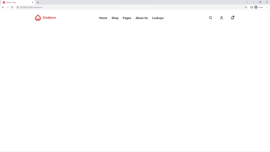
How to Add a Navigation Menu to the Fashion Ecommerce Website
You can download the complete source code of the eCommerce website to compare it with your code when you start experiencing errors.
We are going to start by creating the navigation menu of the fashion eCommerce website as shown in the Figma file design.
The navbar will consist of a logo at the left, the navigation menu in the center, and some icons at the far right.
Create a header element with a header class then copy and paste the HTML code for the navbar below in between the opening and closing header tags.
<!-- ====== Navigation ====== -->
      <nav class="navbar">
        <div class="row container d-flex">
          <div class="logo">
            <img src="./images/logo.svg" alt="" />
          </div>

          <div class="nav-list d-flex">
            <a href="">Home</a>
            <a href="">Shop</a>
            <a href="">Pages</a>
            <a href="">About Us</a>
            <a href="">Lookups</a>
            <div class="close">
              <i class="bx bx-x"></i>
            </div>
            <a class="user-link">Login</a>
          </div>

          <div class="icons d-flex">
            <div class="icon d-flex"><i class="bx bx-search"></i></div>
            <div class="icon user-icon d-flex">
              <i class="bx bx-user"></i>
            </div>
            <div class="icon d-flex">
              <i class="bx bx-bell"></i>
              <span></span>
            </div>
          </div>

          <!-- Hamburger -->
          <div class="hamburger">
            <i class="bx bx-menu-alt-right"></i>
          </div>
        </div>
      </nav>
To see the preview of the HTML in the browser, open the project with the live-server extension.
The navbar can now be considered as a skeleton so we need to add some flesh to it with CSS.
I used CSS Flexbox to position the logo, navigation menu, and icons on the right horizontally.
.header {
  margin-bottom: 4rem;

  /* ========== Navigation =========== */
  .navbar {
    padding: 2.5rem 0;
    position: relative;
    z-index: 1;

    .row {
      justify-content: space-between;

      .nav-list {
        a {
          display: inline-block;
          padding: 1rem;
          font-size: 1.7rem;
          font-weight: 500;
          color: var(--black-color);

          &.user-link {
            display: none;
          }

          &:not(:last-child) {
            margin-right: 0.5rem;
          }

          &:hover {
            color: var(--primary-color);
          }
        }
      }

      .icons {
        .icon {
          font-size: 2.2rem;
          padding: 0.5rem;
          color: var(--black-color);
          cursor: pointer;
          justify-content: center;
          position: relative;

          &:not(:last-child) {
            margin-right: 3rem;
          }

          span {
            display: block;
            width: 1rem;
            height: 1rem;
            background-color: var(--primary-color);
            border: 1px solid var(--black-color);
            position: absolute;
            top: 0.3rem;
            right: 0.4rem;
            border-radius: 50%;
          }

          &:hover {
            background-color: #f4f4f4;
          }
        }
      }
    }
  }

  .hamburger,
  .close {
    display: none;
  }
}
Here is what it looks like in the browser
To make the navigation menu responsive on all devices, we will use Flexbox and CSS position properties.
On wide screens, we will give the nav menu a right property of -100% to hide the menu and when the .nav-list has a second class of .show then the right property will now be 0 to show it.
We are going to use JavaScript to dynamically add the .show class anytime the hamburger icon is clicked.
In brief, we only want to make the navigation menu appear from the right when the .nav-list has a second class of .show .
Copy and paste the media queries below immediately after the styles of the .hamburger & .close.
@media (min-width: 1600px) {
    .header .navbar {
      padding: 4rem 0;
    }
  }

  @media (max-width: 768px) {
    .navbar .row .icons {
      display: none;
    }

    .navbar {
      .row {
        .nav-list {
          position: fixed;
          top: 0;
          // right: 0;
          right: -100%;
          width: 100%;
          max-width: 35rem;
          height: 100%;
          background-color: var(--white-color);
          z-index: 1000;
          flex-direction: column;
          align-items: flex-start;
          padding: 4rem 1rem;
          transition: 0.5s;

          a {
            font-size: 1.8rem;

            &:not(:last-child) {
              margin: 0 0 1rem 0;
            }
          }

          .close {
            display: block;
            position: absolute;
            top: 2.5rem;
            right: 2.5rem;
            color: var(--black-color);
            font-size: 3rem;
          }

          &.show {
            right: 0;
          }
        }

        .hamburger {
          display: block;
          font-size: 3rem;
          color: var(--black-color);
        }
      }
    }
  }
Copy and paste the JavaScript to toggle the .show class on the .nav-list element.
const navList = document.querySelector(".nav-list");

document.querySelector(".hamburger").onclick = () => {
  navList.classList.add("show");
};

document.querySelector(".close").onclick = () => {
  navList.classList.remove("show");
};
Here is what it looks like:
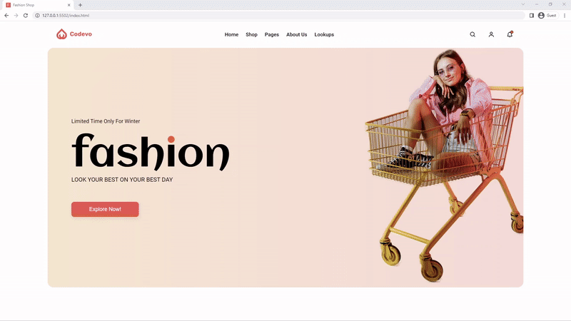
How to Add a Hero Header to the Fashion Ecommerce Website
The hero section consists of a woman sitting in a wheeled cart on the right and some text on the left.
The text content will consist of a span, a custom heading 1, a paragraph, and a call-to-action button.
Copy and paste the HTML for the hero section immediately after the ending nav tag.
<div class="hero">
        <div class="row container d-flex">
          <div class="col">
            <span class="subtitle">Limited Time Only For Winter</span>
            <h1>fash<span class="i">i</span>on</h1>
            <p>LOOK YOUR BEST ON YOUR BEST DAY</p>

            <button class="btn">Explore Now!</button>
          </div>
          <img src="./images/woman-in-cart.png" alt="" />
        </div>
      </div>
Below is the SASS code for the Hero section, I used
.header .hero {
  height: 80vh;
  margin: 0 3rem;

  .row {
    height: 100%;
    background: url('../images/bg.svg') center / cover no-repeat fixed;
    border-radius: 2rem;
    position: relative;

    .col {
      margin-left: 5rem;

      .subtitle {
        display: block;
        font-size: 1.8rem;
        margin-bottom: 4rem;
      }

      h1 {
        font-family: 'Aclonica', sans-serif;
        font-size: 13rem;
        line-height: 1;

        .i {
          color: var(--primary-color);
          position: relative;

          &:before {
            content: 'ı';
            position: absolute;
            color: var(--black-color);
          }
        }
      }

      p {
        font-size: 2rem;
        margin-bottom: 6rem;
      }

      .btn {
        display: inline-block;
        padding: 1.5rem 6rem;
        border-radius: 1rem;
        color: var(--white-color);
        font-weight: 500;
        font-size: 1.8rem;
        background: var(--btn-gradient);
        box-shadow: var(--box-shadow-1);
      }
    }

    img {
      position: absolute;
      right: 0;
      bottom: 0;
    }
  }
}

@media (max-width: 1600px) {
  .header .hero .row img {
    width: 40rem;
  }
}

@media (max-width: 1200px) {
  .header .hero .row .col h1 {
    font-size: 8rem;
  }
}

@media (max-width: 768px) {
  .header .hero {
    .row {
      .col {
        position: absolute;
        top: 10%;
        margin-left: 0;

        .subtitle {
          font-size: 1.6rem;
        }

        h1 {
          font-size: 7rem;
        }

        p {
          font-size: 1.6rem;
        }

        .btn {
          padding: 1.2rem 4rem;
        }
      }

      img {
        width: 40rem;
      }
    }
  }
}

@media (max-width: 567px) {
  .header .hero {
    height: 100vh;
    margin: 0 1rem;

    .row {
      .col {
        .subtitle {
          font-size: 1.6rem;
          margin-bottom: 1.5rem;
        }

        h1 {
          font-size: 7rem;
        }

        p {
          font-size: 1.6rem;
          margin-bottom: 2rem;
        }

        .btn {
          padding: 1.2rem 4rem;
        }
      }

      img {
        width: 25rem;
      }
    }
  }
}
Here is the preview in the browser
How to Add A Registration and Login Form to the Fashion Ecommerce Website
The registration and login form of the fashion eCommerce website is a bit complicated so I have to create another article for it.
Later I will include the link to that article but you can download the source code since it’s already included in the source code.
How to Add the Product Collection Section with Filtering
The product collection section consists of a slider and filtering functionalities of the fashion eCommerce website.
With the slider, we are going to use the SwiperJS library to make our lives easier.
You can use other slider libraries like GlideJS which is also written in vanilla Javascript.
Here is the HTML for the product collection section
<section class="section collection">
      <div class="title">
        <span>COLLECTION</span>
        <h2>Our Top Collection</h2>
      </div>
      <div class="filters d-flex">
        <div data-filter="Jewellery">Jewellery</div>
        <div data-filter="Accessories">Accessories</div>
        <div data-filter="Dresses">Dresses</div>
        <div data-filter="Footwear">Footwear</div>
      </div>

      <div class="products container">
        <div class="swiper mySwiper">
          <div class="swiper-wrapper" id="products">
            <div class="swiper-slide">
              <!-- <div class="product">
                <div class="top d-flex">
                  <img src="./images/product-1.png" alt="" />
                  <div class="icon d-flex">
                    <i class="bx bxs-heart"></i>
                  </div>
                </div>
                <div class="bottom">
                  <h4>Nike Air Men’s Hoodie - Imported Hoodie Red</h4>
                  <div class="d-flex">
                    <div class="price">$150</div>
                    <div class="rating">
                      <i class="bx bxs-star"></i>
                      <i class="bx bxs-star"></i>
                      <i class="bx bxs-star"></i>
                      <i class="bx bxs-star"></i>
                      <i class="bx bxs-star"></i>
                    </div>
                  </div>
                </div>
              </div> -->
            </div>
          </div>
        </div>
        <div class="pagination">
          <div class="custom-pagination"></div>
        </div>
      </div>
    </section>
You can see the HTML only contains one test product which I commented out. Later, we will use Javascript to fetch the products from the JSON file and dynamically display them in the browser.
Here are the SASS styles for the product collection section
.section {
  .title {
    text-align: center;
    margin-bottom: 5rem;

    span {
      display: inline-block;
      border-bottom: 3px solid var(--primary-color);
      padding-bottom: 0.5rem;
      margin-bottom: 2rem;
      position: relative;

      &::before {
        content: '';
        position: absolute;
        bottom: -0.7rem;
        right: 2rem;
        width: 1rem;
        height: 1rem;
        border-radius: 50%;
        background-color: var(--primary-color);
      }
    }

    h2 {
      font-size: 2.4rem;
    }
  }
}

.collection {
  .filters {
    justify-content: center;
    margin-bottom: 7rem;

    div {
      padding: 1.7rem 4rem;
      color: var(--default-color);
      font-size: 1.7rem;
      border-radius: 0.8rem;
      box-shadow: var(--box-shadow-1);
      cursor: pointer;

      &:not(:last-child) {
        margin-right: 4rem;
      }

      &:hover,
      &.active {
        background: var(--gradient);
        color: var(--white-color);
        box-shadow: var(--box-shadow-2);
      }
    }
  }

  .products {
    .swiper-wrapper {
      padding: 0 0 1.5rem;
    }

    .product {
      border-radius: 2.5rem;
      box-shadow: var(--box-shadow-1);
      overflow: hidden;

      .top {
        background: var(--gradient);
        height: 30rem;
        justify-content: center;
        position: relative;

        img {
          height: 25rem;
        }

        .icon {
          position: absolute;
          top: 2rem;
          right: 2rem;
          width: 4rem;
          height: 4rem;
          background-color: var(--primary-color);
          color: var(--white-color);
          border-radius: 50%;
          font-size: 2.5rem;
          justify-content: center;
          cursor: pointer;
          opacity: 0;
          visibility: hidden;
          transition: 0.3s;
        }

        &:hover .icon {
          opacity: 1;
          visibility: visible;
        }
      }

      .bottom {
        padding: 2.5rem 2rem;

        h4 {
          font-size: 1.8rem;
          width: 85%;
          height: 5rem;
          margin-bottom: 1.5rem;
        }

        .d-flex {
          justify-content: space-between;
        }

        .price {
          color: var(--white-color);
          background-color: var(--primary-color);
          border-radius: 1rem;
          padding: 0.5rem 2rem;
        }

        .rating {
          color: var(--primary-color);

          i:not(:last-child) {
            margin-right: 0.3rem;
          }
        }
      }
    }

    .pagination {
      text-align: center;
      margin-top: 3rem;

      .swiper-pagination-bullet {
        background-color: var(--primary-color);
        height: 1rem;
        width: 1rem;
      }

      .swiper-pagination-bullet-active {
        width: 3rem;
        border-radius: 1.5rem;
      }
    }
  }
}

@media (min-width: 1600px) {
  .collection .products .product .top {
    height: 35rem;
  }
}

@media (max-width: 768px) {
  .collection {
    .filters {
      margin-bottom: 7rem;

      div {
        padding: 1.2rem 2.5rem;
        font-size: 1.6rem;

        &:not(:last-child) {
          margin-right: 2rem;
        }
      }
    }
  }
}

@media (max-width: 567px) {
  .collection {
    .filters {
      flex-wrap: wrap;

      div {
        padding: 0.7rem 1rem;
        font-size: 1.5rem;
        margin-bottom: 1rem;

        &:not(:last-child) {
          margin-right: 1rem;
        }
      }
    }
  }
}
When working with SwiperJS, you need to create an instance of the Swiper class and pass two arguments, the class or id selector of the slider HTML element and an options object containing some customizations.
Copy and paste the slider code into the product.js file
const swiper = new Swiper(".mySwiper", {
  grabCursor: true,
  slidesPerView: 1,
  spaceBetween: 70,
  pagination: {
    el: ".custom-pagination",
    clickable: true,
  },
  breakpoints: {
    567: {
      slidesPerView: 2,
    },
    996: {
      slidesPerView: 3,
    },
  },
});
Here is the Javascript code to fetch the products from the JSON file.
const getProducts = async () => {
  try {
    const results = await fetch("./data/products.json");
    const data = await results.json();
    const products = data.products;
    return products;
  } catch (err) {
    console.log(err);
  }
};

const ProductsWrapper = document.getElementById("products");

window.addEventListener("DOMContentLoaded", async function () {
  let products = await getProducts();
  products = products.filter((product) => product.category === "Dresses");
  displayProductItems(products);
  loadData();
});
Here is the JS code to dynamically display the projects on the screen
const displayProductItems = (items) => {
  let displayProduct = items.map(
    (product) => `
                 <div class="swiper-slide">
              <div class="product">
                <div class="top d-flex">
                  <img src=${product.url} alt="" />
                  <div class="icon d-flex">
                    <i class="bx bxs-heart"></i>
                  </div>
                </div>
                <div class="bottom">
                  <h4>${product.title}</h4>
                  <div class="d-flex">
                    <div class="price">$${product.price}</div>
                    <div class="rating">
                      <i class="bx bxs-star"></i>
                      <i class="bx bxs-star"></i>
                      <i class="bx bxs-star"></i>
                      <i class="bx bxs-star"></i>
                      <i class="bx bxs-star"></i>
                    </div>
                  </div>
                </div>
              </div>
            </div>
                  `
  );

  displayProduct = displayProduct.join("");
  ProductsWrapper.innerHTML = displayProduct;
};
Below is the JS code to filter the products based on their categories
const filters = [...document.querySelectorAll('.filters div')];

filters.forEach((filter) => {
  filters[2].classList.add('active');
  filter.addEventListener('click', async (e) => {
    const id = e.target.getAttribute('data-filter');
    const target = e.target;
    const products = await getProducts();
    filters.forEach((btn) => {
      btn.classList.remove('active');
    });
    target.classList.add('active');

    let menuCategory = products.filter((product) => {
      if (product.category === id) {
        return product;
      }
    });

    displayProductItems(menuCategory);
    swiper.update();
  });
});
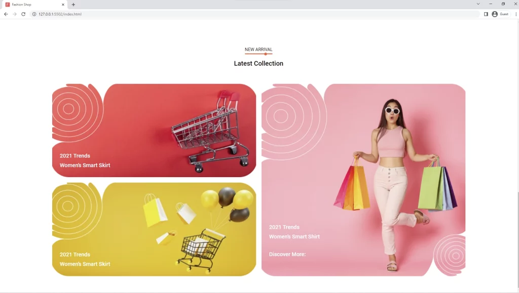
How to Add the New Arrivals Section
The new arrival section is quite simple because it comprises three images with text overlays.
Here is the HTM for the new arrival section
<section class="section new-arrival">
      <div class="title">
        <span>NEW ARRIVAL</span>
        <h2>Latest Collection</h2>
      </div>

      <div class="row container">
        <div class="col col-1">
          <img src="./images/poster-1.png" alt="" />
          <h3>
            2021 Trends <br />
            Women’s Smart Skirt
          </h3>
        </div>
        <div class="col col-2">
          <img src="./images/poster-2.png" alt="" />
          <h3>
            2021 Trends <br />
            Women’s Smart Skirt
          </h3>
        </div>
        <div class="col col-3">
          <img src="./images/poster-3.png" alt="" />
          <h3>
            2021 Trends <br />
            Women’s Smart Shirt <br />
            <span>Discover More:</span>
          </h3>
        </div>
      </div>
    </section>
For the SCSS, we are going to utilize CSS Grid to position the images in different columns and rows depending on the viewport of the screen.
.new-arrival {
  .row {
    display: grid;

    .col {
      position: relative;
      padding: 1rem;

      img {
        width: 100%;
        height: 100%;
        object-fit: cover;
      }

      &-1,
      &-2 {
        grid-column: 1;
      }

      &-3 {
        grid-column: 2;
        grid-row: 1 / span 2;
      }

      h3 {
        position: absolute;
        bottom: 10%;
        left: 5%;
        color: var(--white-color);
        font-size: 2rem;
        line-height: 3.5rem;

        span {
          display: block;
          margin-top: 3rem;
        }
      }
    }
  }
}

@media (max-width: 967px) {
  .new-arrival {
    .row {
      .col {
        h3 {
          font-size: 1.6rem;
          line-height: 2.5rem;
        }
      }
    }
  }
}

@media (max-width: 768px) {
  .new-arrival {
    .row {
      display: block;
      .col {
        h3 {
          bottom: 15%;
          font-size: 1.5rem;
          line-height: 2rem;
        }
      }
    }
  }
}
Here is the preview of the new arrivals section
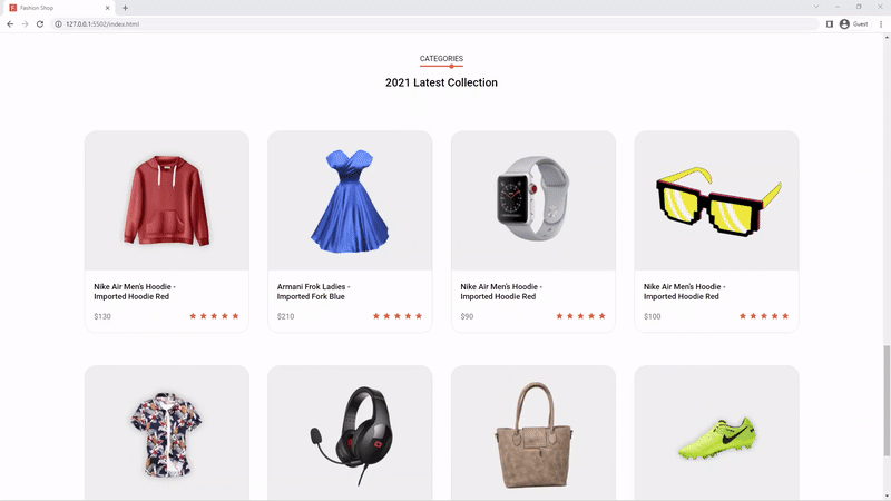
How to Add the Products Section
The products section is somehow similar to the product collection section since we’ll be fetching the products from the JSON file and displaying them on the screen.
This section also has a load more button to load more products when clicked.
Here is the HTML code for the products section
<section class="section categories">
      <div class="title">
        <span>CATEGORIES</span>
        <h2>2021 Latest Collection</h2>
      </div>

      <div class="products container">
        <!-- <div class="product">
          <div class="top d-flex">
            <img src="./images/product-1.png" alt="" />
            <div class="icon d-flex">
              <i class="bx bxs-heart"></i>
            </div>
          </div>
          <div class="bottom">
            <div class="d-flex">
              <h4>Nike Air Men’s Hoodie - Imported Hoodie Red</h4>
              <a href="" class="btn cart-btn">Add to Cart</a>
            </div>
            <div class="d-flex">
              <div class="price">$150</div>
              <div class="rating">
                <i class="bx bxs-star"></i>
                <i class="bx bxs-star"></i>
                <i class="bx bxs-star"></i>
                <i class="bx bxs-star"></i>
                <i class="bx bxs-star"></i>
              </div>
            </div>
          </div>
        </div> -->
      </div>

      <div class="button d-flex">
        <a class="btn loadmore">Load More</a>
      </div>
    </section>
The HTML for the products section is also simple because we’ll use Javascript to dynamically add the products to the HTML.
Here are the styles for the products section
.categories {
  .products {
    display: grid;
    grid-template-columns: repeat(auto-fit, minmax(30rem, 1fr));
    gap: 7rem 4rem;
    padding-top: 4rem;
  }

  .product {
    border-radius: 2.5rem;
    border: 1px solid rgba(#909090, 25%);
    overflow: hidden;
    transition: 0.3s;

    .top {
      background: var(--grey-color);
      height: 30rem;
      justify-content: center;
      position: relative;
      transition: 0.3s;

      img {
        height: 23rem;
      }

      .icon {
        position: absolute;
        top: 2rem;
        right: 2rem;
        width: 4rem;
        height: 4rem;
        background-color: var(--primary-color);
        color: var(--white-color);
        border-radius: 50%;
        font-size: 2.5rem;
        justify-content: center;
        cursor: pointer;
        opacity: 0;
        visibility: hidden;
        transition: 0.3s;
      }
    }

    .bottom {
      padding: 2.5rem 2rem;
      background-color: var(--white-color);

      h4 {
        font-size: 1.7rem;
        height: 5rem;
        transition: 0.3s;
      }

      .d-flex {
        justify-content: space-between;

        &:first-child {
          margin-bottom: 1.5rem;
          align-items: flex-start;
        }
      }

      .cart-btn {
        color: var(--white-color);
        background-color: var(--primary-color);
        border-radius: 1rem;
        padding: 0.8rem 1rem;
        white-space: nowrap;
        visibility: hidden;
        opacity: 0;
        transition: 0.3s;
      }

      .price {
        color: #909090;
        font-weight: 500;
      }

      .rating {
        color: var(--primary-color);

        i:not(:last-child) {
          margin-right: 0.3rem;
        }
      }
    }

    &:hover {
      border: none;
      transform: scale(1.1);
      box-shadow: var(--box-shadow-1);

      .top {
        background: var(--gradient);

        .icon {
          opacity: 1;
          visibility: visible;
        }
      }

      .cart-btn {
        visibility: visible;
        opacity: 1;
      }
    }
  }

  .button {
    justify-content: center;
    margin-top: 8rem;

    .btn {
      display: inline-block;
      padding: 1.5rem 6rem;
      border-radius: 1rem;
      color: var(--white-color);
      font-weight: 500;
      font-size: 1.8rem;
      background: var(--btn-gradient);
      box-shadow: var(--box-shadow-1);
      cursor: pointer;
    }
  }
}
In the SCSS, we used CSS Grid to make the products responsive on different screens with just one line of code.
grid-template-columns: repeat(auto-fit, minmax(30rem, 1fr));
Below is the Javascript code to dynamically display the products on the screen and also add the load more functionality.
const categoriesProducts = document.querySelector('.categories .products');
const loadmore = document.querySelector('.loadmore');

let currentIndex = 0;
async function loadData() {
  let maxResult = 8;
  let products = await getProducts();
  if (currentIndex >= products.length) {
    loadmore.disabled = true;
    loadmore.innerText = 'No More Products';
    return;
  }

  for (var i = 0; i < maxResult; i++) {
    const product = products[i + currentIndex];
    categoriesProducts.insertAdjacentHTML(
      'beforeend',
      `<div class="product">
          <div class="top d-flex">
            <img src=${product.url} alt="" />
            <div class="icon d-flex">
              <i class="bx bxs-heart"></i>
            </div>
          </div>
          <div class="bottom">
            <div class="d-flex">
              <h4>${product.title}</h4>
              <a href="" class="btn cart-btn">Add to Cart</a>
            </div>
            <div class="d-flex">
              <div class="price">$${product.price}</div>
              <div class="rating">
                <i class="bx bxs-star"></i>
                <i class="bx bxs-star"></i>
                <i class="bx bxs-star"></i>
                <i class="bx bxs-star"></i>
                <i class="bx bxs-star"></i>
              </div>
            </div>
          </div>
        </div>`
    );
  }

  currentIndex += maxResult;
}

loadmore.addEventListener('click', loadData);
Here is how the products section looks like in the browser
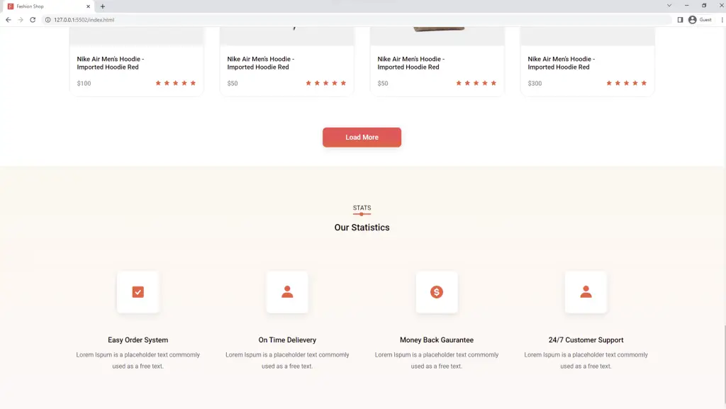
How to Add the Statistics Section
The statistics section is also simple. This section has a background gradient color with four cards placed in four grid columns.
Each card has an icon, a heading, and some paragraph text.
Here is the HTML for the statistical section
 <section class="section statistics">
      <div class="title">
        <span>STATS</span>
        <h2>Our Statistics</h2>
      </div>

      <div class="row container">
        <div class="col">
          <div class="icon">
            <i class="bx bxs-check-square"></i>
          </div>
          <h3>Easy Order System</h3>
          <p>Lorem Ispum is a placeholder text commomly used as a free text.</p>
        </div>
        <div class="col">
          <div class="icon">
            <i class="bx bxs-user"></i>
          </div>
          <h3>On Time Delievery</h3>
          <p>Lorem Ispum is a placeholder text commomly used as a free text.</p>
        </div>
        <div class="col">
          <div class="icon">
            <i class="bx bxs-dollar-circle"></i>
          </div>
          <h3>Money Back Gaurantee</h3>
          <p>Lorem Ispum is a placeholder text commomly used as a free text.</p>
        </div>
        <div class="col">
          <div class="icon">
            <i class="bx bxs-user"></i>
          </div>
          <h3>24/7 Customer Support</h3>
          <p>Lorem Ispum is a placeholder text commomly used as a free text.</p>
        </div>
      </div>
    </section>
Below are the styles for the statistical section. I also used a CSS grid to make the different columns responsive on different screens.
.statistics {
  padding: 10rem 0 10rem;
  background: linear-gradient(
    to bottom,
    rgba(#fccb90, 15%),
    rgba(#ffb9bc, 10%)
  );

  .title {
    margin-bottom: 10rem;
  }

  .row {
    display: grid;
    grid-template-columns: repeat(auto-fit, minmax(25rem, 1fr));
    gap: 3rem;

    .col {
      display: flex;
      align-items: center;
      flex-direction: column;
      text-align: center;

      .icon {
        display: flex;
        align-items: center;
        justify-content: center;
        width: 11rem;
        height: 11rem;
        font-size: 4rem;
        background: var(--white-color);
        border-radius: 1rem;
        box-shadow: var(--box-shadow-1);
        color: var(--primary-color);
        margin-bottom: 6rem;

        &:hover {
          background-color: var(--primary-color);
          color: var(--white-color);
          box-shadow: var(--box-shadow-2);
        }
      }

      h3 {
        margin-bottom: 1.2rem;
      }

      p {
        color: var(--default-color);
      }
    }
  }
}

@media (max-width: 768px) {
  .statistics {
    .row {
      .col {
        .icon {
          width: 8rem;
          height: 8rem;
          font-size: 3rem;
        }

        p {
          width: 80%;
          margin: 0 auto;
        }
      }
    }
  }
}
Here is the preview of the statistic section in the browser
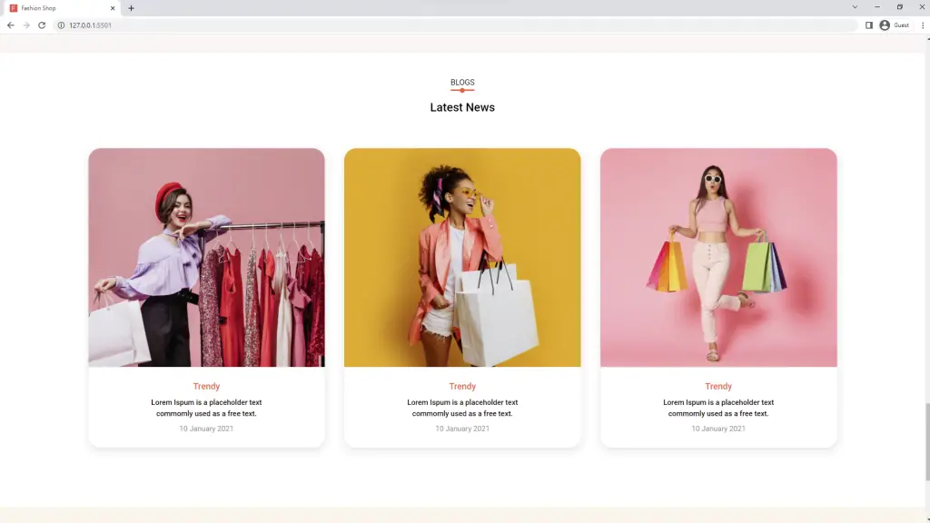
How to Add the Fashion Ecommerce Blog Section
This section contains the featured blog posts of the fashion eCommerce website. It’s always recommended to add a blog section to your eCommerce websites to drive organic traffic from search engines.
Here is the HTML code for the blog section
<section class="section blog">
      <div class="title">
        <span>BLOGS</span>
        <h2>Latest News</h2>
      </div>

      <div class="row container">
        <div class="col">
          <div class="top">
            <img src="./images/blog-1.png" alt="" />
          </div>
          <div class="bottom">
            <h3>Trendy</h3>
            <h4>
              Lorem Ispum is a placeholder text commomly used as a free text.
            </h4>
            <span>10 January 2021</span>
          </div>
        </div>
        <div class="col">
          <div class="top">
            <img src="./images/blog-2.png" alt="" />
          </div>
          <div class="bottom">
            <h3>Trendy</h3>
            <h4>
              Lorem Ispum is a placeholder text commomly used as a free text.
            </h4>
            <span>10 January 2021</span>
          </div>
        </div>
        <div class="col">
          <div class="top">
            <img src="./images/blog-3.png" alt="" />
          </div>
          <div class="bottom">
            <h3>Trendy</h3>
            <h4>
              Lorem Ispum is a placeholder text commomly used as a free text.
            </h4>
            <span>10 January 2021</span>
          </div>
        </div>
      </div>
    </section>
Here are the SCSS styles for the blog section
.blog {
  .title {
    margin-bottom: 7rem;
  }

  .row {
    display: grid;
    grid-template-columns: repeat(auto-fit, minmax(30rem, 1fr));
    gap: 4rem;

    .col {
      border-radius: 2.5rem;
      overflow: hidden;
      box-shadow: var(--box-shadow-1);

      .top {
        height: 45rem;

        img {
          height: 100%;
          object-fit: cover;
        }
      }

      .bottom {
        text-align: center;
        padding: 3rem 0;

        h3 {
          color: var(--primary-color);
          margin-bottom: 1rem;
          font-size: 1.8rem;
        }

        h4 {
          max-width: 50%;
          margin: 0 auto 1rem;
          font-size: 1.5rem;
          line-height: 1.5;
        }

        span {
          color: #909090;
          font-size: 1.5rem;
        }
      }
    }
  }
}

@media (max-width: 1600px) {
  .blog {
    .row {
      .col {
        .top {
          height: 30rem;
        }
        .bottom {
          h4 {
            max-width: 85%;
          }
        }
      }
    }
  }
}
Here is the preview of the blog section
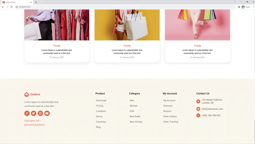
How to Add the Footer Section
At last, we are now on the last section of the fashion eCommerce website.
The footer contains four columns on wide screens and a single column on mobile devices.
The footer has generic links to navigate to other pages of the fashion eCommerce website and some social media icons.
Here is the HTML for the footer
<footer class="footer">
      <div class="row container">
        <div class="col">
          <div class="logo d-flex">
            <img src="./images/logo.svg" alt="logo" />
          </div>
          <p>
            Lorem ispum is a placeholder text <br />
            commonly used as a free text.
          </p>
          <div class="icons d-flex">
            <div class="icon d-flex">
              <i class="bx bxl-facebook"></i>
            </div>
            <div class="icon d-flex"><i class="bx bxl-twitter"></i></div>
            <div class="icon d-flex"><i class="bx bxl-instagram"></i></div>
            <div class="icon d-flex"><i class="bx bxl-youtube"></i></div>
          </div>
          <p class="color">
            Copyrights 2021 <br />
            @Iamabdulqadeer01
          </p>
        </div>
        <div class="col">
          <div>
            <h4>Product</h4>
            <a href="">Download</a>
            <a href="">Pricing</a>
            <a href="">Locations</a>
            <a href="">Server</a>
            <a href="">Countries</a>
            <a href="">Blog</a>
          </div>
          <div>
            <h4>Category</h4>
            <a href="">Men</a>
            <a href="">Women</a>
            <a href="">Kids</a>
            <a href="">Best Seller</a>
            <a href="">New Arrivals</a>
          </div>
          <div>
            <h4>My Account</h4>
            <a href="">My Account</a>
            <a href="">Discount</a>
            <a href="">Returns</a>
            <a href="">Order History</a>
            <a href="">Order Tracking</a>
          </div>
          <div>
            <h4>Contact Us</h4>
            <div class="d-flex">
              <div class="icon"><i class="bx bxs-map"></i></div>
              <span>123 Street Trafford, London, UK</span>
            </div>
            <div class="d-flex">
              <div class="icon"><i class="bx bxs-envelope"></i></div>
              <span>info@sitename.com</span>
            </div>
            <div class="d-flex">
              <div class="icon"><i class="bx bxs-phone"></i></div>
              <span>+456 789 789 001</span>
            </div>
          </div>
        </div>
      </div>
    </footer>
Here are the styles for the footer section. I used Grid columns to make the footer adapt to different screen sizes.
.footer {
  background-color: rgba(#fccb90, 15%);
  padding: 10rem 3rem 10rem;
  margin-top: 7rem;

  .row {
    display: grid;
    grid-template-columns: 1fr 2fr;
    gap: 3rem;

    .col {
      .logo {
        margin-bottom: 2.5rem;
      }

      &:first-child p {
        margin-bottom: 2rem;
        color: #4f5665;
        font-size: 1.7rem;
      }

      .icons {
        margin-bottom: 2rem;
      }

      .icon {
        color: var(--white-color);
        justify-content: center;
        height: 4rem;
        width: 4rem;
        font-size: 2.5rem;
        border-radius: 50%;
        background-color: var(--primary-color);
        cursor: pointer;

        &:not(:last-child) {
          margin-right: 1rem;
        }
      }

      &:first-child .color {
        color: var(--primary-color);
      }

      &:last-child {
        display: grid;
        grid-template-columns: repeat(4, 1fr);

        div {
          display: flex;
          flex-direction: column;

          a {
            font-size: 1.7rem;
            padding: 0.5rem;
            margin-bottom: 1rem;
            color: #4f5665;
          }
        }

        h4 {
          font-size: 2rem;
          font-weight: 500;
          margin-bottom: 2.5rem;
        }

        .d-flex {
          flex-direction: row;
          margin-bottom: 2rem;

          .icon {
            display: flex;
            align-items: center;
            justify-content: center;
            font-size: 1.5rem;
            width: auto;
            height: auto;
            padding: 0.7rem;
          }

          span {
            font-size: 1.8rem;
            color: #4f5665;
          }
        }
      }
    }
  }
}

@media (max-width: 1200px) {
  .footer .col:first-child {
    display: none;
  }

  .footer .row {
    display: block;
  }
}

@media (max-width: 768px) {
  .footer .row {
    .col:last-child {
      grid-template-columns: 1fr;
      gap: 3rem 0;
    }
  }
}
Here is what the footer looks like in the browser
Conclusion
In this article, you have learned how to make a:
- responsive fashion eCommerce website
- blogs section
- sliders with SwiperJS library
This is how you can build a responsive fashion eCommerce website with HTML, CSS, and Javascript. Feel free to add more functionalities and pages to make it more appealing.
Click on the download button below to download the complete source code of the fashion eCommerce website.
Is there a way to load more products of each category rather than all the products. So if footwear was selected, all the footwear products would be displayed with the load more button.
You need to modify the JavaScript logic to filter by category.