
Technology has become crucial in this day and age – having a good landing page for your business is very essential. With a decent amount of traffic, you can drive customers to your site where they’ll find your products and services and hopefully take action.
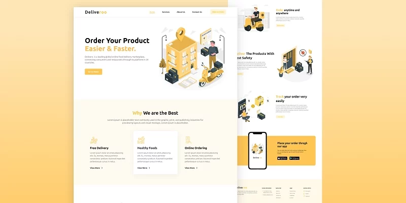
In this well-structured tutorial, I’m going to take you through how you can build a landing page for a Food Ordering Company with only HTML, CSS and JavaScript.
The name of our fictional Food Ordering Company is Deliveroo, and its purpose is to provide food Ordering services to customers.
At the end of this article, you will be able to make:
- a preloader
- a responsive navbar and hamburger menu
- a scroll-to-top button
- a responsive landing page
Don’t get too overwhelmed because it doesn’t end there, you will also improve your CSS skills after completing this tutorial.
Resources
- Figma File Design of the Food Ordering Company Website
- Starter Files on Github
- Github Repo for the Food Ordering Company Website
- Google Fonts
At the end of this article, you will learn how to build a Responsive Food Ordering Website for a fictional company from scratch with modern HTML and CSS skills.
How to download the images used in the Food Ordering Company Landing Page
To download the images, visit DownGit, copy and paste the link below into the URL bar and click on the “Download” button.
https://github.com/wpcodevo/LC-24-deliveroo/tree/setup/images
After the download is complete extract the images folder from the zip file.
The Project Folder Structure
The folder structure is simple and does not follow the convention most front end developers use – my focus is to make things simple so that beginners can also code along.
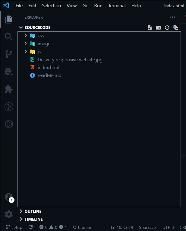
In the root directory, there are three folders – an images folder, a CSS folder, and a JS folder. Both the CSS and JS folders contain styles.css and main.js files respectively.
Also, there is an index.html, readMe.md, and screenshot files in the root directory.
Basic HTML Boilerplates
The basic HTML boilerplate code looks like this:
<!DOCTYPE html>
<html lang="en">
  <head>
    <meta charset="UTF-8" />
    <meta http-equiv="X-UA-Compatible" content="IE=edge" />
    <meta name="viewport" content="width=device-width, initial-scale=1.0" />
    <title>Deliveroo</title>
    <!-- StyleSheets -->
    <link rel="stylesheet" href="./css/styles.css" />
  </head>
  <body>
    <!-- Preloader -->

    <!-- Header -->

    <!-- Home -->

    <!-- Services -->

    <!-- About #1 -->

    <!-- About #2 -->

    <!-- About #3 -->

    <!-- App -->

    <!-- Footer -->

    <!-- Go To Top -->

    <!-- Scripts -->
    <script src="./js/main.js"></script>
  </body>
</html>
How to Make the Navbar
The navbar will consist of a logo that will be placed at the left and a nav menu at the right. Later when we make the landing page responsive with media queries then we will put a hamburger icon on the far right to toggle the nav menu.
With the logo, we will be using text since it’s not that difficult to implement. A span with a class of “yellow” will be placed in a link tag so that we can style it differently.
The HTML for the logo looks like this:
<header class="header">
      <a href="/" class="logo">Delive<span class="yellow">roo</span></a>
</header>
It’s a combination of two words “Delive” and “roo”, with “roo” having a yellow color.
The navigation menu items are generic links placed in a nav HTML tag, as shown in the HTML snippets below:
 <nav class="navbar">
        <a href="#home">Home</a>
        <a href="#services">Services</a>
        <a href="#about">About Us</a>
        <a href="#contact">Contact Us</a>
        <a href="" class="btn">Make an Order</a>
      </nav>
In addition, we need a hamburger icon for toggling the mobile menu. The hamburger icon will be hidden on larger viewport devices and visible on smaller screens.
The HTML for the hamburger icon:
<!-- Hamburger -->
      <div class="hamburger">
        <img src="./images/grid-outline.svg" alt="" />
      </div>
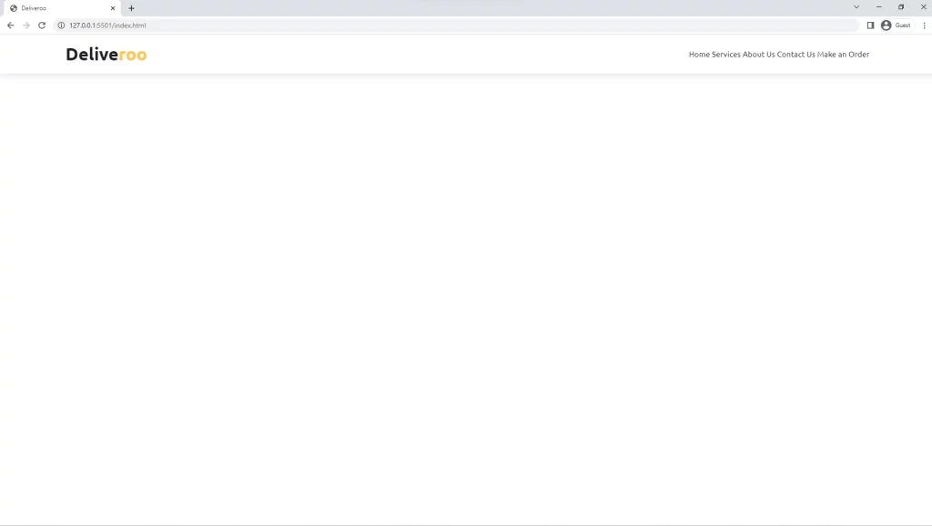
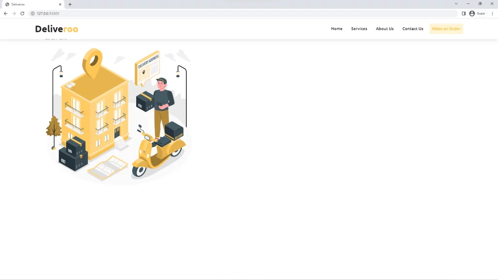
Run the project with Live Server to see the preview in the browser. The nav menu now looks like this in the browser
How to Style the Navbar
At this point, the navbar looks ugly so we need to style it with CSS. We need to style the logo to make it look like what was in the Figma file design. Also, we will be utilizing Flexbox to properly align and position both the logo and menu items side by side.
For this web page, I will be using Ubuntu font throughout. I also have some CSS Reset code, basic reusable CSS code, and CSS variables containing all the color variables we need in this project.
@import url('https://fonts.googleapis.com/css2?family=Ubuntu:wght@300;400;500;700&display=swap');

/* =========== CSS Variables =========== */

:root {
  --black: #1f1f1f;
  --white: #fff;
  --yellow: #ffc554;
  --deep-yellow: #ffc727;
  --bg-yellow: #fffaf1;
  --btn-yellow: #fff4d4;
  --footer-yellow: #fff9e9;
  --grey: #737373;
  --box-shadow: 0 0.5rem 1.5rem rgba(0, 0, 0, 0.1);
  --transition: all 0.2s linear;
}

/* =========== Basic Reset =========== */

*,
*::after,
*::before {
  box-sizing: inherit;
  margin: 0;
  padding: 0;
}

html {
  font-size: 62.5%;
  box-sizing: border-box;
}

body {
  font-family: 'Ubuntu', sans-serif;
  font-size: 1.6rem;
  font-weight: 400;
  color: var(--black);
}

a {
  text-decoration: none;
  color: inherit;
}

li {
  list-style: none;
}

img {
  height: 100%;
}

section {
  padding: 2rem 9%;
}

.yellow {
  color: var(--yellow);
}

/* =========== Header =========== */

/* =========== Home =========== */

/* =========== Services =========== */

/* =========== About =========== */

/* =========== App =========== */

/* =========== Footer =========== */

/* =========== Preloader =========== */

/* =========== Scroll To Top =========== */
From the CSS snippet code above, I already included the Ubuntu Google font. It is always a good convention to remove the default browser margin and padding assigned to all elements by browsers and also set box-sizing to inherit.
I could have set box-sizing to border-box in the universal selectors but it is good practice to set box-sizing to border-box in the HTML tag so that all elements can inherit it.
I also set the root font size to 62.5% which is equivalent to 1rem or 10px, which means 1.6rem will be equivalent to 16px.
Let’s style the logo by reducing the font size and setting the font weight to 500
.logo {
  font-size: 3.6rem;
  font-weight: 700;
}
To position the logo, hamburger, and menu items side by side, I will be using Flexbox. Remember we will later hide the hamburger and only make it visible on larger screens.
.header {
  position: fixed;
  top: 0;
  left: 0;
  right: 0;
  padding: 1rem 7%;
  height: 8rem;
  background: var(--white);
  display: flex;
  align-items: center;
  justify-content: space-between;
  box-shadow: var(--box-shadow);
  z-index: 1000;
}
I applied a box shadow to make the navbar stand out and also help the user know where the navbar ends.
I also made the navbar fixed, so that it always stays at the top whenever the user scrolls down.
I did it with these 4 lines of CSS:
position: fixed;
  top: 0;
  left: 0;
  right: 0;
To make the hamburger visible you need to give the img tag a width of 3rem.
To hide the hamburger, am going to select the .hamburger class and give it a display of none. Also, let’s select the img tag in the hamburger and set the width to 3rem.
.header .hamburger img {
  width: 3rem;
}

.header .hamburger {
  display: none;
}
The navbar should look better
We also need to make sure the nav items are spaced out properly, padding and margin will be helpful here.
.navbar a {
  font-weight: 500;
  transition: var(--transition);
  padding: 1rem;
  border-bottom: 2px solid transparent;
}

.navbar a:not(:last-child) {
  margin-right: 1rem;
}

.navbar a:hover {
  color: var(--yellow);
  border-color: var(--yellow);
}
From the design, the last nav item is actually a button so we need to style it accordingly.
.btn {
  display: inline-block;
  color: var(--yellow);
  background-color: var(--btn-yellow);
  padding: 1rem;
  border-radius: 0.5rem;
  transition: var(--transition);
}

.btn:hover {
  box-shadow: var(--box-shadow);
}
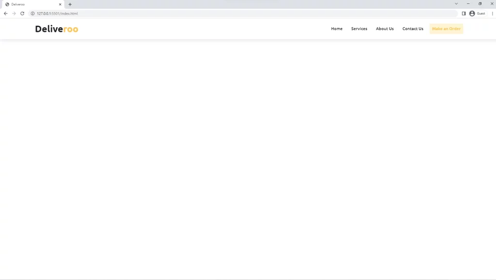
Now the navbar looks great
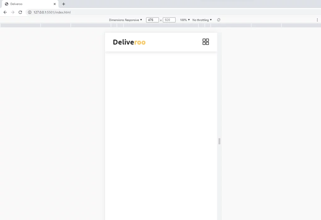
How to Make the Navbar Responsive
The navbar is not responsive yet, so we should fix that.
To make the navbar responsive, we need to make the hamburger visible on smaller devices using media queries.
With a viewport less than 996px, let’s reduce the size of the logo, the padding, and the margin of the nav items.
@media (max-width: 996px) {
  .logo {
    font-size: 3rem;
  }

  .navbar a {
    padding: 0.5rem;
  }

  .navbar a:not(:last-child) {
    margin-right: 0.5rem;
  }
}
Now, let’s work on viewports less than 768px, I will start making the navbar have a position fixed, and also with the help of Flexbox let’s align the nav items vertically.
I made the navbar have a top property of -100% to hide it at the top. Later will use a secondary class of .show. That means we will use JavaScript to add the second class to the navbar element.
Next, since we added a display property of none to the hamburger, we need to make it visible on smaller screens by setting the display property to block.
@media (max-width: 768px) {
  .header .navbar {
    position: fixed;
    /* top: 9rem; */
    left: 0;
    right: 0;
    width: 90%;
    padding: 2.5rem;
    margin: 0 auto;
    box-shadow: var(--box-shadow);
    background-color: var(--white);
    text-align: center;
    border-radius: 1.5rem;
    display: flex;
    flex-direction: column;
    transition: 0.4s;
    top: -100%;
  }

  .header .navbar a:last-child {
    display: none;
  }

  .header .hamburger {
    display: block;
  }

  .navbar.show {
    top: 9rem;
  }
}
So far so good
To make the nav items visible, you have to dynamically add a class attribute show to the navbar tag and also set the top to 9rem.
@media (max-width: 768px) {
  .navbar.show {
    top: 9rem;
  }
}
To accomplish this, we need to write some JavaScript to toggle the show class.
const navbar = document.querySelector(".navbar");
const hamburger = document.querySelector(".hamburger");

hamburger.addEventListener("click", () => {
  navbar.classList.toggle("show");
});
Here is what I did in the JavaScript snippet code to toggle the class attribute show:
- I selected the
.navbarusing document.querySelector() and assigned it to a variable navbar using the const keyword. - I also selected the
.hamburgerclass and assigned it to a variable hamburger - I added an event listener to the hamburger, the actual event is a click event. I then use the toggle() method to add and remove the show class.
At this stage, the navbar can now be toggled in and out with the hamburger.
But there’s a big problem. The nav menu items are not hidden any time one of the menu links is clicked. For a better user experience, we need to also add a smooth scroll to the web page any time one of the menu links is clicked.
To do this, we need more JavaScript:
- Let’s select the
.headerclass usingdocument.querySelector('.header')and assign it to a header variable. - Next, let’s select all the nav links but not the last child using
document.querySelectorAll('.navbar a:not(:last-child)')and assign it to a scrollLink variable. - Now, convert the scrollLink from node-list to array using
Array.from(scrollLink)and use a map() method on it. Add a click event listener to the iterable variable - Get the href of each of the links without the # sign and assign it to a variable id then use
document.getElementById(id)to get their actual elements. - Calculate the offset top then subtract 90 from it and assign the resulting value to a variable position.
- Add a scrollTo() to the window object and set left to 0, top to our position variable, and behavior to smooth.
Your final code should look like the snippets below
const header = document.querySelector('.header');
const scrollLink = document.querySelectorAll('.navbar a:not(:last-child)');

Array.from(scrollLink).map((link) => {
  link.addEventListener('click', (e) => {
    // Prevent Default
    e.preventDefault();

    const id = e.currentTarget.getAttribute('href').slice(1);
    const element = document.getElementById(id);
    let position = element.offsetTop - 90;

    window.scrollTo({
      left: 0,
      top: position,
      behavior: 'smooth',
    });
    navbar.classList.remove('show');
  });
});
Note: When you click on the nav links there would be an error since we haven’t added the sections yet.
How to build the Hero Sections
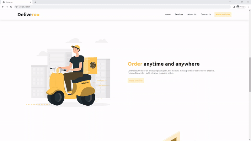
The hero section is going to contain a short description of our fictional company with a call-to-action button at the left and an image at the right.
Below is the code snippet of the Hero Section
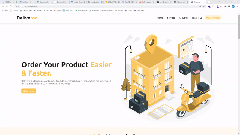
<section class="home" id="home">
      <div class="content">
        <h1>Order Your Product <span class="yellow">Easier & Faster.</span></h1>
        <p>
          Delivero is a leading global online food delivery marketplace,
          connecting consumers and restaurants through its platform in 24
          countries.
        </p>
        <a href="#" class="home-btn">Go to Menu</a>
      </div>
      <div class="image">
        <img src="./images/Delivery address.svg" alt="" />
      </div>
    </section>
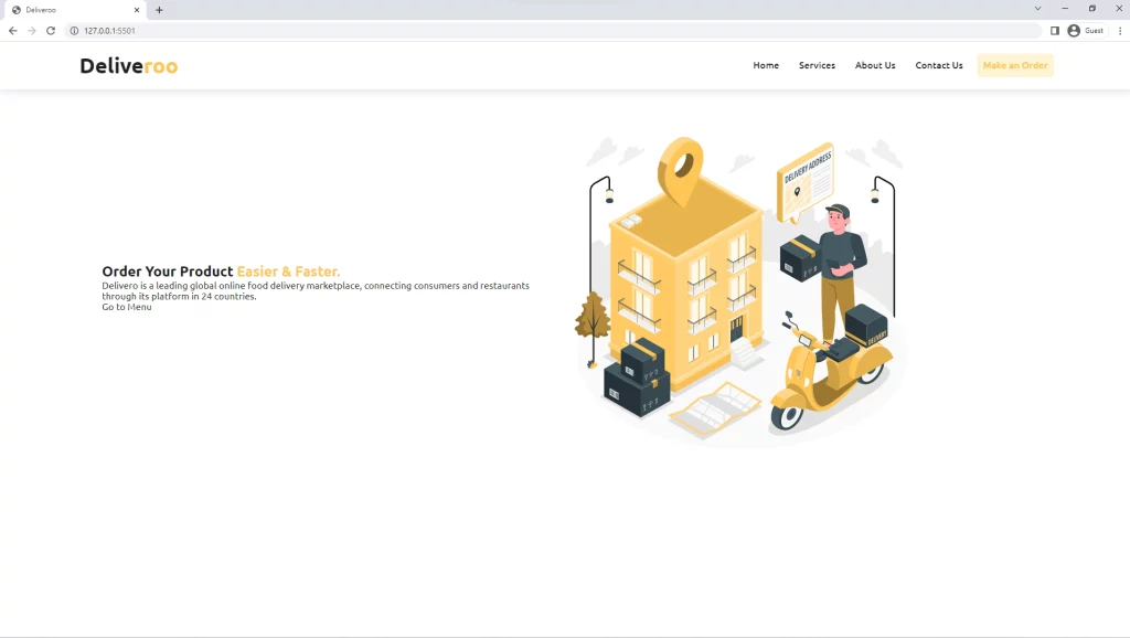
With the HTML above, this is the preview in the browser
How to Style the Hero Section
To align the content and the image side by side, we need CSS Grid.
.home {
  padding-top: 13rem;
  display: grid;
  grid-template-columns: 1fr 1fr;
  align-items: center;
  gap: 2rem;
}
Note: I added a generic style where I set padding left and right to 9% for all the sections we are going to create.
section {
  padding: 2rem 9%;
}
Not only did I align the grid items in two columns but I also gave padding-top of 13rem to the hero section to push it down a little.
So far, this is what we have in the browser:
Before we start styling the content at the left, let’s make the hero image responsive by setting its width to 100%.
.home .image img {
  width: 100%;
}
Next, let’s style the h1 and p elements by modifying their font sizes, giving them some margin-bottom, and adding a font weight of 700 to the h1.
.home .content h1 {
  font-size: 5.8rem;
  font-weight: 700;
  margin-bottom: 2rem;
}

.home .content p {
  color: var(--grey);
  font-size: 1.8rem;
  margin-bottom: 2rem;
}
Note: there is a button below the paragraph, let’s also give it some styles.
.home .content .home-btn {
  display: inline-block;
  color: var(--white);
  font-weight: 500;
  border-radius: 0.5rem;
  background-color: var(--yellow);
  padding: 1rem 1.5rem;
  margin-top: 1rem;
  transition: var(--transition);
}

.home .content .home-btn:hover {
  transform: translateY(-3px);
  box-shadow: var(--box-shadow);
}
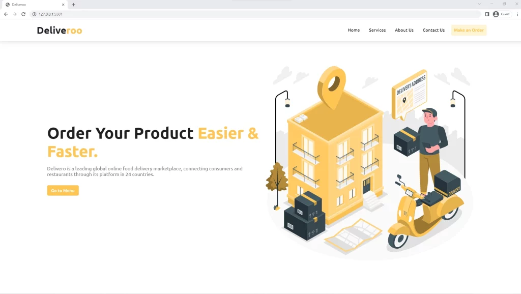
Here is the preview of the Hero Section in the browser
Next, let’s make it responsive using media queries so that it can properly adapt to different device sizes.
How to Make the Hero Section Responsive with Media Query
Let’s start with a viewport less than 996px where we only reduce the font size of the h1 to 4rem.
@media (max-width: 999px) {
  .home .content h1 {
    font-size: 4rem;
  }
}
Next, let’s work on viewports having their max-width equal to 768px. To make the description text more visible on medium screens, we need to reduce the font sizes and margin-bottom of both heading 1 and the paragraph.
We also need to set the grid layout of the hero section by changing it from 2 columns to 1 column.
Next, let’s give the hero image a max-width and also set margin-left and right to auto in order to center it.
@media (max-width: 768px) {
  .home .content h1 {
    font-size: 3rem;
    margin-bottom: 1.5rem;
  }

  .home .content p {
    font-size: inherit;
    margin-bottom: 1.5rem;
  }

  .home {
    grid-template-columns: 1fr;
  }

  .home .image {
    max-width: 40rem;
    margin: 0 auto;
  }
}
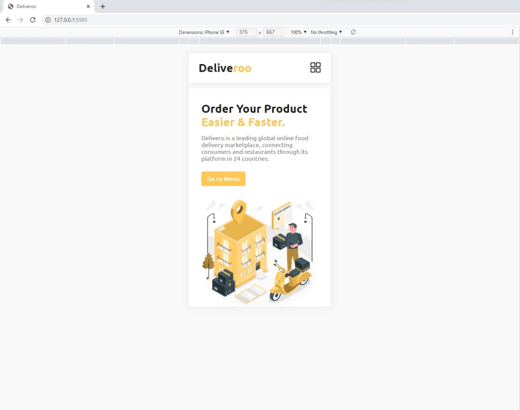
Here is the result after making the Hero Section responsive
How to Make the Services Section
The services section will do what the name implies – it will provide the various services our fictional Food Ordering Company has to offer to its customers.
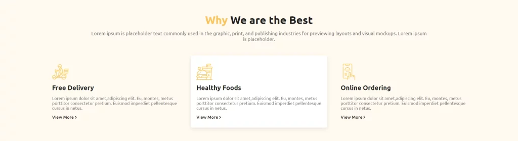
The Services section comprises a title text at the top and three cards representing the services of the Food Ordering Company.
The HTML for the services section:
<section class="services" id="services">
      <div class="top">
        <h2><span class="yellow">Why</span> We are the Best</h2>
        <p>
          Lorem ipsum is placeholder text commonly used in the graphic, print,
          and publishing industries for previewing layouts and visual mockups.
          Lorem ipsum is placeholder.
        </p>
      </div>

      <div class="bottom">
        <div class="box">
          <img src="./images/delivery-man.svg" alt="" />
          <h4>Free Delivery</h4>
          <p>
            Lorem ipsum dolor sit amet,adipiscing elit. Eu, montes, metus
            porttitor consectetur pretium. Euismod imperdiet pellentesque cursus
            in netus.
          </p>
          <a href="#">View More <img src="./images/btn-arrow.svg" alt="" /> </a>
        </div>
        <div class="box">
          <img src="./images/fast-food.svg" alt="" />
          <h4>Healthy Foods</h4>
          <p>
            Lorem ipsum dolor sit amet,adipiscing elit. Eu, montes, metus
            porttitor consectetur pretium. Euismod imperdiet pellentesque cursus
            in netus.
          </p>
          <a href="#">View More <img src="./images/btn-arrow.svg" alt="" /> </a>
        </div>
        <div class="box">
          <img src="./images/order-food.svg" alt="" />
          <h4>Online Ordering</h4>
          <p>
            Lorem ipsum dolor sit amet,adipiscing elit. Eu, montes, metus
            porttitor consectetur pretium. Euismod imperdiet pellentesque cursus
            in netus.
          </p>
          <a href="#">View More <img src="./images/btn-arrow.svg" alt="" /> </a>
        </div>
      </div>
    </section>
We are also going to give the services section a background color with the CSS background property.
The background property is a shorthand for:
- background-color
- background-image
- background-size
- background-position
- background-origin
- background-repeat
- background-clip
- background-attachment
Apart from the background color, we will also use CSS Grid to automatically make the services cards responsive with just one line of code.
Let’s start by overriding the generic padding for all sections and also set the background color to a color variable. Also, we need to style the top div containing the h2 and the paragraph elements.
section.services {
  background-color: var(--bg-yellow);
  padding: 5rem 9%;
}

.services .top {
  text-align: center;
  margin-bottom: 5rem;
}

.services .top h2 {
  font-size: 4rem;
  margin-bottom: 1.5rem;
}

.services .top p {
  width: 80%;
  margin: 0 auto;
  font-size: 1.8rem;
  color: var(--grey);
}
Let’s come to the most important part where we are going to use three lines of CSS Grid to make the div containing the services box have a grid layout of responsive columns.
.services .bottom {
  display: grid;
  grid-template-columns: repeat(auto-fit, minmax(30rem, 1fr));
  gap: 3rem;
}
Let’s continue with the styling of the individual services box, with the services box we are going to utilize Flexbox to align the items vertically.
.services .bottom {
  display: grid;
  grid-template-columns: repeat(auto-fit, minmax(30rem, 1fr));
  gap: 3rem;
}

.services .bottom .box {
  display: flex;
  flex-direction: column;
  align-items: flex-start;
  padding: 3rem 2rem;
  border-radius: 0.5rem;
}

.services .bottom .box:hover {
  background-color: var(--white);
  box-shadow: var(--box-shadow);
}

.services .bottom .box img {
  height: 6rem;
}

.services .bottom .box h4 {
  font-size: 2.4rem;
  margin: 1.5rem 0;
}

.services .bottom .box p {
  color: var(--grey);
  margin-bottom: 1.5rem;
}

.services .bottom .box a {
  display: inline-block;
  font-weight: 500;
}

.services .bottom .box a img {
  height: 1rem;
}
How to Make the Services Section Responsive with Media Query
Since we have already made the services section responsive with CSS Grid the only job left is to reduce the font size of the h2 and also reduce the margin and the padding of the individual services box.
@media (max-width: 768px) {
  .services .top {
    margin-bottom: 3rem;
  }

  .services .top p {
    width: 100%;
    font-size: inherit;
  }

  .services .top h2 {
    font-size: 3rem;
    margin-bottom: 1rem;
  }

  .services .bottom .box {
    padding: 1.5rem;
  }
}
Here is a preview of the services section in the browser
How to Make the About Section
The about section will do what the name says – it will detail what our fictional Food Ordering Company is about.
The HTML for this section is not complicated:
<section class="about" id="about">
      <div class="image">
        <img src="./images/illus riding.svg" alt="" />
      </div>
      <div class="content">
        <h3><span class="yellow">Order</span> anytime and anywhere</h3>
        <p>
          Lorem ipsum dolor sit amet,adipiscing elit. Eu, montes, metus
          porttitor consectetur pretium. Euismod imperdiet pellentesque cursus
          in netus.
        </p>
        <a href="#" class="btn">Make an Offer</a>
      </div>
    </section>
We will be having three about sections so to differentiate them we will add a secondary class to each of the remaining about sections.
The HTML for the second About Section
   <section class="about about-2">
      <div class="content">
        <h3>
          <span class="yellow">Deliver</span> the products with best safety
        </h3>
        <p>
          Lorem ipsum dolor sit amet,adipiscing elit. Eu, montes, metus
          porttitor consectetur pretium. Euismod imperdiet pellentesque cursus
          in netus.
        </p>
        <a href="#" class="btn">Make an Offer</a>
      </div>

      <div class="image">
        <img src="./images/illus deliver.svg" alt="" />
      </div>
    </section>
The HTML for the third About Section
<section class="about about-3" style="gap: 3rem 13rem">
      <div class="image">
        <img src="./images/buying online.svg" alt="" />
      </div>

      <div class="content">
        <h3><span class="yellow">Track</span> your order very easily</h3>
        <p>
          Lorem ipsum dolor sit amet,adipiscing elit. Eu, montes, metus
          porttitor consectetur pretium. Euismod imperdiet pellentesque cursus
          in netus.
        </p>
        <a href="#" class="btn">Track Now</a>
      </div>
    </section>
How to Style the About Sections
The about sections consist of 2 parts, text on one side and an image on the other side. What I did was alternate the images by changing their positions in the HTML.
section.about {
  display: grid;
  grid-template-columns: 1fr 1fr;
  align-items: center;
  gap: 5rem;
}

.about .image img {
  width: 100%;
}

.about .content h3 {
  font-size: 4rem;
  margin-bottom: 2rem;
}

.about .content p {
  color: var(--grey);
  width: 90%;
  margin-bottom: 3rem;
}
Also, I made the about section have two grid columns with CSS Grid. In addition, I aligned both the text and image horizontally and gave them a gap of 5rem.
How to make the About Section Responsive
To make the about section responsive, we need to make it have only one grid column on smaller screens.
Also, I used CSS Grid tricks to alternate the position of the image in the second about section.
@media (max-width: 768px) {
  section.about {
    grid-template-columns: 1fr;
    gap: 3rem 0;
  }

  .about .image {
    width: 90%;
  }

  .about.about-2 .image {
    grid-column-start: 1;
    grid-row-start: 1;
  }

  .about .content h3 {
    font-size: 3rem;
    margin-bottom: 1rem;
  }
  .about .content p {
    width: 100%;
    margin-bottom: 2rem;
  }
}
If you followed everything correctly then you should end up with a result like mine.
How to Build the App Download Section
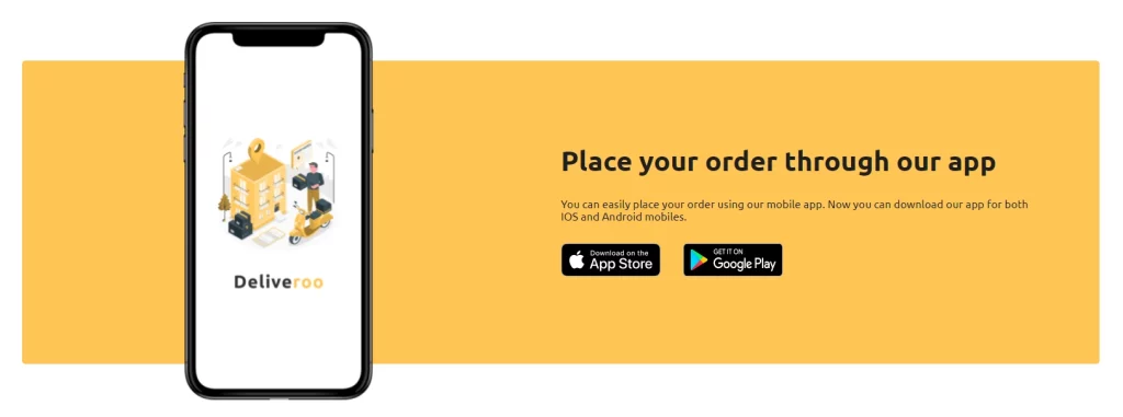
If you manage to reach this section then let me congratulate you on your hard work. You can call this section the App or Contact section.
The HTML for the App Section:
 <section class="app" id="contact">
      <div class="image">
        <img src="./images/splash with mobile.svg" alt="" />
      </div>
      <div class="content">
        <h3>Place your order through our app</h3>
        <p>
          You can easily place your order using our mobile app. Now you can
          download our app for both IOS and Android mobiles.
        </p>
        <div class="links">
          <img src="./images/app-store.png" alt="" />
          <img src="./images/google-play.png" alt="" />
        </div>
      </div>
    </section>
The App section can be considered the easiest part of this website but when we start positioning the phone image then you will know it’s not what you think.
How to Style the App Section
As usual, we are going to use CSS Grid in this section to make the app section have two columns. Also, we need to give the app section position relative so that later we can use position absolute to position the image in it.
section.app {
  margin: 10rem 9%;
  border-radius: 0.5rem;
  background-color: var(--yellow);
  display: grid;
  grid-template-columns: 1fr 1fr;
  align-items: center;
  position: relative;
  padding: 22rem 0;
}

section.app .image {
  position: absolute;
  left: 15%;
}

section.app .image img {
  width: 100%;
}

section.app .content {
  position: absolute;
  right: 5%;
  width: 45%;
}

section.app .content h3 {
  font-size: 4rem;
  margin-bottom: 3rem;
}

section.app .content p {
  margin-bottom: 3rem;
}

section.app .content .links img {
  margin-right: 3rem;
}
How to make the App Section Responsive
Since positioning the image is a little complicated, I hide it on smaller screens using display none.
@media (max-width: 1200px) {
  section.app .image {
    max-width: 20rem;
  }
}

@media (max-width: 768px) {
  section.app .image {
    display: none;
  }

  section.app {
    grid-template-columns: 1fr;
    padding: 20rem 0;
    margin: 5rem 9%;
  }

  section.app .content {
    width: 85%;
    left: 50%;
    transform: translateX(-50%);
  }

  section.app .content h3 {
    font-size: 3.5rem;
    margin-bottom: 2rem;
  }

  section.app .content .links img {
    width: 8rem;
    margin-right: 0;
  }
}
This is how the app section looks like
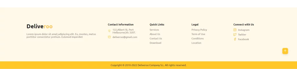
How to Make the Footer
The HTML for the Footer
<footer class="footer">
      <div class="top">
        <div class="content">
          <a href="" class="logo">Delive<span class="yellow">roo</span></a>
          <p>
            Lorem ipsum dolor sit amet,adipiscing elit. Eu, montes, metus
            porttitor consectetur pretium. Euismod imperdiet
          </p>
        </div>

        <div class="links">
          <div class="link">
            <h4>Contact Information</h4>
            <div>
              <img src="./images/location-cross.svg" alt="" />
              <span>122,Albert St, Port Melbourne,Vic 3207.</span>
            </div>
            <div>
              <img src="./images/sms-tracking.svg" alt="" />
              <span>deliveroo@gmail.com</span>
            </div>
          </div>

          <div class="link">
            <h4>Quick Links</h4>
            <a href="#">Services</a>
            <a href="#">About Us</a>
            <a href="#">Contact Us</a>
            <a href="#">Download</a>
          </div>

          <div class="link">
            <h4>Legal</h4>
            <a href="#">Privacy Policy</a>
            <a href="#">Term of Use</a>
            <a href="#">Conditions</a>
            <a href="#">Location</a>
          </div>

          <div class="link">
            <h4>Connect with Us</h4>
            <div>
              <img src="./images/instagram.svg" alt="" />
              <span>Instagram</span>
            </div>
            <div>
              <img src="./images/twitter.svg" alt="" />
              <span>Twitter</span>
            </div>
            <div>
              <img src="./images/facebook.svg" alt="" />
              <span>Facebook</span>
            </div>
          </div>
        </div>
      </div>
      <div class="bottom">
        <p>Copyright © 2010-2022 Deliveroo Company S.L. All rights reserved.</p>
      </div>
    </footer>
How to Style the Footer
We used both CSS Grid and Flexbox to style the footer in order to meet the styles of modern footer design.
.footer .top {
  background-color: var(--footer-yellow);
  padding: 10rem 9%;
  display: grid;
  grid-template-columns: 1fr 2fr;
}

.footer .top .links {
  display: grid;
  grid-template-columns: repeat(4, 1fr);
  gap: 3rem;
}

.footer .bottom {
  display: flex;
  align-items: center;
  justify-content: center;
  padding: 1.5rem 0;
  background-color: var(--deep-yellow);
}

.footer .top .content p {
  color: var(--grey);
  margin-top: 2rem;
  width: 90%;
}

.footer .top .link h4 {
  font-size: 1.7rem;
  margin-bottom: 1.5rem;
}

.footer .top .link a {
  display: inline-block;
  color: var(--grey);
  margin-bottom: 1rem;
}

.footer .top .link span {
  color: var(--grey);
}

.footer .top .link a {
  display: block;
}

.footer .top .link div {
  margin-bottom: 1rem;
  display: flex;
  align-items: center;
}

.footer .top .link div img {
  margin-right: 1rem;
}
How to make the Footer Responsive with Media Query
To make the footer responsive, I used CSS grid to align the items in one column and also set the .content to display none.
@media (max-width: 996px) {
  .footer .top {
    padding: 5rem 9%;
    grid-template-columns: 1fr;
  }

  .footer .top .content {
    display: none;
  }
}

@media (max-width: 768px) {
  .footer .top .links {
    grid-template-columns: 1fr;
    gap: 3rem 0;
  }

  .footer .top .link {
    display: flex;
    flex-direction: column;
  }

  .footer .bottom {
    padding: 1.5rem;
  }
}
Here is the preview of the footer
How to Make the Scroll-to-top button
For a better user experience, it’s always good to implement a scroll-to-top button on your website. Whenever this button is clicked, it will scroll the user to the top of the page.
The HTML for the Scroll-to-top button
<div class="scroll-top">
      <img src="./images/arrow-up-outline.svg" alt="" />
    </div>
How to Style the Scroll-to-top button
When the user lands on the web page, the scroll-to-top button will be hidden. The button will only show when the user scrolls to a particular viewport height of the screen.
.scroll-top {
  position: fixed;
  bottom: 10%;
  right: 3%;
  background-color: var(--deep-yellow);
  padding: 0.8rem;
  border-radius: 1rem;
  box-shadow: var(--box-shadow);
  animation: grow 1s linear infinite alternate;
  cursor: pointer;
  display: none;
}

.scroll-top img {
  width: 2.5rem;
}

@keyframes grow {
  0% {
    transform: scale(0.8);
  }
  100% {
    transform: scale(1);
  }
}

.scroll-top.show {
  display: block;
}
Add More Functionality to the Scroll-to-top button with JavaScript
To implement the scroll-to-top functionality, we need to write these lines of JavaScript
const scrollTop = document.querySelector(".scroll-top");

scrollTop.addEventListener("click", () => {
  window.scrollTo({
    left: 0,
    top: 0,
    behavior: "smooth",
  });
});

window.addEventListener("scroll", (e) => {
  const scrollHeight = window.pageYOffset;

  if (scrollHeight > 300) {
    scrollTop.classList.add("show");
  } else {
    scrollTop.classList.remove("show");
  }
});
What the above JS snippet is actually doing?
- I first selected the button with
document.querySelector(".scroll-top")and assign the value to a variable scrollTop - Now, let’s add a click event listener to the scrollTop variable to listen to a click action from the user.
- Next, we call the scrollTo() method on the window object and passed in an object with properties of top and left of 0. Also, we want the animation to be smooth so we added a smooth behavior property.
- Now, we have to add another scroll event listener to the window object in order to hide and show the scroll-to-top button based on the scroll height of the screen.
How to Make the Preloader
It’s best practice to show a preloader when your website will be fetching data from a database. Sometimes the process can take some period depending on the user’s internet connection.
To prevent the user from seeing a blank web page we need to show a preloader to tell the user that the web page is now loading.
The HTML for the Preloader
<div class="preloader">
      <img src="./images/preloader.gif" alt="" />
    </div>
How to Style the Preloader
.preloader {
  position: fixed;
  top: 0;
  left: 0;
  width: 100%;
  height: 100%;
  background-color: var(--white);
  display: flex;
  align-items: center;
  justify-content: center;
  z-index: 10000000;
}

.preloader img {
  width: 20rem;
  height: 20rem;
}
Add More Functionality to the Preloader with JavaScript
Since we are not working with a database we have to simulate a way to delay the loading time of the landing page so that we can show our preloader.
I actually added a setTimeout() method to hide the preloader with display none after 2000 milliseconds.
const preloader = document.querySelector(".preloader");

window.addEventListener("load", () => {
  setTimeout(() => {
    preloader.style.display = "none";
  }, 2000);
});

There are more functionalities we can integrate into this landing page but let’s keep it simple.
Feel free to give yourself the challenge to add more features to the landing page.
Good example of a landing page.
Highly recommend to use this example when you start building landing page.
Thanks for your effort.