

In this article, you’ll learn how to build a Login and Signup Form with validations using React, React Hook Form, TypeScript, Material UI v5, Zod, and React Router Dom.

You can also check out:
- How I Setup Redux Toolkit and RTK Query the right way
- Form Validation with React Hook Form, Material UI, React and TypeScript
- How to Customize Material-UI Rating Component with React and TypeScript
- How to Setup Material-UI v5 with React JS and TypeScript
Introduction
We’re going to start by creating a custom FormInput component with the TextField component from MUI and useFormContext from React Hook Form.
Having a custom FormInput that we can use in both the Login and Signup Forms will help us follow the DRY principle in programming.
The Login and Signup Forms will be built with the following technologies:
- React – UI library for building frontend applications.
- Material UI – A UI library that provides customizable React components.
- TypeScript – A superset of JavaScript. Adds additional typings to JavaScript.
- Zod – A user input validation library for both frontend and backend.
- React Router Dom – Implements dynamic routing in a React web app.
- React Hook Form – A library for validating React forms
What the course will cover
- Form validation with Zod schema
- Creating a custom Input component with
useFormContextandController. - Adding Google and GitHub Oauth Buttons
Login and Signup with React, Material-UI and React Hook Form Overview
We’ll add Form validation to both the Login and SignUp forms with React Hook Form, TypeScript, Material UI and Zod.
Validations Rules for the Login Form
- Email: required, must be a valid email address
- Password: required, must be between 8 and 32 characters
- PersistUser: optional, must be a boolean
Validations Rules for the SignUp Form
- Name: required, must be less than 70 characters
- Email: required, must be a valid email address
- Password: required, must be between 8 and 32 characters
- Confirm Password: required, must be equal to Password
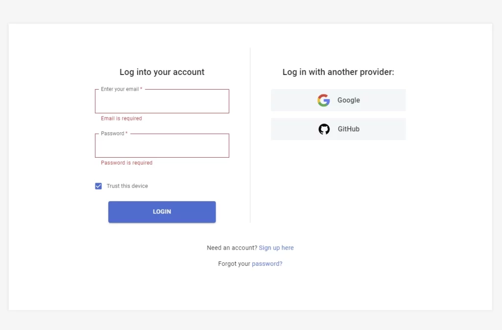
Validation Errors when the User doesn’t provide any of the required fields
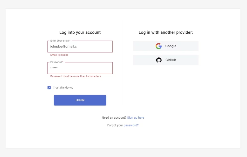
Validation Errors when the User doesn’t meet the validation requirement
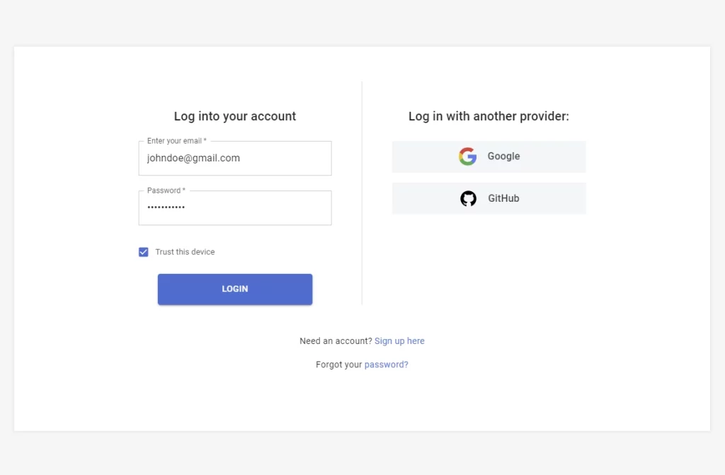
No Validation Errors after the user meets all the requirements
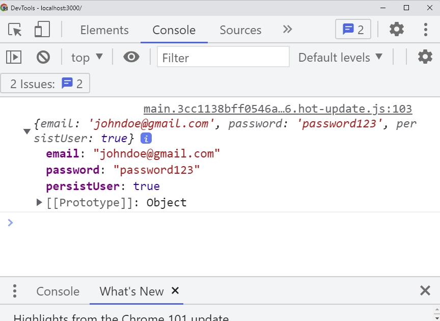
Output after the Login Form has been Submitted
Validation Errors when the User doesn’t provide any of the required fields
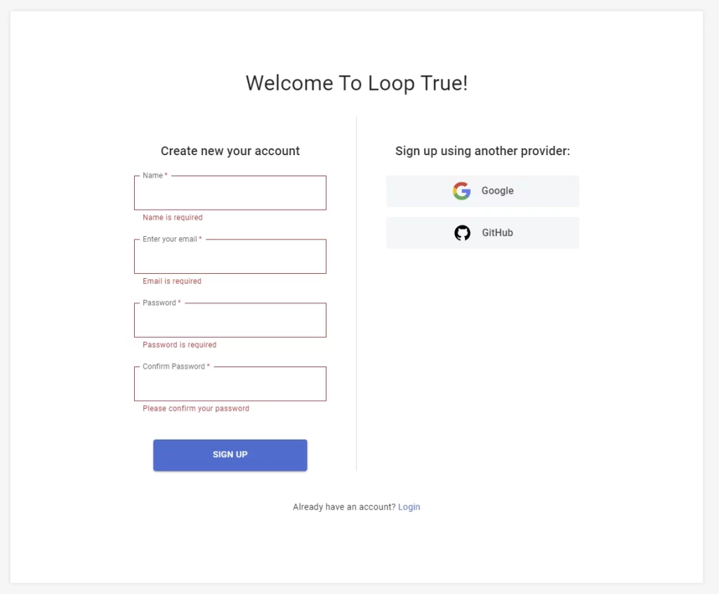
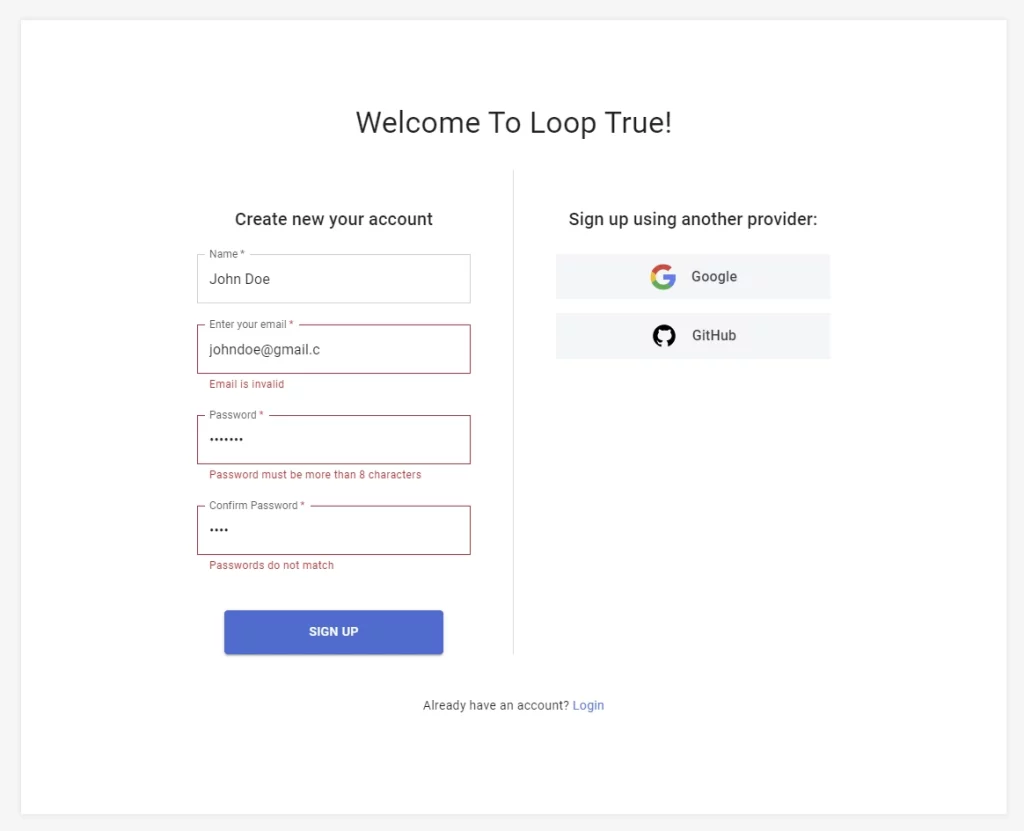
Validation Errors when the User doesn’t meet the validation requirements
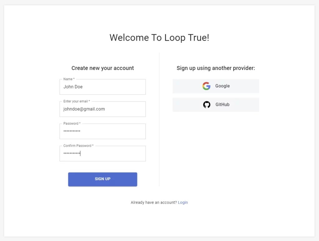
No Error when the user provides all the fields
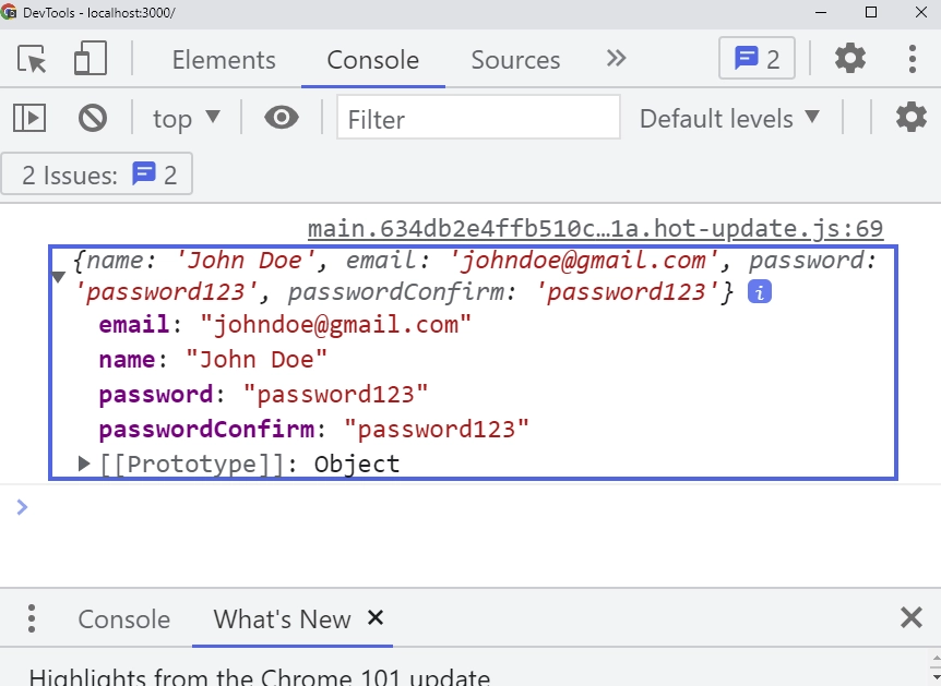
Output after the SignUp Form has been Submitted
Assumed Knowledge
This course assumes you have:
- Basic knowledge of React (JSX, Props, State, Functional Components)
- Basic knowledge of TypeScript and Javascript
- Basic knowledge of Material UI
- Basic knowledge of HTML Forms
Development Environment
To follow along with this course you need to have Node.js installed on your machine.
Clone the Repository
The complete source code of this course can be found on GitHub
git clone https://github.com/wpcodevo/Blog_MUI_React-hook-form.git
You can now navigate into the cloned directory, install the dependencies and start the development server:
cd Blog_MUI_React-hook-form
yarn install
yarn start
Project Structure and Dependencies
mui-app/

├── node_modules/
├── public/
│ ├── favicon.ico
│ └── index.html
├── src/
│ ├── assets/
│ │ ├── github.svg
│ │ └── google.svg
│ ├── components/
│ │ └── FormInput.tsx
│ ├── pages/
│ │ ├── login.page.tsx
│ │ └── Signup.page.tsx
│ ├── App.tsx
│ ├── index.tsx
│ └── react-app-env.d.ts
├── .gitignore
├── package.json
├── README.md
├── tsconfig.json
└── yarn.lock
Project Setup and Dependencies Installation
Before we start writing a single line of code, we need to install all the libraries we’ll need in the project.
Fetch and Install Material UI
Open your project root directory in the terminal and run this command. You can use any package manager you’re comfortable with.
# with npm
npm install @mui/material @emotion/react @emotion/styled @mui/lab

# with yarn
yarn add @mui/material @emotion/react @emotion/styled @mui/lab
Install React Hook Form and Zod
Run this command to install React Hook Form, @hookform/resolvers and Zod.
@hookform/resolvers allow us to use any external validation libraries like Yup, Zod, Joi, class validator, Superstruct, Vest and many others with React Hook Form.
#  with npm
npm install react-hook-form @hookform/resolvers zod
# with yarn
yarn add react-hook-form @hookform/resolvers zod
Install React Router Dom
Run this command to install React Router Dom. React Router Dom has tools we can use to navigate between different pages.
#  with npm
npm install react-router-dom
# with yarn
yarn add react-router-dom
Open your package.json and your dependencies should look somewhat like this. I personally removed some of the unnecessary dependencies added by Create-React-App.
{
  "name": "mui-app",
  "version": "0.1.0",
  "private": true,
  "dependencies": {
    "@emotion/react": "^11.9.0",
    "@emotion/styled": "^11.8.1",
    "@hookform/resolvers": "^2.8.8",
    "@mui/lab": "^5.0.0-alpha.77",
    "@mui/material": "^5.6.1",
    "@types/node": "^16.11.27",
    "@types/react": "^18.0.5",
    "@types/react-dom": "^18.0.1",
    "react": "^18.0.0",
    "react-dom": "^18.0.0",
    "react-hook-form": "^7.30.0",
    "react-router-dom": "^6.3.0",
    "react-scripts": "5.0.1",
    "typescript": "^4.6.3",
    "zod": "^3.14.4"
  }
}
Custom Input with Material UI and React Hook Form
As a React developer, you always have to follow the DRY (Don’t Repeat Yourself) principle.
I decided to create a custom Input component with Material UI InputField and useFormContext hook from React Hook Form in order to prevent us from copying and pasting similar code in both the Signup and Login components.
Create a file named src/components/FormInput.tsx and add the following imports.
import { FC } from 'react';
import { useFormContext, Controller } from 'react-hook-form';
import { TextField, TextFieldProps } from '@mui/material';
import { styled } from '@mui/material/styles';
Next, let’s use the styled function from MUI v5 to give some styles to the TextField component.
This will make the TextField component look simple and prevent us from writing the styles directly on it.
The styles in the code snippets below override some of the default styles that come with a TextField component.
// ? Styled Material UI TextField Component
const CssTextField = styled(TextField)({
  '& label.Mui-focused': {
    color: '#5e5b5d',
    fontWeight: 400,
  },
  '& .MuiInputBase-input': {
    borderColor: '#c8d0d4',
  },
  '& .MuiInput-underline:after': {
    border: 'none',
  },
  '& .MuiOutlinedInput-root': {
    '&.Mui-error': {
      '& .MuiOutlinedInput-notchedOutline': {
        borderColor: '#d32f2f',
      },
    },
    '& fieldset': {
      borderColor: '#c8d0d4',
      borderRadius: 0,
    },
    '&:hover fieldset': {
      border: '1px solid #c8d0d4',
    },
    '&.Mui-focused fieldset': {
      border: '1px solid #c8d0d4',
    },
  },
});
Now, let’s define a type that lists the various props the custom FormInput component will receive and add it as a type to the FormInput component.
I also extended the TextFieldProps from Material UI so that we can add more props when we make use of the custom FormInput.
// ? Type of Props the FormInput will receive
type FormInputProps = {
  name: string;
} & TextFieldProps;

const FormInput: FC<FormInputProps> = ({ name, ...otherProps }) => {
  // ? Utilizing useFormContext to have access to the form Context
  const {
    control,
    formState: { errors },
  } = useFormContext();

  return (
    <Controller
      control={control}
      name={name}
      defaultValue=''
      render={({ field }) => (
        <CssTextField
          {...field}
          {...otherProps}
          variant='outlined'
          sx={{ mb: '1.5rem' }}
          error={!!errors[name]}
          helperText={
            errors[name] ? (errors[name]?.message as unknown as string) : ''
          }
        />
      )}
    />
  );
};

export default FormInput;
React Hook Form and Material UI Login Form
Create a new file named src/pages/login.tsx and add the following imports.
import {
  Container,
  Grid,
  Box,
  Typography,
  Stack,
  Link as MuiLink,
  FormControlLabel,
  Checkbox,
} from '@mui/material';
import LoadingButton from '@mui/lab/LoadingButton';
import { FC } from 'react';
import { useForm, SubmitHandler, FormProvider } from 'react-hook-form';
import { Link } from 'react-router-dom';
import { literal, object, string, TypeOf } from 'zod';
import { zodResolver } from '@hookform/resolvers/zod';
import FormInput from '../components/FormInput';
import { ReactComponent as GoogleLogo } from '../assets/google.svg';
import { ReactComponent as GitHubLogo } from '../assets/github.svg';
import styled from '@emotion/styled';
Next, let’s style both the React Router Dom Link component and MUI Link component and export them to be used in the Signup component.
// ? Styled React Route Dom Link Component
export const LinkItem = styled(Link)`
  text-decoration: none;
  color: #3683dc;
  &:hover {
    text-decoration: underline;
    color: #5ea1b6;
  }
`;

// ? Styled Material UI Link Component
export const OauthMuiLink = styled(MuiLink)`
  display: flex;
  justify-content: center;
  align-items: center;
  background-color: #f5f6f7;
  border-radius: 1;
  padding: 0.6rem 0;
  column-gap: 1rem;
  text-decoration: none;
  color: #393e45;
  font-weight: 500;
  cursor: pointer;

  &:hover {
    background-color: #fff;
    box-shadow: 0 1px 13px 0 rgb(0 0 0 / 15%);
  }
`;
Defining the Login Form Schema with Zod
Now, let’s use Zod to define the form validation rules for the Login component.
// ? Login Schema with Zod
const loginSchema = object({
  email: string().min(1, 'Email is required').email('Email is invalid'),
  password: string()
    .min(1, 'Password is required')
    .min(8, 'Password must be more than 8 characters')
    .max(32, 'Password must be less than 32 characters'),
  persistUser: literal(true).optional(),
});
Infer the Zod Schema to Obtain TypeScript Type
Instead of writing a separate Interface containing the different fields in the schema, let’s use the TypeOf function from Zod to infer the types from the schema.
// ? Infer the Schema to get the TS Type
type ILogin = TypeOf<typeof loginschema>;
React Hook Form and Material UI Login Form Validation
Now, let’s provide the validation schema rules we defined above to the useForm hook from React Hook Form using the zodResolver function from @hookform/resolvers/zod .
The useForm hook accepts a generic so let’s add the inferred type to it and also provide some default values.
I also defined the onSubmitHandler and gave it the SubmitHandler type from React Hook Form. The SubmitHandler accepts a generic so I added the inferred type to make TypeScript happy.
const LoginPage: FC = () => {
  // ? Default Values
  const defaultValues: ILogin = {
    email: '',
    password: '',
  };

  // ? The object returned from useForm Hook
  const methods = useForm<ILogin>({
    resolver: zodResolver(loginSchema),
    defaultValues,
  });

  // ? Submit Handler
  const onSubmitHandler: SubmitHandler<ILogin> = (values: ILogin) => {
    console.log(values);
  };

  // ? JSX to be rendered

};
The useForm hook returns an object containing the following methods. In the snippets below, I destructured some of the important methods.
const {handleSubmit, reset, formState: {isSubmitSuccessful, isDirty, isSubmitted, isSubmitting,isValid}, control, errors} = methods
Below are some of the most common methods you’ll be using:
- handleSubmit – This function receives the form data if the form validation is successful.
- reset – This function resets the entire form state, fields reference, and subscriptions. Useful when you want to set some default values when the component mounts.
- isSubmitSuccessful – A boolean that indicates the form was successfully submitted without any Promise rejection or Error.
- errors – An object with field errors
- control – This object contains methods for registering components into React Hook Form. Note: do not access any of the properties in the control object directly. They’re for internal usage only.
In the code snippets below, I used the Box component from MUI v5 and gave it a component value of ‘form’. Meaning when the Login component gets rendered in the DOM, the output element of the Box component will be an HTML form.
Then I imported the custom FormInput component and added the required props and some other props accepted by the TextField component.
I also used the LoadingButton component from @mui/lab and set the loading prop to false.
A loading spinner will be shown in the LoadingButton when the value of the loading prop is true.
import {
  Container,
  Grid,
  Box,
  Typography,
  Stack,
  Link as MuiLink,
  FormControlLabel,
  Checkbox,
} from '@mui/material';
import LoadingButton from '@mui/lab/LoadingButton';
import { FC } from 'react';
import { useForm, SubmitHandler, FormProvider } from 'react-hook-form';
import { Link } from 'react-router-dom';
import { literal, object, string, TypeOf } from 'zod';
import { zodResolver } from '@hookform/resolvers/zod';
import FormInput from '../components/FormInput';
import { ReactComponent as GoogleLogo } from '../assets/google.svg';
import { ReactComponent as GitHubLogo } from '../assets/github.svg';
import styled from '@emotion/styled';

// ? Styled React Route Dom Link Component
export const LinkItem = styled(Link)`
  text-decoration: none;
  color: #3683dc;
  &:hover {
    text-decoration: underline;
    color: #5ea1b6;
  }
`;

// ? Styled Material UI Link Component
export const OauthMuiLink = styled(MuiLink)`
  display: flex;
  justify-content: center;
  align-items: center;
  background-color: #f5f6f7;
  border-radius: 1;
  padding: 0.6rem 0;
  column-gap: 1rem;
  text-decoration: none;
  color: #393e45;
  font-weight: 500;
  cursor: pointer;

  &:hover {
    background-color: #fff;
    box-shadow: 0 1px 13px 0 rgb(0 0 0 / 15%);
  }
`;

// ? Login Schema with Zod
const loginSchema = object({
  email: string().min(1,'Email is required').email('Email is invalid'),
  password: string()
    .min(1,'Password is required')
    .min(8, 'Password must be more than 8 characters')
    .max(32, 'Password must be less than 32 characters'),
  persistUser: literal(true).optional(),
});

// ? Infer the Schema to get the TS Type
type ILogin = TypeOf<typeof loginschema>;

const LoginPage: FC = () => {
  // ? Default Values
  const defaultValues: ILogin = {
    email: '',
    password: '',
  };

  // ? The object returned from useForm Hook
  const methods = useForm<ILogin>({
    resolver: zodResolver(loginSchema),
    defaultValues,
  });

  // ? Submit Handler
  const onSubmitHandler: SubmitHandler<ILogin> = (values: ILogin) => {
    console.log(values);
  };

  // ? JSX to be rendered
  return (
    <Container
      maxWidth={false}
      sx={{ height: '100vh', backgroundColor: { xs: '#fff', md: '#f4f4f4' } }}
    >
      <Grid
        container
        justifyContent='center'
        alignItems='center'
        sx={{ width: '100%', height: '100%' }}
      >
        <Grid
          item
          sx={{ maxWidth: '70rem', width: '100%', backgroundColor: '#fff' }}
        >
          <FormProvider {...methods}>
            <Grid
              container
              sx={{
                boxShadow: { sm: '0 0 5px #ddd' },
                py: '6rem',
                px: '1rem',
              }}
            >
              <Grid
                item
                container
                justifyContent='space-between'
                rowSpacing={5}
                sx={{
                  maxWidth: { sm: '45rem' },
                  marginInline: 'auto',
                }}
              >
                <Grid
                  item
                  xs={12}
                  sm={6}
                  sx={{ borderRight: { sm: '1px solid #ddd' } }}
                >
                  <Box
                    display='flex'
                    flexDirection='column'
                    component='form'
                    noValidate
                    autoComplete='off'
                    sx={{ paddingRight: { sm: '3rem' } }}
                    onSubmit={methods.handleSubmit(onSubmitHandler)}
                  >
                    <Typography
                      variant='h6'
                      component='h1'
                      sx={{ textAlign: 'center', mb: '1.5rem' }}
                    >
                      Log into your account
                    </Typography>

                    <FormInput
                      label='Enter your email'
                      type='email'
                      name='email'
                      focused
                      required
                    />
                    <FormInput
                      type='password'
                      label='Password'
                      name='password'
                      required
                      focused
                    />

                    <FormControlLabel
                      control={
                        <Checkbox
                          size='small'
                          aria-label='trust this device checkbox'
                          required
                          {...methods.register('persistUser')}
                        />
                      }
                      label={
                        <Typography
                          variant='body2'
                          sx={{
                            fontSize: '0.8rem',
                            fontWeight: 400,
                            color: '#5e5b5d',
                          }}
                        >
                          Trust this device
                        </Typography>
                      }
                    />

                    <LoadingButton
                      loading={false}
                      type='submit'
                      variant='contained'
                      sx={{
                        py: '0.8rem',
                        mt: 2,
                        width: '80%',
                        marginInline: 'auto',
                      }}
                    >
                      Login
                    </LoadingButton>
                  </Box>
                </Grid>
                <Grid item xs={12} sm={6}>
                  <Typography
                    variant='h6'
                    component='p'
                    sx={{
                      paddingLeft: { sm: '3rem' },
                      mb: '1.5rem',
                      textAlign: 'center',
                    }}
                  >
                    Log in with another provider:
                  </Typography>
                  <Box
                    display='flex'
                    flexDirection='column'
                    sx={{ paddingLeft: { sm: '3rem' }, rowGap: '1rem' }}
                  >
                    <OauthMuiLink href=''>
                      <GoogleLogo style={{ height: '2rem' }} />
                      Google
                    </OauthMuiLink>
                    <OauthMuiLink href=''>
                      <GitHubLogo style={{ height: '2rem' }} />
                      GitHub
                    </OauthMuiLink>
                  </Box>
                </Grid>
              </Grid>
              <Grid container justifyContent='center'>
                <Stack sx={{ mt: '3rem', textAlign: 'center' }}>
                  <Typography sx={{ fontSize: '0.9rem', mb: '1rem' }}>
                    Need an account?{' '}
                    <LinkItem to='/signup'>Sign up here</LinkItem>
                  </Typography>
                  <Typography sx={{ fontSize: '0.9rem' }}>
                    Forgot your{' '}
                    <LinkItem to='/forgotPassword'>password?</LinkItem>
                  </Typography>
                </Stack>
              </Grid>
            </Grid>
          </FormProvider>
        </Grid>
      </Grid>
    </Container>
  );
};

export default LoginPage;
Setup Dynamic Routing with React Router Dom
Now, let’s begin writing some routing logic. In this project, we have only two pages – the Login Page and the SignUp Page.
I imported the BrowserRouter component from React Router Dom and wrapped it around the App component.
import React from 'react';
import ReactDOM from 'react-dom/client';
import { BrowserRouter } from 'react-router-dom';
import App from './App';

const root = ReactDOM.createRoot(
  document.getElementById('root') as HTMLElement
);
root.render(
  <React.StrictMode>
    <BrowserRouter>
      <App />
    </BrowserRouter>
  </React.StrictMode>
);
Next, I used both the Routes and Route components in the App component to route the root URL to the LoginPage component and also the path '/signup' to the SignupPage component.
mport { CssBaseline } from '@mui/material';
import { Route, Routes } from 'react-router-dom';
import LoginPage from './pages/login.page';
import SignupPage from './pages/Signup.page';

function App() {
  return (
    <>
      <CssBaseline />
      <Routes>
        <Route path='/' element={<LoginPage />} />
        <Route path='/signup' element={<SignupPage />} />
      </Routes>
    </>
  );
}

export default App;
React Hook Form and Material UI Signup Form Template
The Signup form will look similar to the Login form so you can copy the Login component and paste it into the Signup component and change the required names respectively.
For the sake of this course, let’s do it manually to exercise your muscle memory.
In the Signup page component, add the following imports.
import { Container, Grid, Box, Typography, Stack } from '@mui/material';
import LoadingButton from '@mui/lab/LoadingButton';
import { FC } from 'react';
import { useForm, SubmitHandler, FormProvider } from 'react-hook-form';
import { object, string, TypeOf } from 'zod';
import { zodResolver } from '@hookform/resolvers/zod';
import FormInput from '../components/FormInput';
import { ReactComponent as GoogleLogo } from '../assets/google.svg';
import { ReactComponent as GitHubLogo } from '../assets/github.svg';
import { LinkItem, OauthMuiLink } from './login.page';
Defining the Signup Form Schema with Zod
Next, let’s define the registration form validation rules with Zod.
// ? SignUp Schema with Zod
const signupSchema = object({
  name: string().min(1, 'Name is required').max(70),
  email: string().min(1, 'Email is required').email('Email is invalid'),
  password: string()
    .min(1, 'Password is required')
    .min(8, 'Password must be more than 8 characters')
    .max(32, 'Password must be less than 32 characters'),
  passwordConfirm: string().min(1, 'Please confirm your password'),
}).refine((data) => data.password === data.passwordConfirm, {
  path: ['passwordConfirm'],
  message: 'Passwords do not match',
});
Infer the Signup Form Schema to Obtain the TypeScript Type
Next, let’s infer the TypeScript types from the signupSchema we defined above.
// ? Infer the Schema to get TypeScript Type
type ISignUp = TypeOf<typeof signupschema>;
React Hook Form and Material UI Signup Form Validation
Now let’s define some default values for the useForm hook and also let’s provide the useForm hook with the schema we defined above using the zodResolver function.
Also, let’s define the onSubmitHandler to get the values returned from the form when the submit button is clicked.
const SignupPage: FC = () => {
  // ? Default Values
  const defaultValues: ISignUp = {
    name: '',
    email: '',
    password: '',
    passwordConfirm: '',
  };

  // ? Object containing all the methods returned by useForm
  const methods = useForm<ISignUp>({
    resolver: zodResolver(signupSchema),
    defaultValues,
  });

  // ? Form Handler
  const onSubmitHandler: SubmitHandler<ISignUp> = (values: ISignUp) => {
    console.log(values);
  };

  // ? Returned JSX
};
Below is the full source code of the Signup form component.
import { Container, Grid, Box, Typography, Stack } from '@mui/material';
import LoadingButton from '@mui/lab/LoadingButton';
import { FC } from 'react';
import { useForm, SubmitHandler, FormProvider } from 'react-hook-form';
import { object, string, TypeOf } from 'zod';
import { zodResolver } from '@hookform/resolvers/zod';
import FormInput from '../components/FormInput';
import { ReactComponent as GoogleLogo } from '../assets/google.svg';
import { ReactComponent as GitHubLogo } from '../assets/github.svg';
import { LinkItem, OauthMuiLink } from './login.page';

// ? SignUp Schema with Zod
const signupSchema = object({
  name: string().min(1,'Name is required').max(70),
  email: string().min(1,'Email is required').email('Email is invalid'),
  password: string()
    .min(1,'Password is required')
    .min(8, 'Password must be more than 8 characters')
    .max(32, 'Password must be less than 32 characters'),
  passwordConfirm: string().min(1,'Please confirm your password'),
}).refine((data) => data.password === data.passwordConfirm, {
  path: ['passwordConfirm'],
  message: 'Passwords do not match',
});

// ? Infer the Schema to get TypeScript Type
type ISignUp = TypeOf<typeof signupschema>;


const SignupPage: FC = () => {
  // ? Default Values
  const defaultValues: ISignUp = {
    name: '',
    email: '',
    password: '',
    passwordConfirm: '',
  };

  // ? Object containing all the methods returned by useForm
  const methods = useForm<ISignUp>({
    resolver: zodResolver(signupSchema),
    defaultValues,
  });

  // ? Form Handler
  const onSubmitHandler: SubmitHandler<ISignUp> = (values: ISignUp) => {
    console.log(values);
  };

  // ? Returned JSX
  return (
    <Container
      maxWidth={false}
      sx={{ height: '100vh', backgroundColor: { xs: '#fff', md: '#f4f4f4' } }}
    >
      <Grid
        container
        justifyContent='center'
        alignItems='center'
        sx={{ width: '100%', height: '100%' }}
      >
        <Grid
          item
          sx={{ maxWidth: '70rem', width: '100%', backgroundColor: '#fff' }}
        >
          <Grid
            container
            sx={{
              boxShadow: { sm: '0 0 5px #ddd' },
              py: '6rem',
              px: '1rem',
            }}
          >
            <FormProvider {...methods}>
              <Typography
                variant='h4'
                component='h1'
                sx={{
                  textAlign: 'center',
                  width: '100%',
                  mb: '1.5rem',
                  pb: { sm: '3rem' },
                }}
              >
                Welcome To Loop True!
              </Typography>
              <Grid
                item
                container
                justifyContent='space-between'
                rowSpacing={5}
                sx={{
                  maxWidth: { sm: '45rem' },
                  marginInline: 'auto',
                }}
              >
                <Grid
                  item
                  xs={12}
                  sm={6}
                  sx={{ borderRight: { sm: '1px solid #ddd' } }}
                >
                  <Box
                    display='flex'
                    flexDirection='column'
                    component='form'
                    noValidate
                    autoComplete='off'
                    sx={{ paddingRight: { sm: '3rem' } }}
                    onSubmit={methods.handleSubmit(onSubmitHandler)}
                  >
                    <Typography
                      variant='h6'
                      component='h1'
                      sx={{ textAlign: 'center', mb: '1.5rem' }}
                    >
                      Create new your account
                    </Typography>

                    <FormInput
                      label='Name'
                      type='text'
                      name='name'
                      focused
                      required
                    />
                    <FormInput
                      label='Enter your email'
                      type='email'
                      name='email'
                      focused
                      required
                    />
                    <FormInput
                      type='password'
                      label='Password'
                      name='password'
                      required
                      focused
                    />
                    <FormInput
                      type='password'
                      label='Confirm Password'
                      name='passwordConfirm'
                      required
                      focused
                    />

                    <LoadingButton
                      loading={false}
                      type='submit'
                      variant='contained'
                      sx={{
                        py: '0.8rem',
                        mt: 2,
                        width: '80%',
                        marginInline: 'auto',
                      }}
                    >
                      Sign Up
                    </LoadingButton>
                  </Box>
                </Grid>
                <Grid item xs={12} sm={6} sx={{}}>
                  <Typography
                    variant='h6'
                    component='p'
                    sx={{
                      paddingLeft: { sm: '3rem' },
                      mb: '1.5rem',
                      textAlign: 'center',
                    }}
                  >
                    Sign up using another provider:
                  </Typography>
                  <Box
                    display='flex'
                    flexDirection='column'
                    sx={{ paddingLeft: { sm: '3rem' }, rowGap: '1rem' }}
                  >
                    <OauthMuiLink href=''>
                      <GoogleLogo style={{ height: '2rem' }} />
                      Google
                    </OauthMuiLink>
                    <OauthMuiLink href=''>
                      <GitHubLogo style={{ height: '2rem' }} />
                      GitHub
                    </OauthMuiLink>
                  </Box>
                </Grid>
              </Grid>
              <Grid container justifyContent='center'>
                <Stack sx={{ mt: '3rem', textAlign: 'center' }}>
                  <Typography sx={{ fontSize: '0.9rem', mb: '1rem' }}>
                    Already have an account? <LinkItem to='/'>Login</LinkItem>
                  </Typography>
                </Stack>
              </Grid>
            </FormProvider>
          </Grid>
        </Grid>
      </Grid>
    </Container>
  );
};

export default SignupPage;
Summary
In this article, we learned how to build Login and Signup Forms with React, React Hook Form, Material UI v5, Zod, React Router Dom, and TypeScript.
Check out the source code on GitHub
Hey
I’m new in react and i was trying to structure my code like for you but every time i check the result of the handlesunbmit function on the console and the result is {}
Try adding the “name” attribute to the inputs to see if it will work.